Designing an F1 poster centered on Michael Schumacher is less about retelling a career and more about translating charisma into a single, potent image. This article examines how posture, facial cues, color, composition and visual storytelling combine to make Schumacher not just a subject but a presence—a champion rendered as graphic art for walls and fans.
Focus on aura over biography
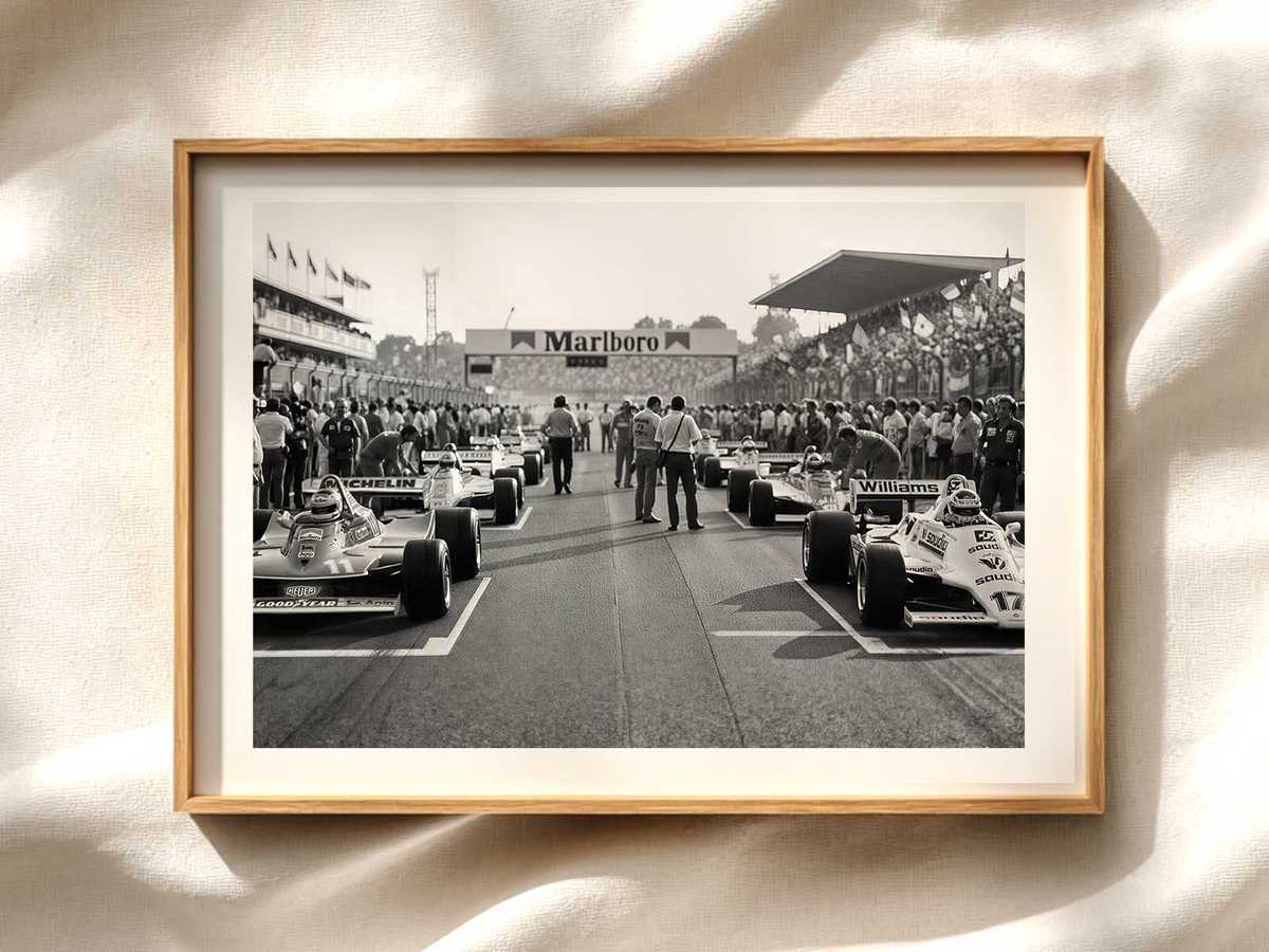
When the goal is a poster, chronology is secondary. Viewers arrive seeking an emotional hit: the thrill of speed, the intensity of competition, and the idea of the driver as icon. To create that instant recognition, design choices should emphasize signature gestures and props—helmet tilt, stance beside the car, gloved hands on wheel—rather than blocks of text or career milestones. These visual cues act as shorthand for Schumacher’s competitive persona without needing a timeline.
Posture and silhouette: the foundation of presence
Silhouette is one of the most effective ways to make a figure read immediately at a distance. Schumacher’s posture can be stylized to amplify confidence: an upright stance, a slight lean forward suggesting engagement, or a relaxed cross of arms to signal control. Translating that posture into a clear, high-contrast silhouette allows the poster to communicate instantly, whether it’s viewed across a room or as a thumbnail online.
Facial cues and helmet language
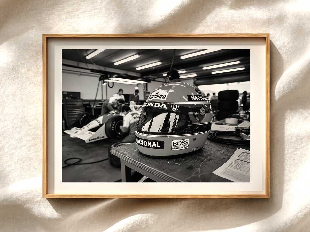
Where faces are shown, minimalism often wins. A few well-placed highlights across the brow, jawline and eyes can convey determination without photorealism. Conversely, using the helmet as a focal device—emphasizing visor reflections, sponsor decals, and the helmet’s shape—creates mystery and iconography. The helmet becomes both a shield and a symbol: anonymity that paradoxically heightens the personality behind it.
Color, contrast and emotional palette
Color choices drive mood. Deep reds and blacks communicate aggression and intensity; muted sepia or film-grain textures evoke nostalgia and legacy. High-contrast duotones can modernize a vintage subject, while a limited palette ensures the driver reads as a graphic element rather than a photograph. Use accent colors sparingly to guide the eye to focal points—helmet, gloves, or team badge—so the composition feels intentional and stage-like.
Composition and negative space
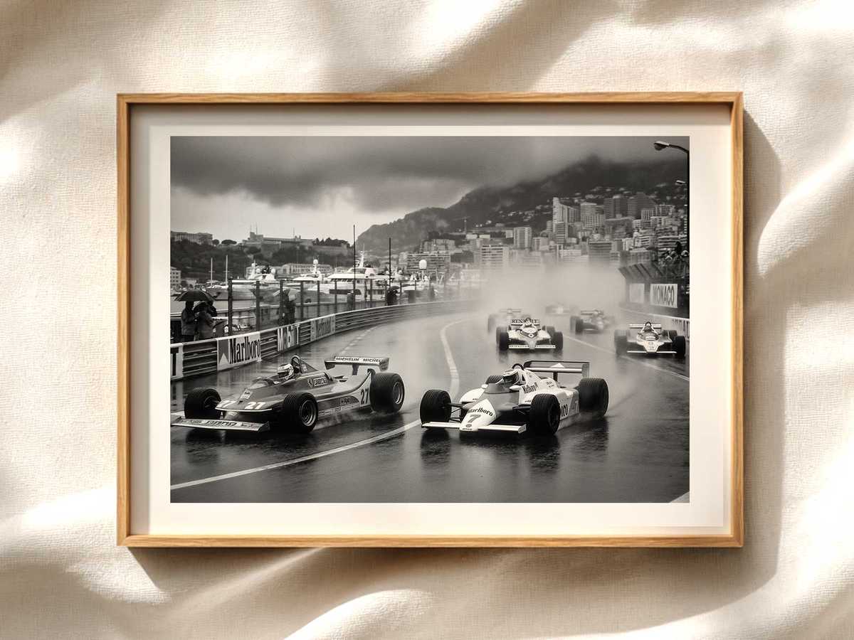
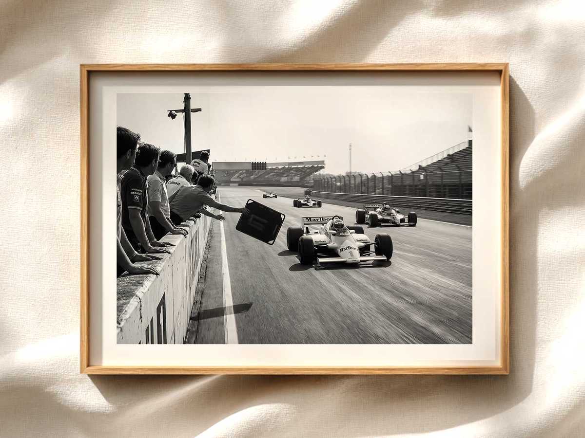
Leaving breathing room around the figure elevates presence. Negative space isolates the driver, turning them into the poster’s protagonist. Balanced asymmetry—placing Schumacher slightly off-center with a diagonal implied line from helmet to wheel—creates dynamism. Consider layering: a subtle background grid, racetrack blur or abstract speed lines can suggest motion while keeping the central figure dominant.
Typography as part of the portrait
Text should complement, not compete. Choose a typeface that matches the mood: a bold geometric sans for modern energy, a condensed display face for vintage motorsport feel. Keep the driver’s name understated if the image is strong; sometimes a small, well-placed nameplate or monogram is enough to crown the figure without distracting from the visual aura.
Light, texture and the feel of material
Lighting treatments add depth and character. Strong rim lighting separates the figure from the background and emphasizes contours. Film grain, paper texture, or halftone patterns can suggest print history and tactile quality—important for posters meant to hang on walls. These material cues invite closer inspection and make the artwork feel like an object, not just an image.
Iconography and symbolic elements
Small symbolic additions can amplify the champion narrative without becoming literal. Trophies sketched in outline, laurel motifs rendered as abstract curves, or subtle track maps worked into negative space evoke achievement and context. Use these sparingly to keep the composition elegant and focused on the visual personality of Schumacher.
Balancing homage and originality
Fans respond to authenticity but also to fresh interpretation. A successful poster nods to recognizable elements—helmet designs, team colors, posture—while offering a distinct artistic voice. This balance preserves respect for the subject and gives collectors something visually new to display.
Practical considerations for production
Ensure the artwork scales well for different poster sizes and print processes. Vector-based elements for silhouettes and typography preserve crispness; high-resolution raster layers with careful grading serve photographic textures. Consider variants for limited editions: alternate colorways, small signature plates, or numbered runs that increase desirability while keeping the core visual identity intact.
Conclusion: making Schumacher a visual champion
Turning Michael Schumacher into a graphic presence for an F1 poster is an exercise in distillation. Prioritize posture, silhouette, and a controlled emotional palette to create an image that reads instantly and rewards closer viewing. The best posters make the driver feel larger than life—an emblem of speed and focus—while remaining elegant, wearable art for walls.