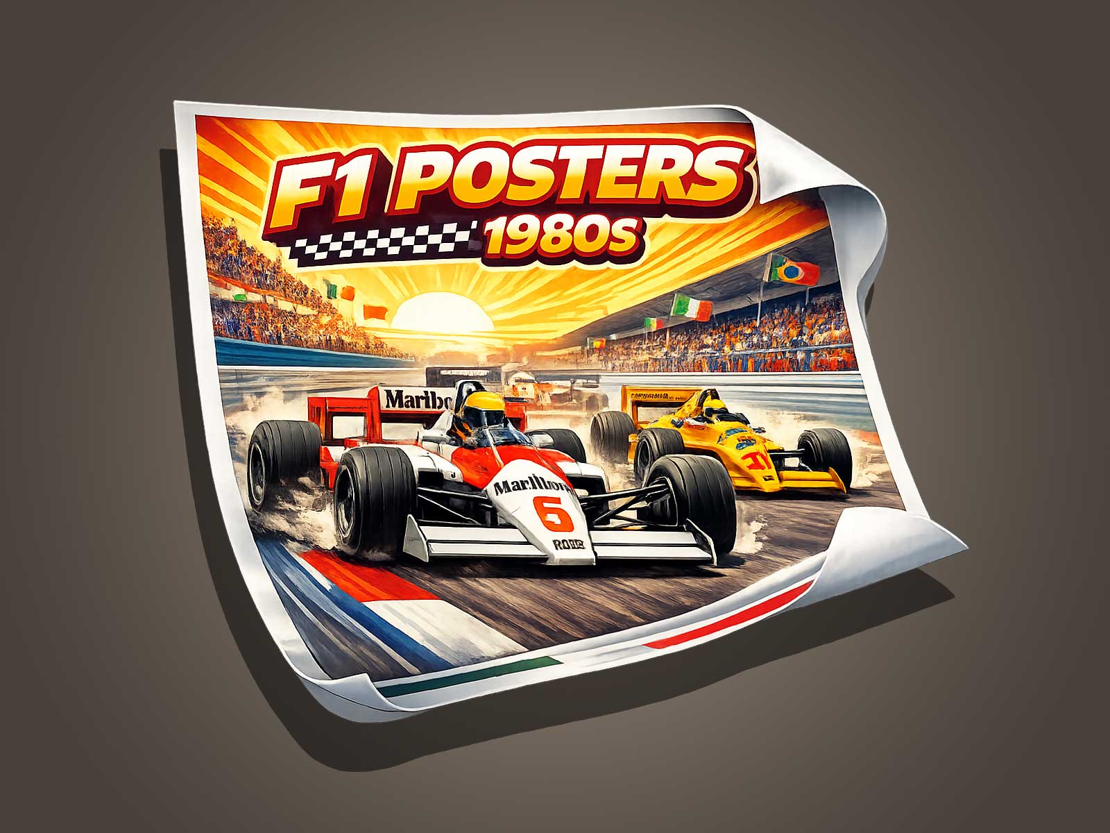
The F1 Spanish Grand Prix acquires a special depth when seen through a vintage 1980s Formula 1 aesthetic. This article explores how a poster treatment that emphasizes visual memory, historical patina, and cultural heritage transforms race imagery into an artifact. We examine design choices—color fading, grain, typography, and composition—that not only reference the decade but amplify the Grand Prix’s emotional and archival value.
Why the 1980s Aesthetic Amplifies the Spanish Grand Prix
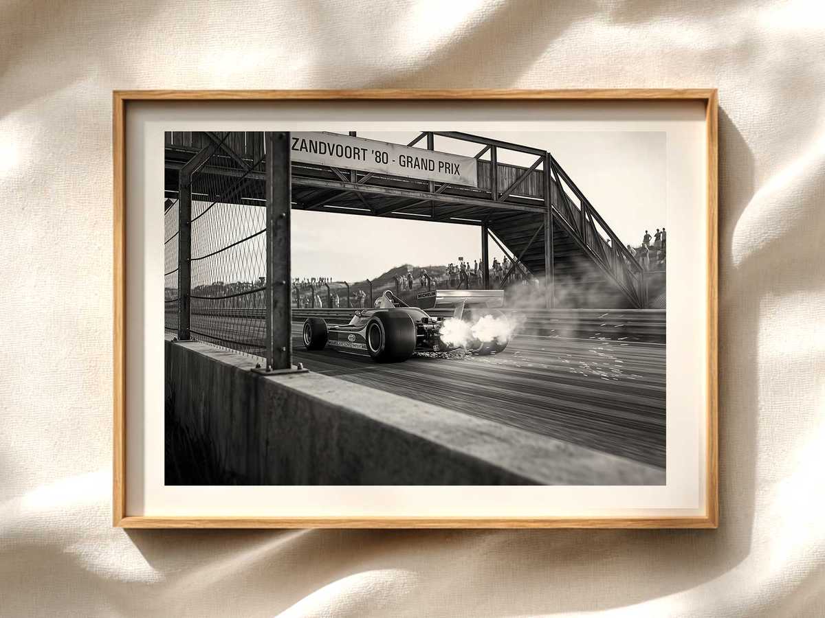
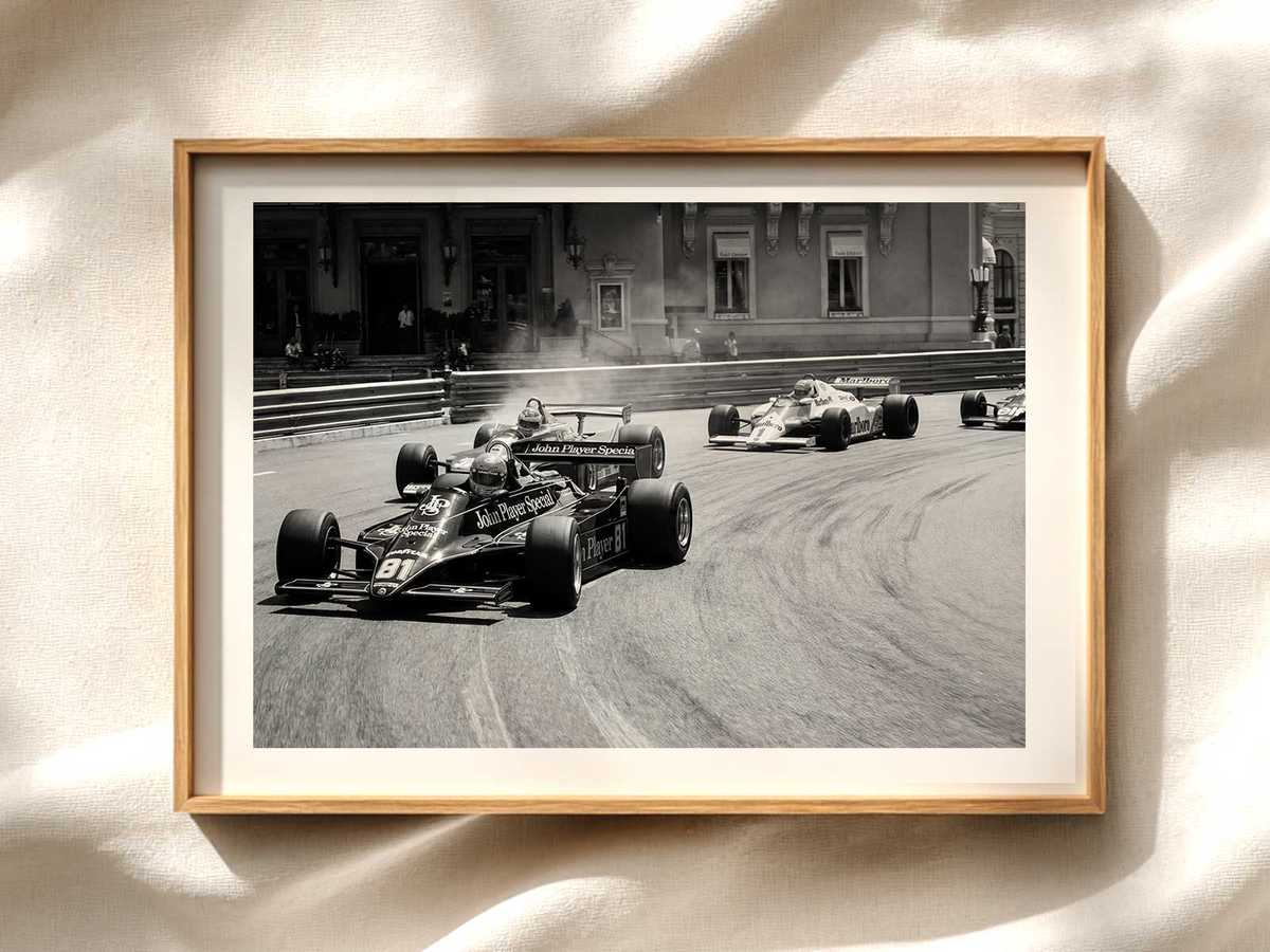
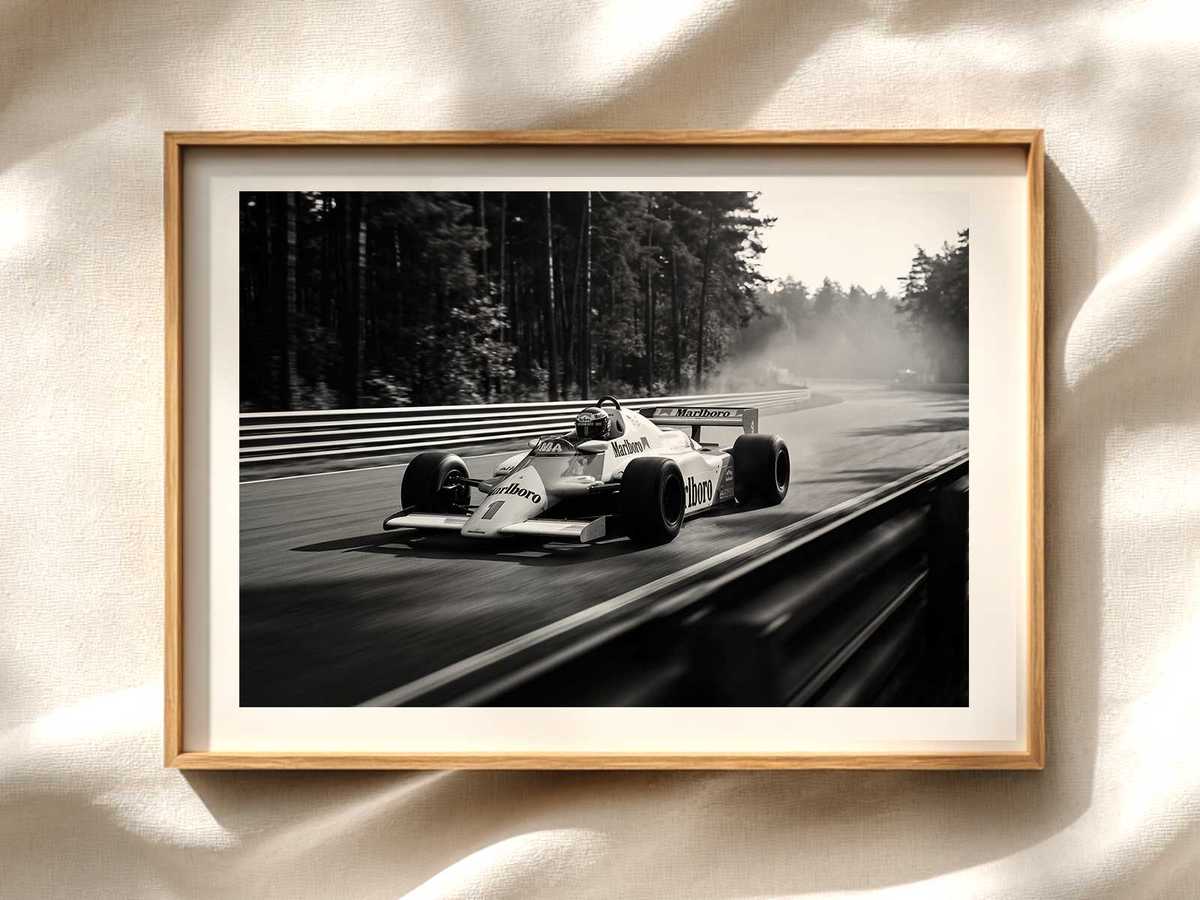
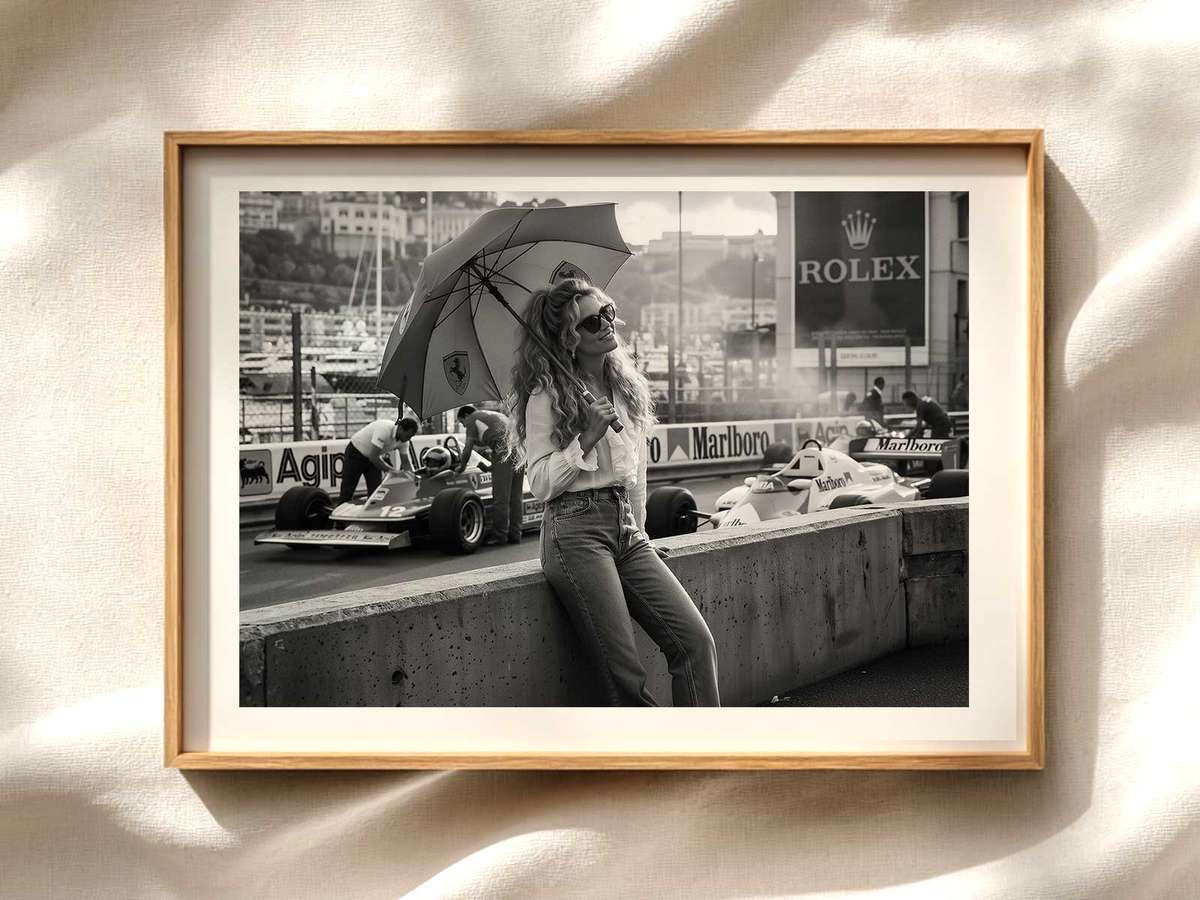
The 1980s were a decisive era for Formula 1: technological change, iconic liveries, and memorable circuits created potent visual material. Applying that aesthetic to Spanish Grand Prix imagery does more than evoke nostalgia; it reframes the photograph as a material witness. Subtle desaturation, warm color shifts, and film grain suggest the passage of time, inviting viewers to treat the poster as an object of collective memory rather than a simple race snapshot.
Visual Memory and the Role of Patina
Patina—the look of age and wear—acts as a visual shorthand for authenticity. In a poster, controlled abrasions, edge wear and faint scratches give the sense that the image has survived decades of handling and display. For the Spanish Grand Prix, this suggests stories beyond a single race: weathered grandstands, sun-faded banners, and the tactile history of fans who witnessed those moments. That perceived continuity increases the poster’s emotional resonance and perceived value.
Design Elements That Create Heritage Value
Several design choices anchor a vintage poster in the 1980s while preserving the subject’s historic dignity:
- Color treatment: Warm magenta or amber bias and selective desaturation to mimic aging film stocks.
- Grain and texture: Film grain and paper texture layers that suggest analog production.
- Typography: Condensed sans-serifs or geometric typefaces with slightly distressed treatment referencing period motorsport graphics.
- Framing and composition: Tight cropping on car and circuit details that read well at poster scale and emphasize motion and machine.
- Subtle overlays: Track maps, race dates, or event badges rendered as faded stamps to imply archival provenance.
How a Poster Becomes a Heritage Object
A poster moves from decorative to heritage when it suggests continuity across generations. For collectors, that meaning is crucial: the image becomes an heirloom to hang and pass down. For the Spanish Grand Prix, signage, spectator silhouettes and period cars in an 80s-inspired finish offer clues to a specific cultural moment in motorsport. These cues let viewers reconstruct context, making the poster a gateway to memory rather than a static illustration.
Practical Tips for Choosing an Authentic Vintage-Style Poster
When selecting a Spanish Grand Prix poster with an 80s aesthetic, consider the following:
- Look for intentional aging rather than random damage—distress should feel designed.
- Check print quality: archival inks and textured papers retain the intended patina without further unintended degradation.
- Review composition at full size—details like crowd, signage, and car decals should remain legible and meaningful.
- Prefer editions that include a short provenance note or design explanation to support the poster’s heritage claim.
Conclusion: Memory, Materiality, and the Spanish Grand Prix Poster
Rendering the F1 Spanish Grand Prix with a 1980s vintage aesthetic deepens the image’s narrative potential. Through carefully applied patina, filmic color treatment, and period-accurate typography, a poster can become a vessel of memory—an object that conveys time, place, and cultural significance. For fans and collectors, such pieces offer more than decoration: they are curated fragments of racing history, ready to be displayed and preserved.
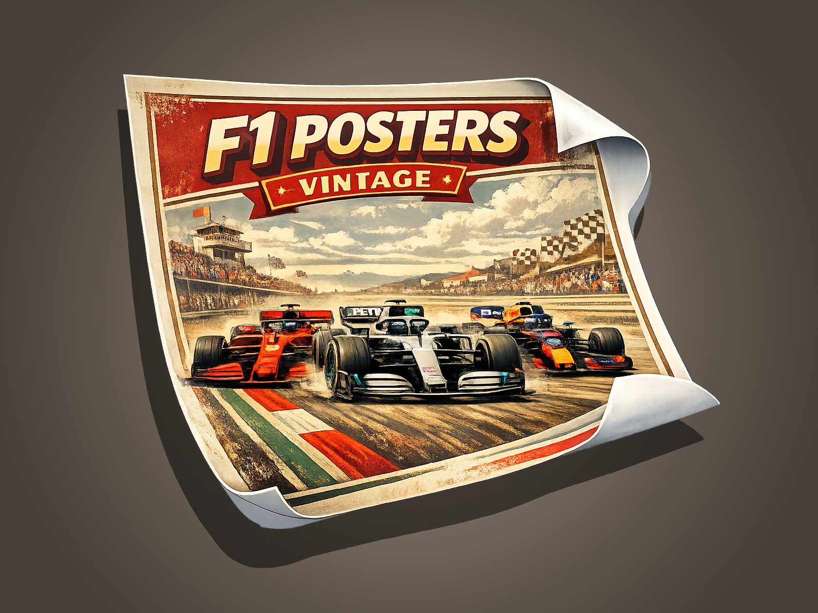
See similar vintage Formula 1 prints and period-inspired posters on our curated listings, including related items like classic race photography, retro circuit maps, and limited-edition heritage prints.