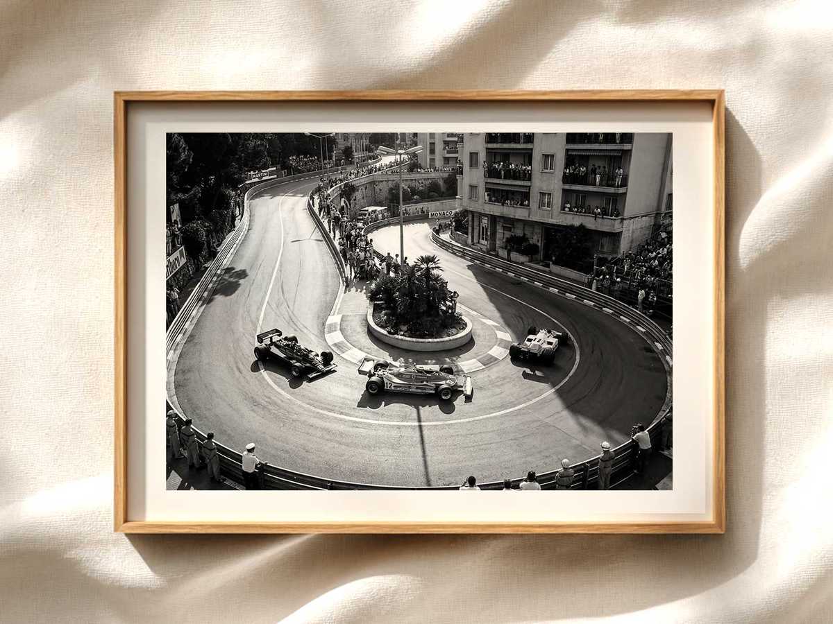
The strongest circuit posters do more than show a car or a corner: they conjure a place. This Miami International Autodrome print aims to do exactly that, using the dramatic compression of a peloton between rails and city façades to make viewers feel the weekend tension, the heat of competition and the urban pulse rather than simply read a race result.
What you notice first is the squeeze—cars funnelled together in a narrow corridor of asphalt, flanked by safety barriers and glassy buildings. That compression is the visual engine of the image: it translates velocity into geometry. Rails pick out tight lines, shadows from grandstand structures carve rhythm into the frame, and the vertical of the cityscape pushes the eye back down the track. The result is an image that feels urgent and cinematic without needing graphic clutter.
Colour and light set the mood. In this composition, warm late-afternoon tones meet the cooler reflections of modern façades, creating a layered palette that reads like a memory rather than a technical diagram. Surface reflections on helmets and bodywork echo nearby architecture, so the track and the city are seen as one continuous environment. That interplay makes the poster readable at a glance and intriguing up close—perfect for a living room, office or dedicated motorsport wall.
Fans recognise place through a handful of visual anchors rather than detailed maps. The verticality of nearby buildings, the corridor-like feeling of a street layout, and the contrast between hard barriers and fleeting motion are enough to evoke Miami’s urban race identity. This poster leans into those cues, trusting the viewer’s memory and imagination to complete the scene. It becomes less about a lap time and more about the weekend atmosphere: the nervous brevity before a restart, the collective inhale as cars breathe through a tight section, the human scale of marshals and grandstands glimpsed at the frame edges.
[IMAGE_INSERT_ARTICLE_01]
The composition also serves a practical purpose for display. Strong vertical and diagonal lines draw attention from across a room, while a restrained background keeps the overall image elegant rather than busy. That balance makes the artwork versatile: it complements minimalist interiors as well as richer, layered décor. Placed over a mantle, behind a desk, or within a clustered gallery wall, the poster introduces motion and place without dominating the space.
Collector appeal here is emotional and tactile. The image invites repeated looking—each glance reveals another detail: a spray of heat haze, a reflection in a helmet visor, the texture of barrier paint. These are the small, earned touches that reward ownership and make the print feel personal rather than purely decorative. As a gift or a focal piece, the poster says you appreciate the theatre of street racing: the architecture, the compressed choreography, and the weekend’s quiet, electric tension.
Finally, venue-led imagery excels because it carries narrative without exposition. A well-made poster of the Miami International Autodrome lets the place tell the story: urban geometry becomes the stage, the peloton becomes the movement, and the mood becomes memory. For anyone who loves Formula 1 as site-specific spectacle, this kind of artwork transforms sporting memory into something you can hang, live with, and return to again and again.