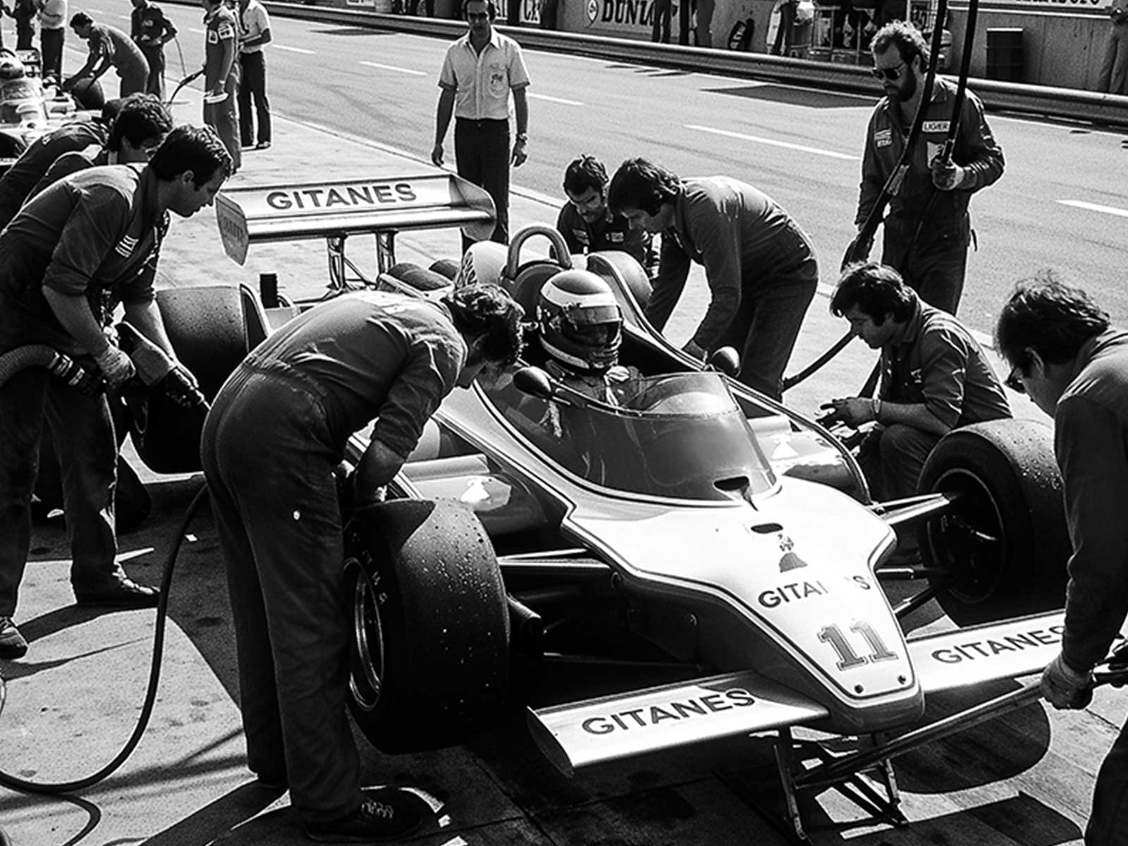
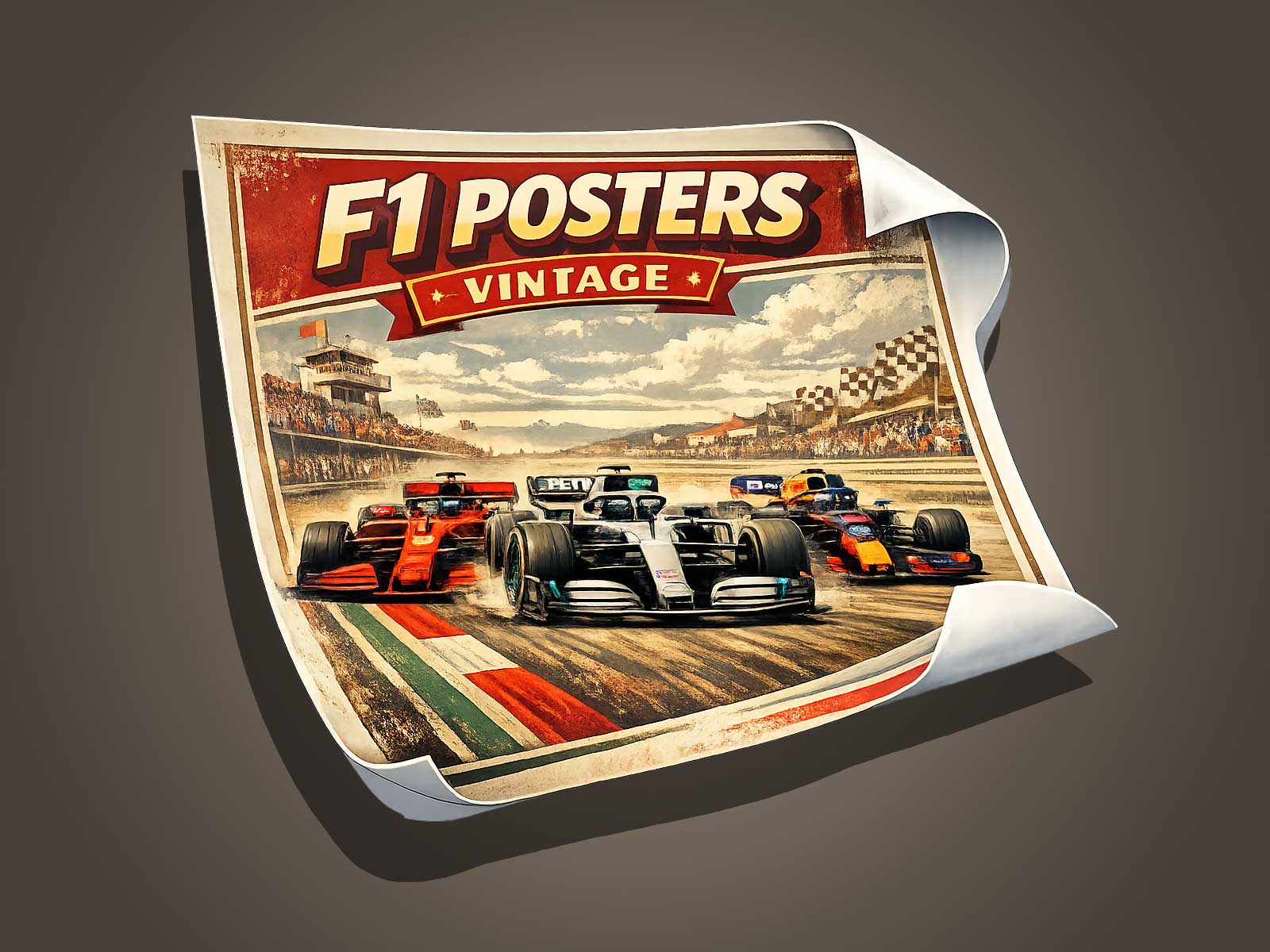
A Max Verstappen poster can be much more than a driver portrait: it becomes an icon that projects charisma, posture and the emotional imagery of a champion. This article explores how designers translate Verstappen’s racing persona into graphic form—through composition, color, silhouette and subtle symbolic detail—so a poster functions as both decoration and a concentrated narrative of speed and confidence.
Focusing on visual aura over biography
Instead of recounting career facts, posters aim to evoke feeling. For a Max Verstappen poster, the goal is to make viewers sense momentum, intensity and assuredness at a glance. Designers achieve this by prioritizing elements that read quickly: a striking pose, a simplified color palette, and purposeful negative space. These choices deliver an immediate emotional hit rather than a timeline of achievements.
Posture and gesture: the body language of a champion
Small compositional decisions about posture and gesture communicate leadership. A slightly turned torso, an upright chin, or a focused gaze framed by a helmet visor tells a story of determination. Even when Verstappen is stylized or abstracted, the angle of the shoulders, the tilt of the head, and the implied direction of movement make the figure read as confident and in control.
Silhouette and iconography
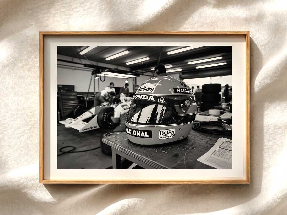
Strong silhouettes make posters legible from distance. For Verstappen, designers often use a recognizable helmet shape, a helmet stripe, or the outline of an RB/Red Bull nose to anchor the composition. These visual anchors act like logos: they condense identity into a compact, repeatable motif that collectors recognize instantly.
Color and contrast: speed translated into hue
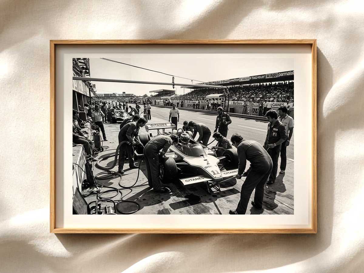
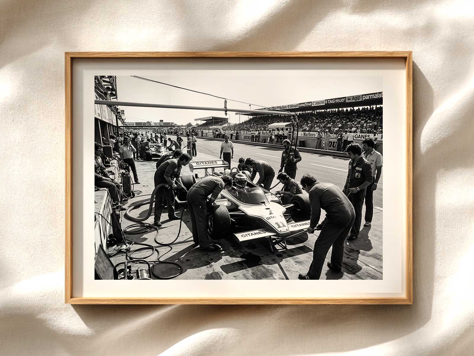
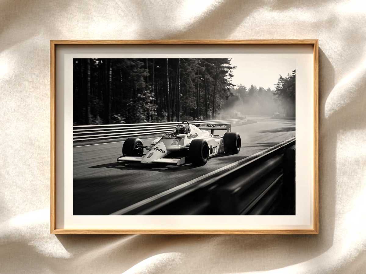
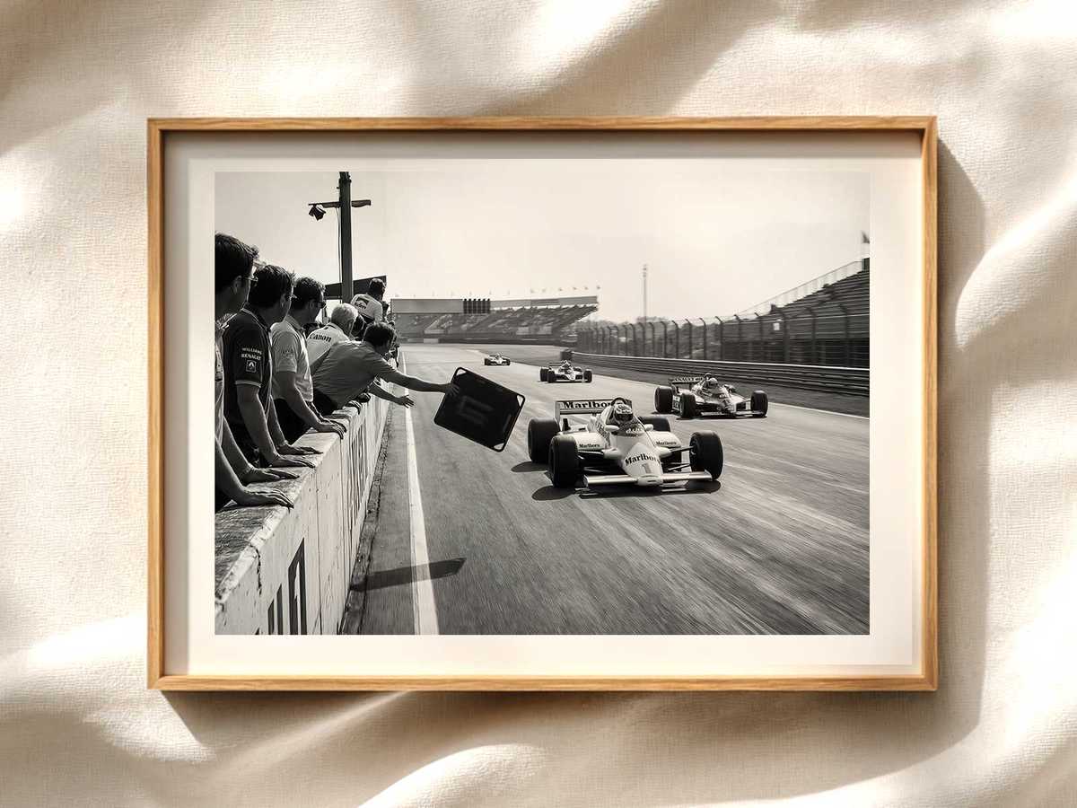
Color choices reinforce mood. High-contrast palettes—deep midnight blues, bright reds, and metallic accents—evoke speed, intensity and premium performance. Alternatively, muted palettes and grain textures can create a vintage aura, linking Verstappen’s contemporary dominance to classic motorsport romance. Strategic contrast also guides the eye: a bright helmet against a darker background makes the driver pop as the focal point.
Typography and graphic balance
When text is included, typography should support rather than compete with the image. Bold, condensed sans-serifs align with performance themes; restrained placements—driver name, race location or year—act as visual punctuation. Careful spacing and scale preserve the poster’s balance so the graphic presence remains central.
Emotional storytelling through detail
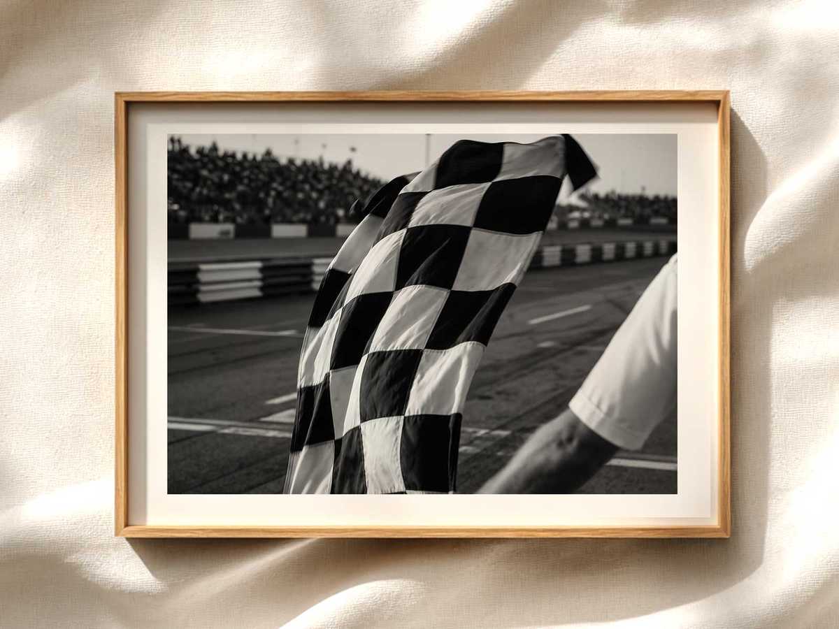
Small symbolic details amplify narrative without heavy exposition. Tire marks, blurred track lines, or a subtle crown motif can suggest dominance and the racetrack context. These devices let the poster hint at triumph and speed while keeping the composition visually clean and emotionally resonant.
Materiality and finish: how print choices affect perception
Paper choice, finish and print technique alter how the poster reads. Matte stock and soft textures lend a timeless, artful quality; glossy or metallic finishes add energy and reflectivity that echo high-performance engineering. Embossing or spot varnish on a helmet or sponsor element can create tactile emphasis that elevates the image into an object worth displaying.
Designing for different spaces
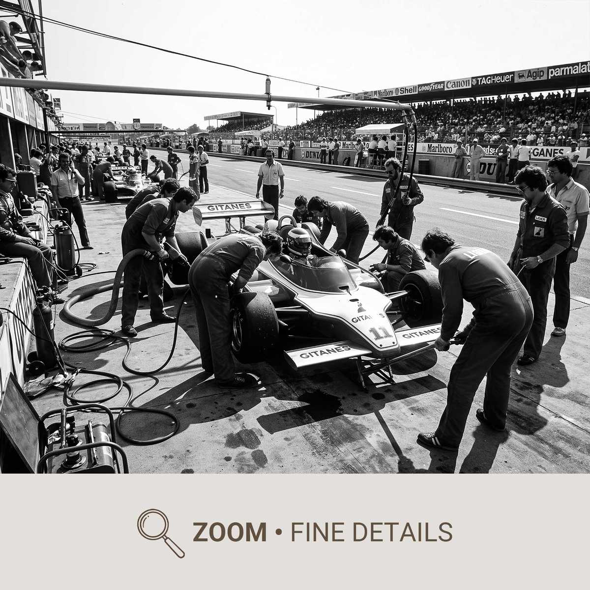
Consider viewing distance and placement. A poster intended for a living room needs strong, readable forms and a striking focal point. A smaller print for a desk should emphasize detail that rewards close inspection, like helmet patterns or race-specific iconography. Designers often produce variations—full-bleed action pieces and simplified portrait versions—to fit varied collector tastes.
Respectful representation
While amplifying heroism, effective posters avoid caricature. The aim is an authentic visual tribute: evocative, stylish and recognizable without exaggeration. Respectful representation keeps the subject’s integrity intact while allowing designers artistic license to heighten mood and symbolism.
Conclusion: the poster as concentrated myth
A successful Max Verstappen poster distills a racing persona into visual essentials: posture, silhouette, color, and suggestive detail. The result is a piece that reads as both contemporary design and myth-making—a compact image that lets fans feel the presence of a champion on their wall.
For those seeking posters that balance emotional impact and clean design, consider works that prioritize bold silhouette, intentional color contrasts and subtle symbolic cues. These are the elements that turn a driver portrait into an enduring graphic presence.