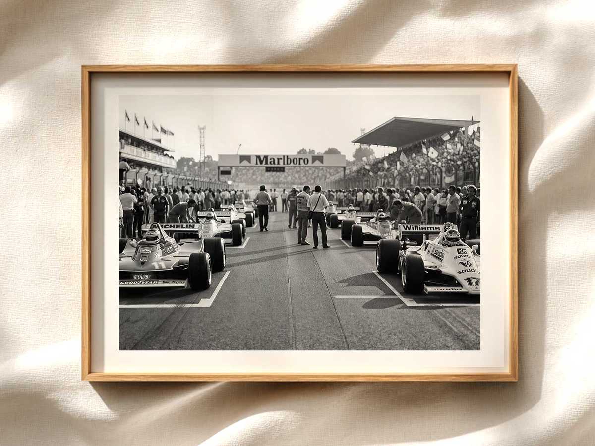
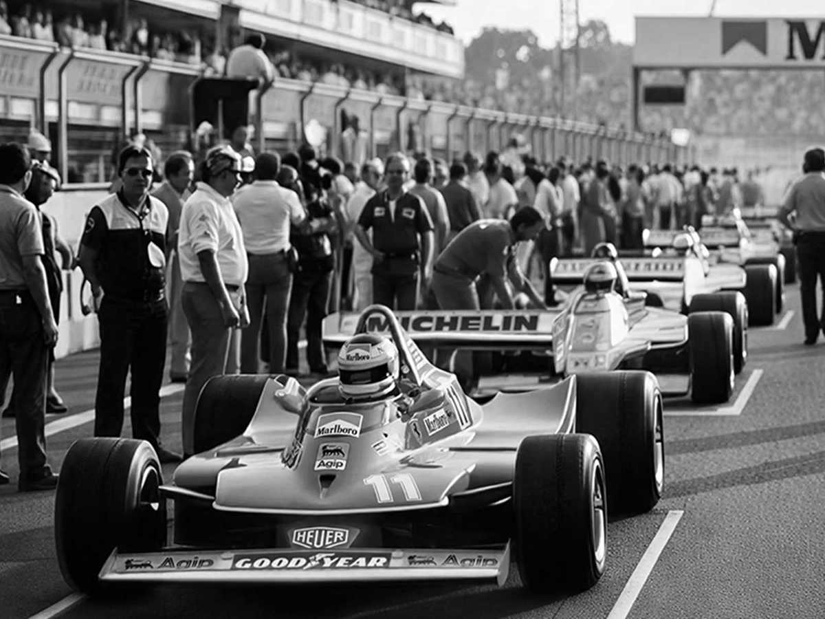
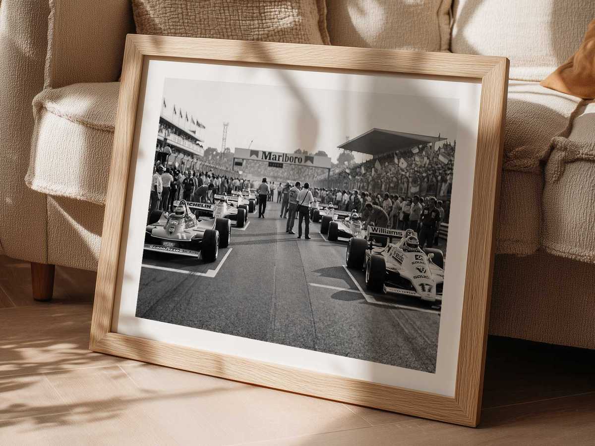
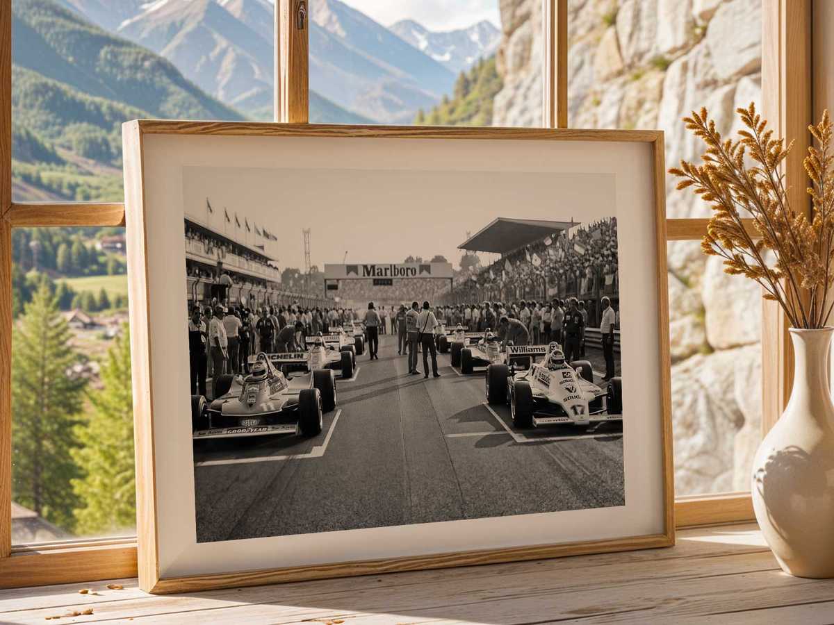
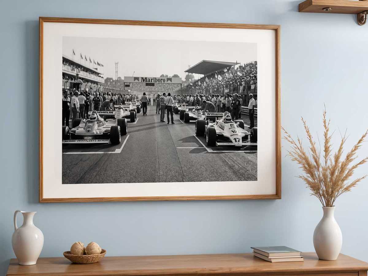
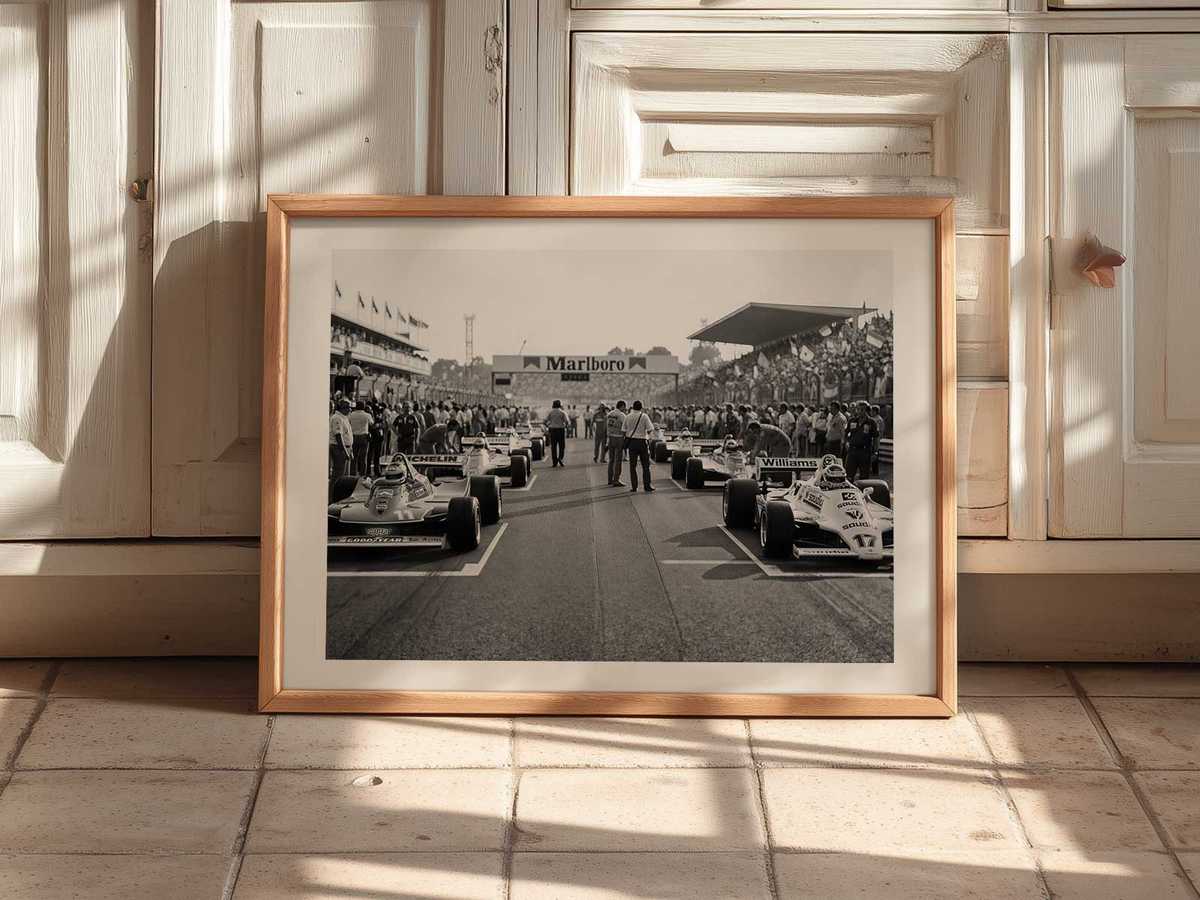
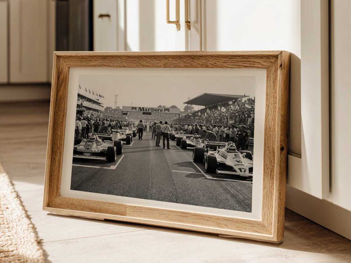
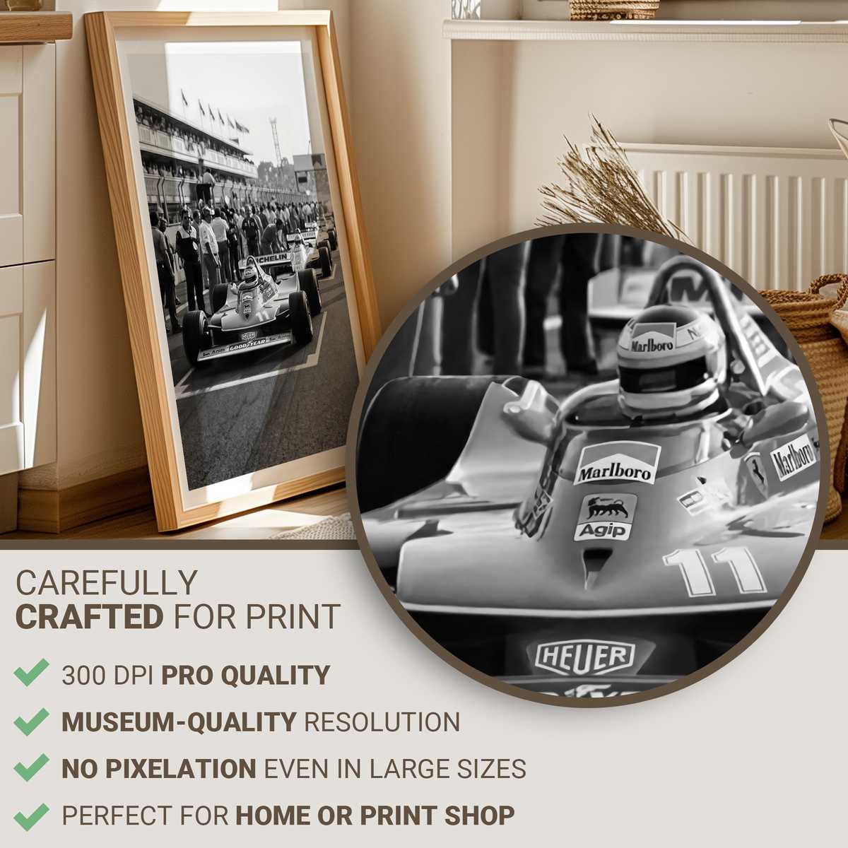
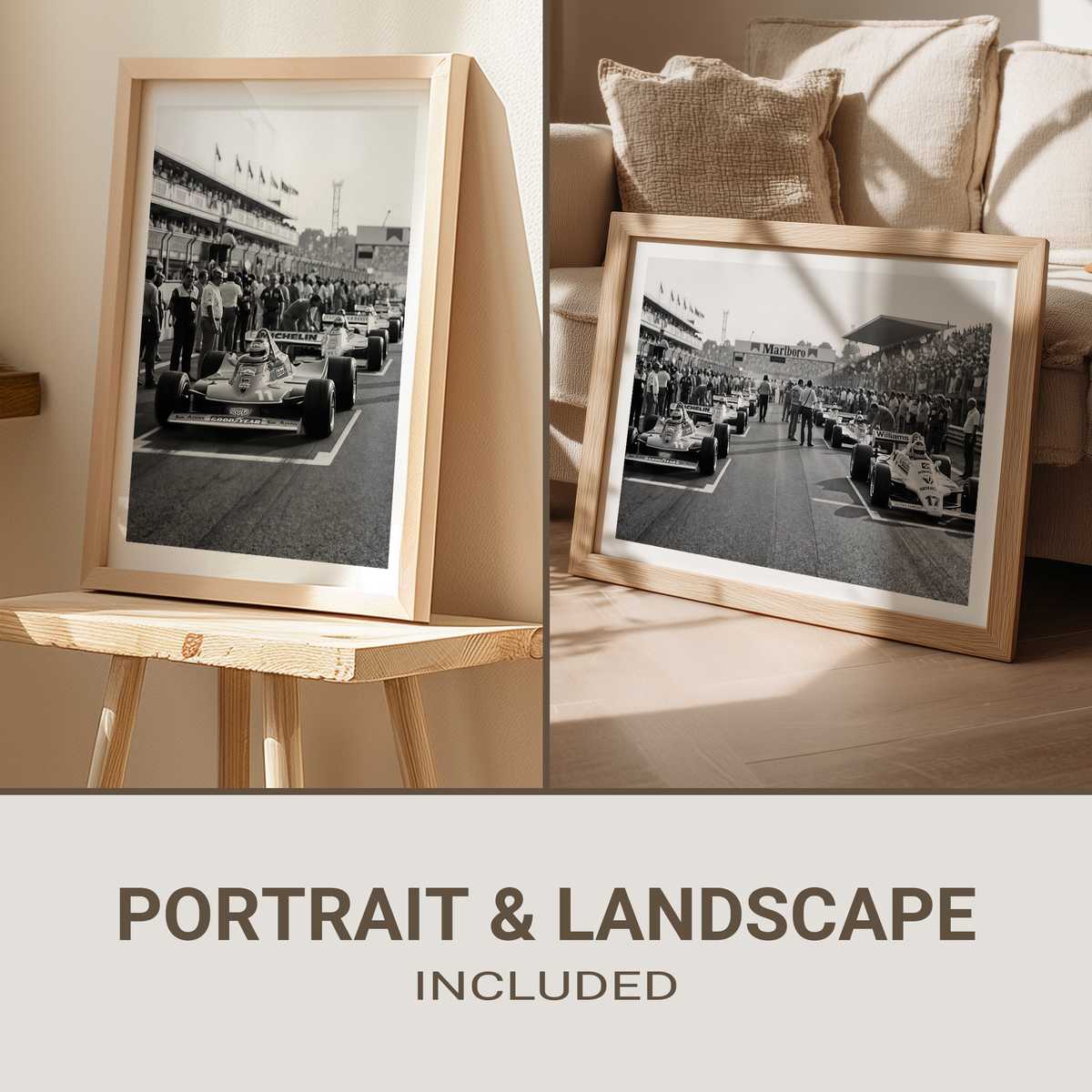
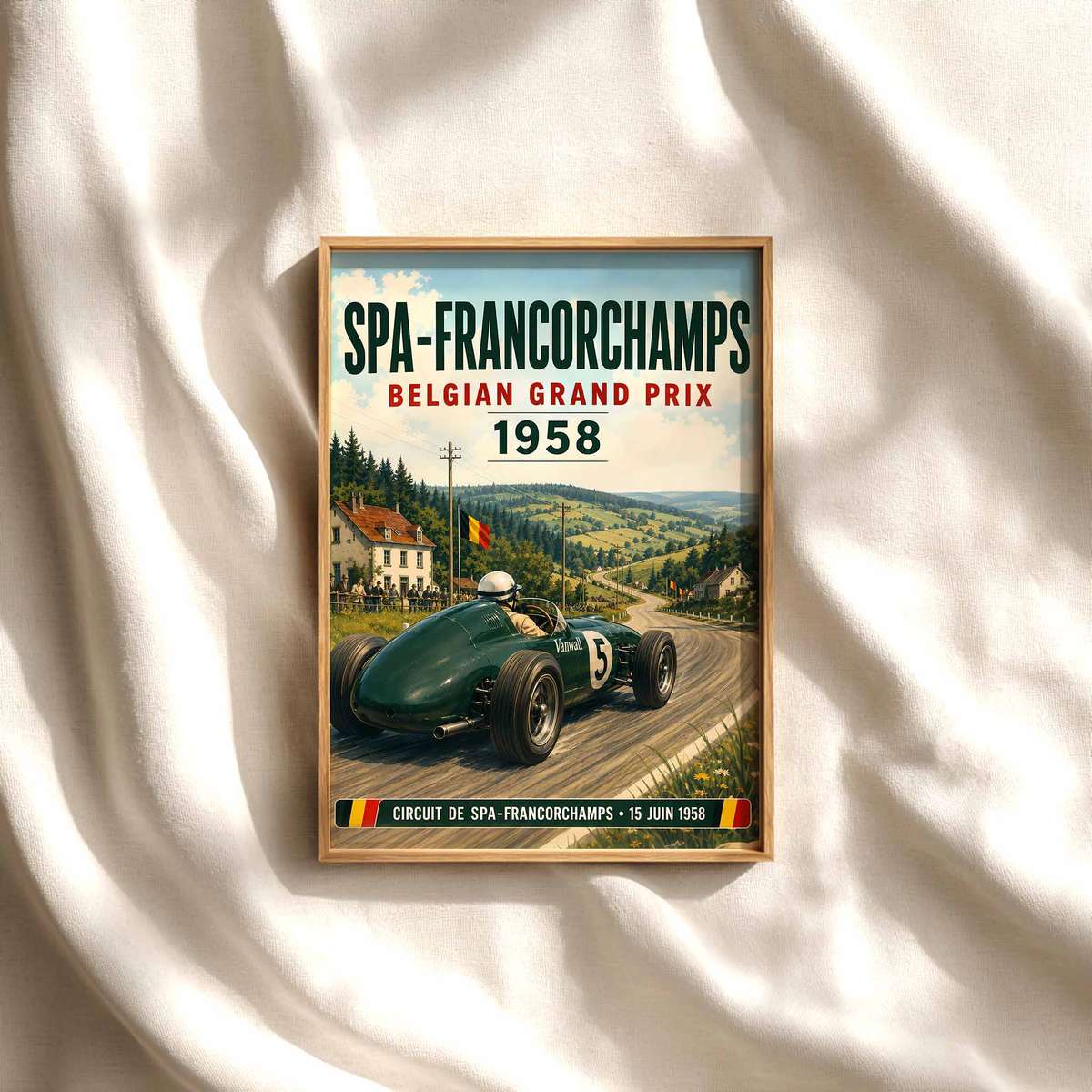
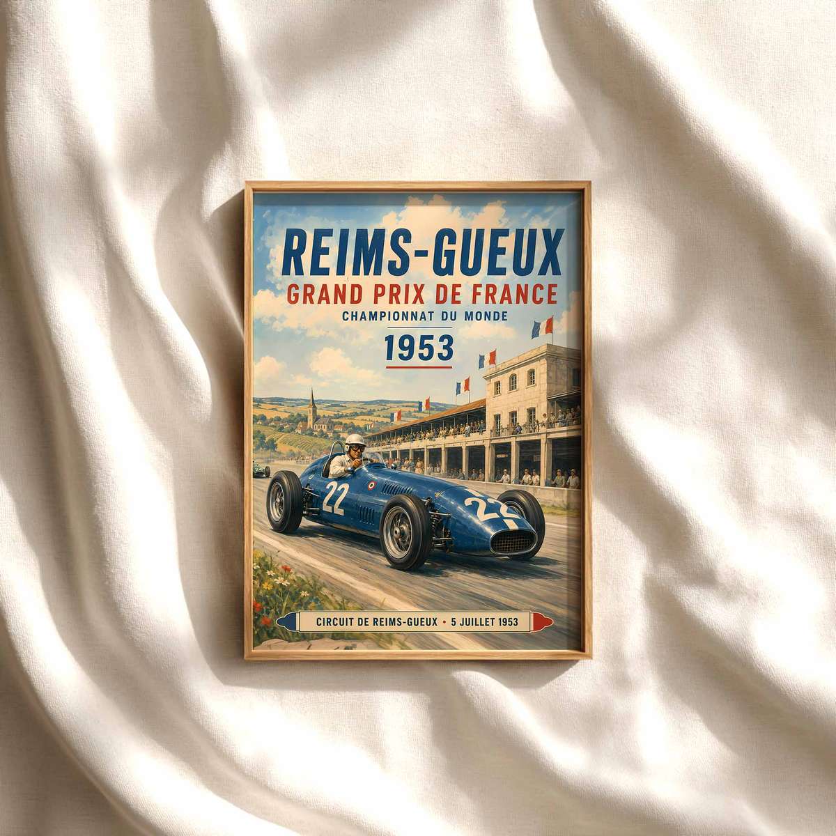
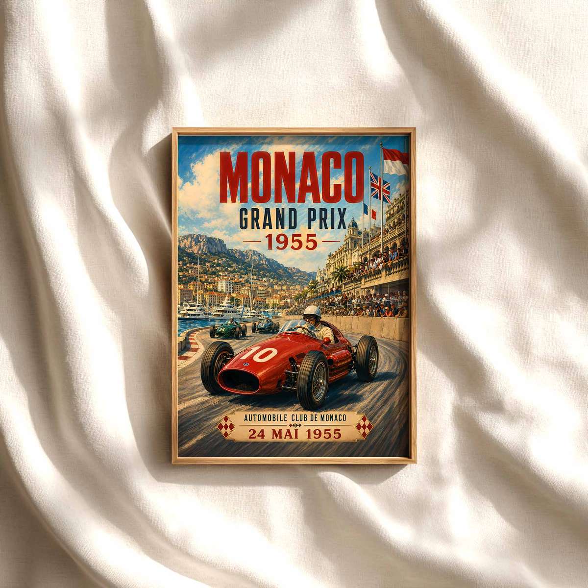
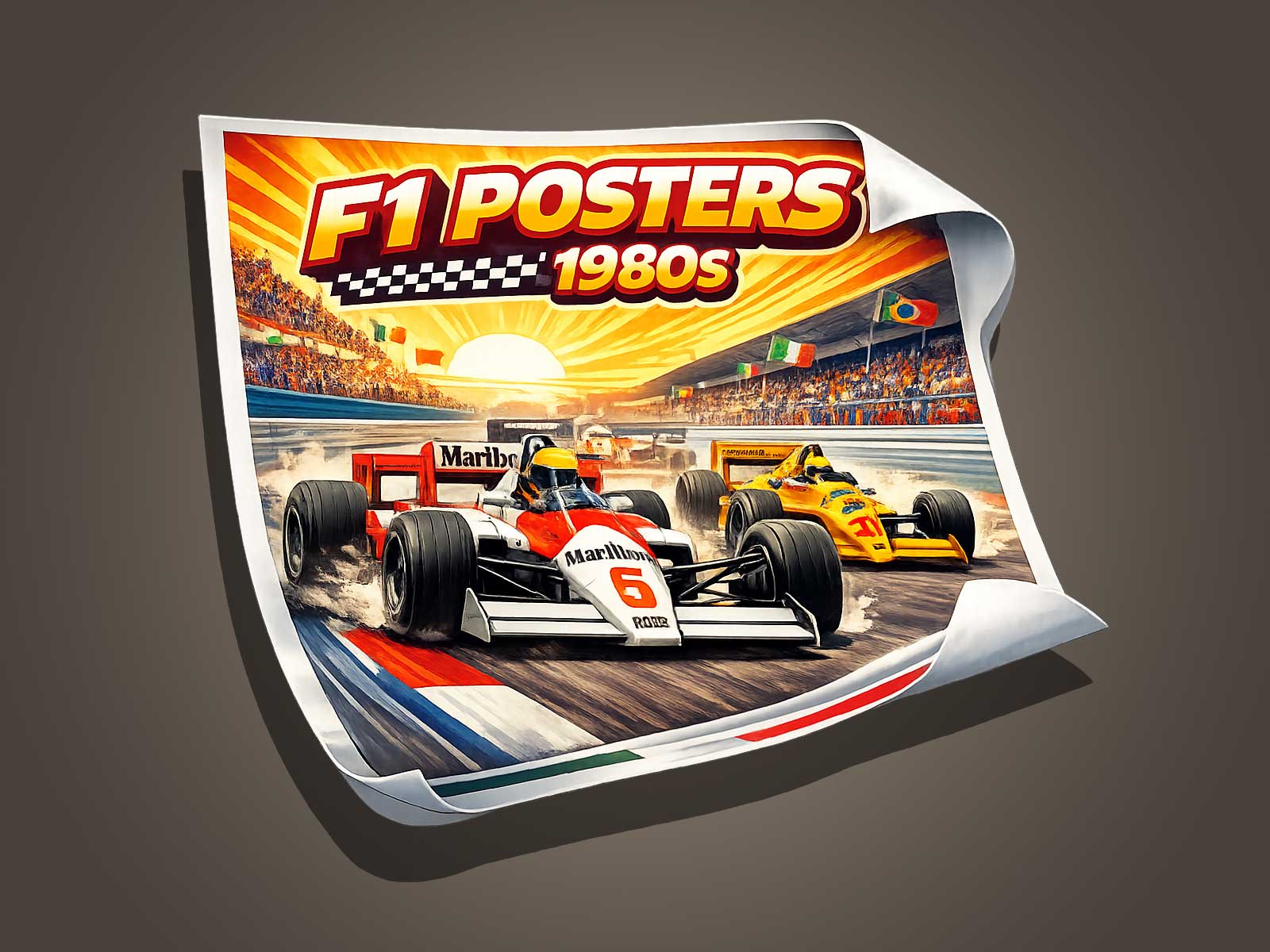
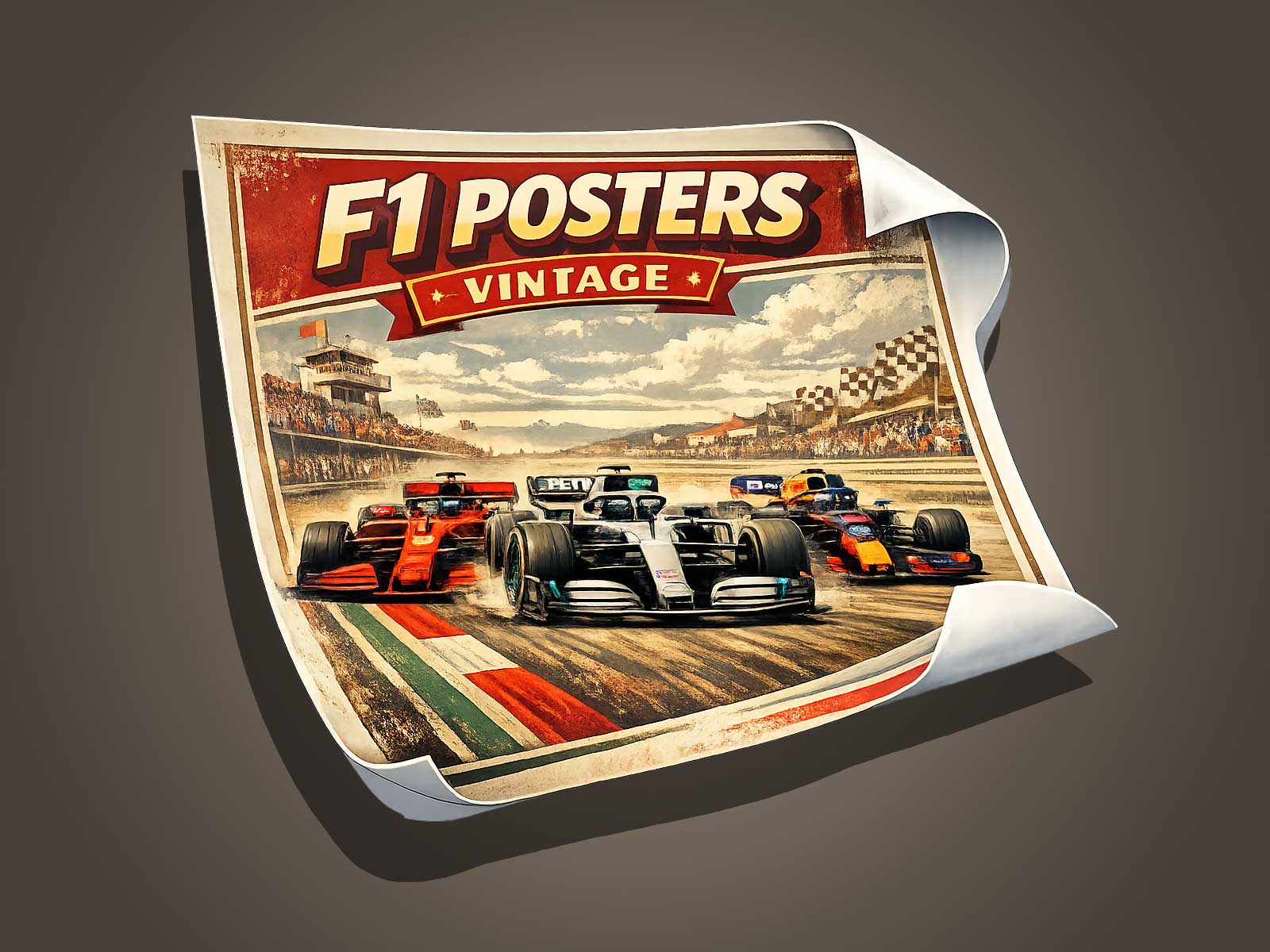
Formula 1 tracks are more than asphalt and kerbs: they are layered visual memories shaped by grandstands, signage, and the era that witnessed their peaks. A vintage F1 aesthetic inspired by the 1980s adds depth to these circuits—introducing patina, tonal warmth, and graphic cues that summon heritage. This article explains why 1980s-inspired poster design is particularly effective at amplifying the character and historical value of f1 tracks, and it offers practical ideas for collectors and designers aiming to preserve and celebrate that visual legacy.
Why the 1980s aesthetic suits F1 tracks
The 1980s occupy a distinct place in motorsport history: bold typography, saturated color palettes, and photographic grain were common across advertising and editorial work. When applied to images of f1 tracks, these visual traits do more than evoke nostalgia. They create a narrative frame that emphasizes texture—worn tarmac, oil stains, chalked grid lines—and the human marks left by decades of racing. Designers who reproduce that era’s look in posters give viewers an immediate sense of time and place, converting a modern photograph into a slice of motorsport memory.
Memory and the visual archaeology of circuits
Tracks change: layouts are modified, grandstands rebuilt, and sponsorship visual clutter shifts season by season. A vintage treatment acts like a visual archaeology, fixing a circuit in an evocative moment rather than a single technical specification. This helps viewers connect emotionally to a track’s history—its dramatic corners, famous run-off areas, and distinctive skyline—by presenting those elements with the visual language contemporary fans associate with classic racing eras.
Patina, grain, and tonal choices that add authenticity
Patina in poster design is not simply simulated damage; it is a controlled layering of texture and color that suggests time’s passage. In practice, designers apply subtle film grain, warm color shifts, and slightly faded highlights to replicate 1980s print processes. These treatments make asphalt look lived-in and signage feel historically accurate, while avoiding contrived distress. On posters of f1 tracks, such techniques increase perceived authenticity and make the image read as an archival artifact rather than a modern reproduction.
Compositional strategies that emphasize heritage
Effective vintage posters balance photographic realism with graphic restraint. Cropped vistas that focus on signature track features—turn complexes, start/finish straights, or distinctive pit architecture—work well when combined with era-appropriate typography and simple emblematic badges. Limited color palettes echo period print limitations and direct attention to form and line, helping the viewer register the track’s most memorable shapes.
How vintage treatments increase a poster’s heritage value
Collectors value objects that feel like tangible links to the past. A poster that convincingly channels the 1980s aesthetic possesses two qualities: visual appeal and narrative resonance. It tells a story about motorsport’s evolution and preserves a particular look of the circuit. That narrative quality can elevate wall art from decorative to collectible, especially when paired with factual cues—such as the year, a race name, or an emblem—that anchor the image to a specific moment in the track’s history.
Practical tips for designers and collectors
- Choose source images with strong architectural or graphic elements—pits, grandstands, or turns with recognisable silhouette.
- Apply grain and color shift sparingly to avoid masking detail; the goal is resonance, not obscurity.
- Use typography inspired by 1980s motorsport marketing: condensed sans-serifs, geometric accents, and restrained badge work.
- Include minimal factual labels (track name, year) to anchor the image without over-explaining.
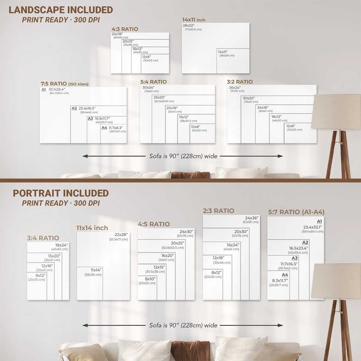
- For framing and print choices, prefer matte papers and warm archival inks to reinforce the aged effect.
Case example: framing a circuit as heritage
Imagine a poster of a classic corner rendered with warm tonality, subtle film grain, and a narrow type strip noting the circuit and year. The treatment cues the viewer to read the image as historical evidence rather than a contemporary snapshot. This reframing enhances the track’s perceived lineage and encourages reflection on how the circuit has evolved—an effect that modern crisp photography rarely achieves on its own.
Conclusion
Designing f1 track posters through a 1980s vintage lens deepens visual memory, introduces convincing patina, and strengthens the heritage value of the image. For collectors and designers who want to honor the past while creating compelling wall art, this aesthetic offers a potent toolkit: texture to suggest age, color to evoke era, and composition to highlight what makes each circuit unique.
Find vintage-style F1 track posters and prints that celebrate this approach at our curated listing on Etsy: Vintage Formula 1 Photo Print — 80s F1.