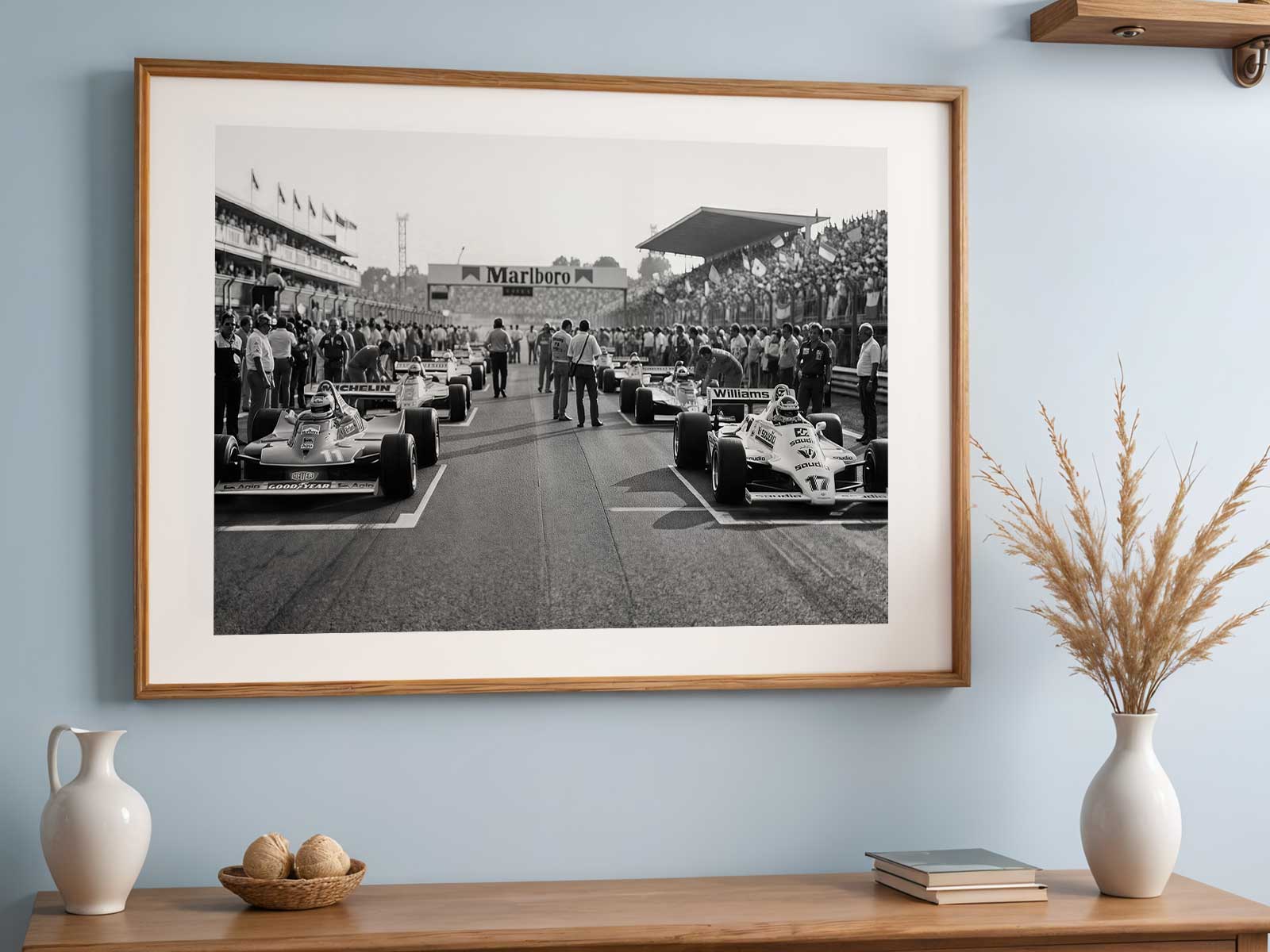
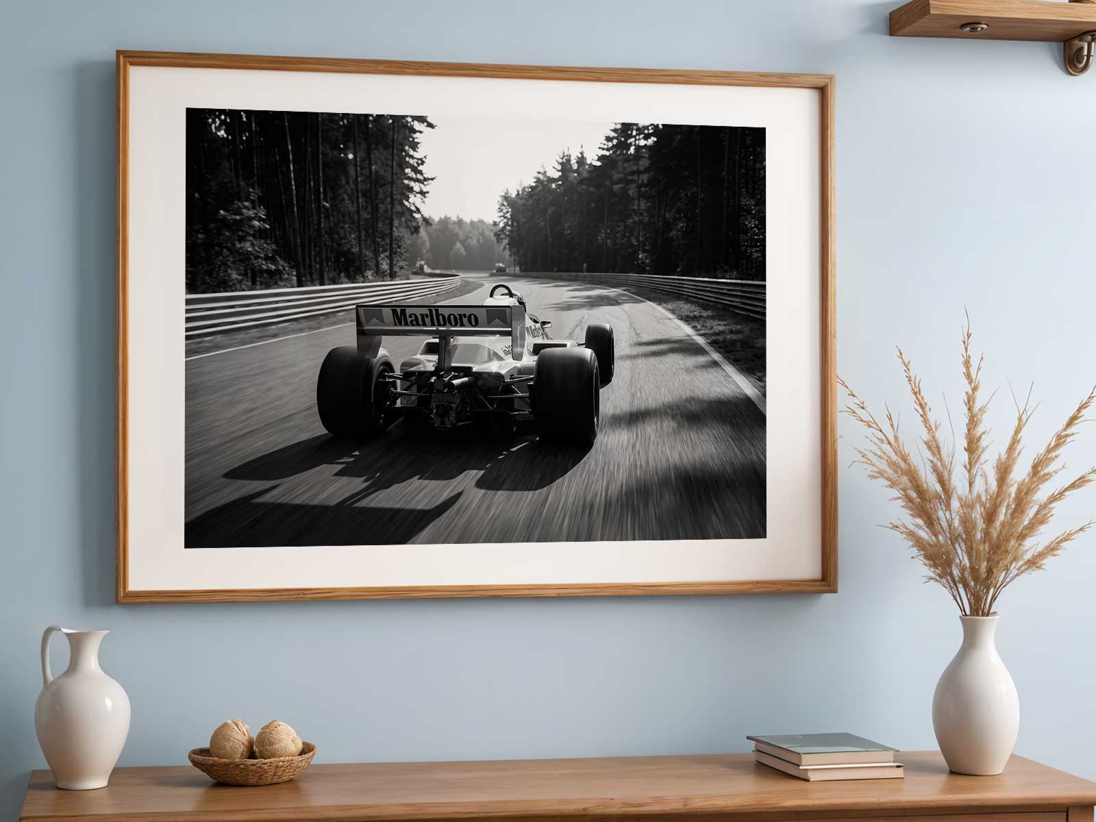
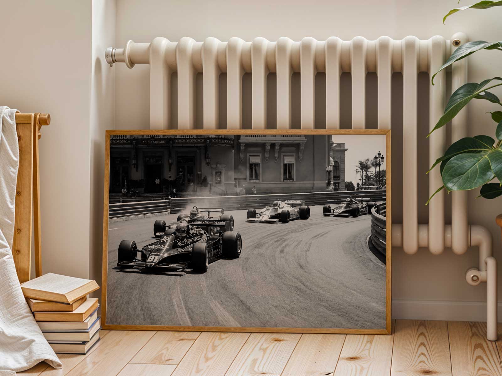
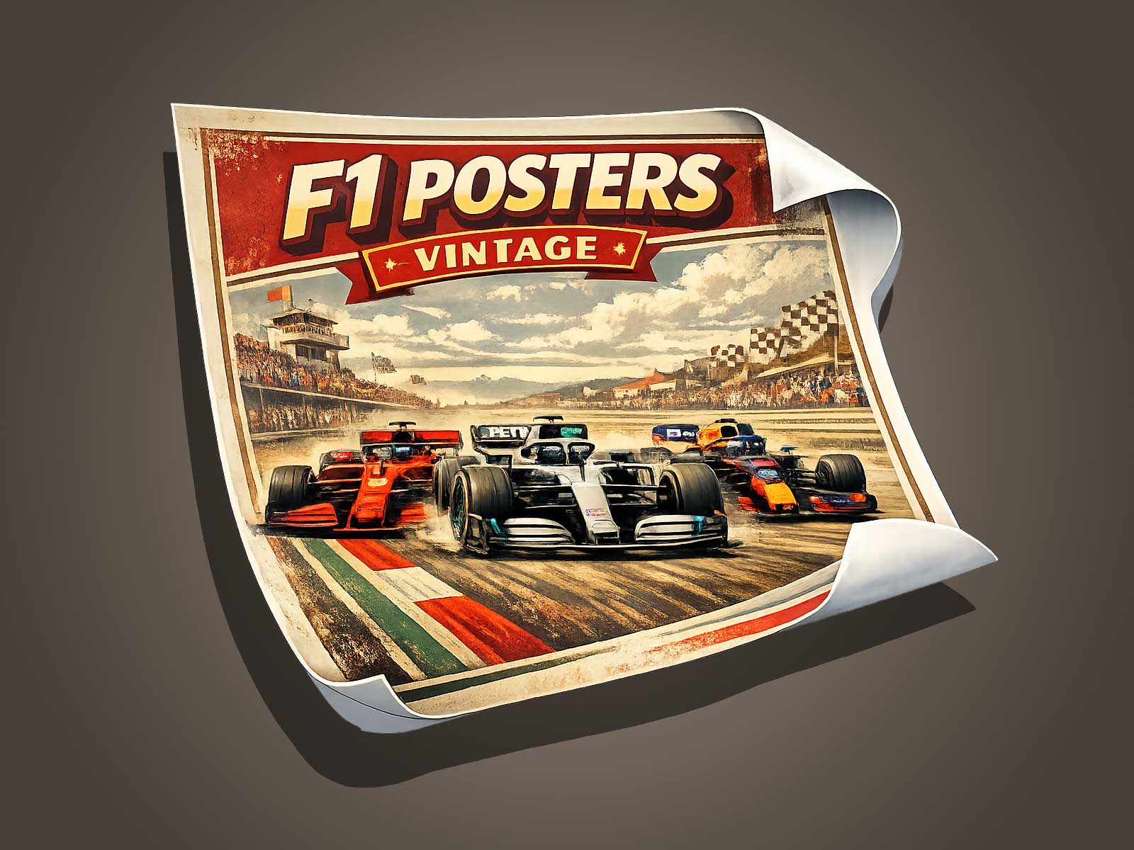
The Formula One car is more than a racing machine: it’s a compact, high-performance object that communicates identity and motion at a glance. For poster and wall art, the visual reading of a Formula One car depends on three tightly connected elements—silhouette, livery, and the sensation of speed. This article breaks down each element to help artists, designers, and enthusiasts translate the car’s presence into compelling imagery.
Silhouette: the car’s architectural signature
The silhouette is the quickest way a viewer recognizes a Formula One car. Unlike road cars, F1 machines have a distinct profile: low nose, pronounced front and rear wings, sidepods that channel airflow, and a narrow cockpit. For poster composition, reducing the car to a clear, unambiguous outline improves instant recognition. Use high-contrast backgrounds or single-color fields so the silhouette reads cleanly at thumbnail scale—critical for online listings and gallery walls.
Consider negative space to emphasize key design cues: the gap between front wing and wheel, the rake angle that suggests nose-up attitude, or the visible roll hoop behind the driver’s head. These small gaps and angles define the car’s personality and translate well to minimalist or vector-based art styles.
Livery: color, typography, and visual hierarchy
Livery turns silhouette into identity. Color blocks, sponsor logos, and racing numbers create a layered visual hierarchy that guides the eye. Successful poster art often simplifies livery into primary color planes and a single accent, preserving recognizability without overwhelming with detail.
When adapting livery for a print, prioritize contrast and reading order. Place the boldest color in the largest panel, use secondary tones for aerodynamic surfaces, and treat logos or numbers as typographic elements that balance the composition. For historic or vintage posters, slightly desaturating colors or adding aged paper textures can reinforce era-specific mood while keeping the car’s livery legible.
Sensation of speed: visual shortcuts that imply motion
Speed is a feeling conveyed through a mix of cues rather than literal motion blur alone. Track context such as sweeping curbs, tire smoke, spray, or blurred grandstands can imply velocity, but the car itself supplies stronger cues: wheel tilt, compressed suspension, aerodynamic spray from wing edges, and heat haze behind the exhaust.
Graphically, you can suggest speed with directional lines, repeated silhouettes, or stretched reflections. Pay attention to the relationship between the car’s orientation and implied motion vector; a car angled into the frame with a long trailing motion line feels faster than a perfectly centered, static profile. Use light direction—specular highlights elongated along the car’s axis—to enhance the impression of motion without resorting to overused radial blurs.
Compositional strategies for poster design
Combine silhouette, livery, and motion cues using a clear visual hierarchy: silhouette first, livery second, speed third. Establish a focal point—often the cockpit or the leading wheel—and arrange other elements to support that anchor. For minimalist posters, scale the car larger with generous margins to celebrate form. For narrative or editorial pieces, include contextual elements like track curbs, timing boards, or partial grandstands at a reduced scale to deepen the sense of place.
Typography and cropping are also practical tools. Crop tightly across the nose or rear wing to emphasize technical detail, or place the car off-center on a long horizontal canvas to accentuate motion. Choose typefaces that echo the livery’s character: condensed, technical fonts for modern F1, or rounded, geometric types for vintage-inspired designs.
Practical tips for photographers and illustrators
- Photographers: shoot low and slightly ahead of the car to capture aggressive rake and wing profiles. Use fast shutter speeds to freeze tire detail when you want clarity; use panning with mid shutter speeds for controlled motion blur in the background while keeping the silhouette sharp.
- Illustrators: start with a clean vector silhouette, then layer in livery shapes and minimal texture. Test your design at small sizes to ensure the silhouette and number remain readable.
- Poster printers: maintain strong color separations and proof livery contrasts under the intended lighting conditions of the final display environment.
Why the car’s visual reading matters for posters and wall art
Posters function as instant statements. A well-composed depiction of a Formula One car quickly communicates era, team identity, and excitement. By focusing on silhouette, livery, and the sensation of speed, creators can make images that stand out in a crowded market—whether sold as small online thumbnails or printed large for a feature wall.
When you design with these three pillars in mind, the car becomes a concise visual message: a symbol of engineering, brand, and motion. That clarity is what transforms a technical object into compelling poster art.