Suzuka is more than a layout; it is a mood. This poster interprets the circuit’s weekend tension by freezing the visual density of a starting grid just before the lights go out. Instead of showing a winner or a single moment of glory, the image concentrates on the layered cues that make Suzuka recognisable: the tight rows of cars, the compressed perspective of grandstands and pit buildings, the low sun or overcast light that flattens colour into a study of silhouettes and highlights.
The first thing the viewer notices is the crowding itself — machines aligned like a technical choreography, helmets and wings forming a horizon of shapes. That density becomes the poster’s focal texture: a near-abstract pattern from a distance that resolves into details when you step closer. It reads as both spectacle and tension, so the artwork acts like a memory trigger rather than a race report. Fans familiar with Suzuka will recognise the ambience of a circuit that demands concentration, while newcomers feel the anticipatory hush that defines any true Grand Prix start.
Colour and light are handled with restraint to keep the piece refined for display. Muted racetrack greys, punctuated by team liveries and the occasional flash of sunlight on composite surfaces, give the poster a gallery-ready palette. The surrounding decor — whether a motorsport study, living room, or office — benefits from this balance: the print adds energy without dominating the space. It works as a collector’s piece because it emphasizes atmosphere over action, inviting repeated viewing and quiet recollection.
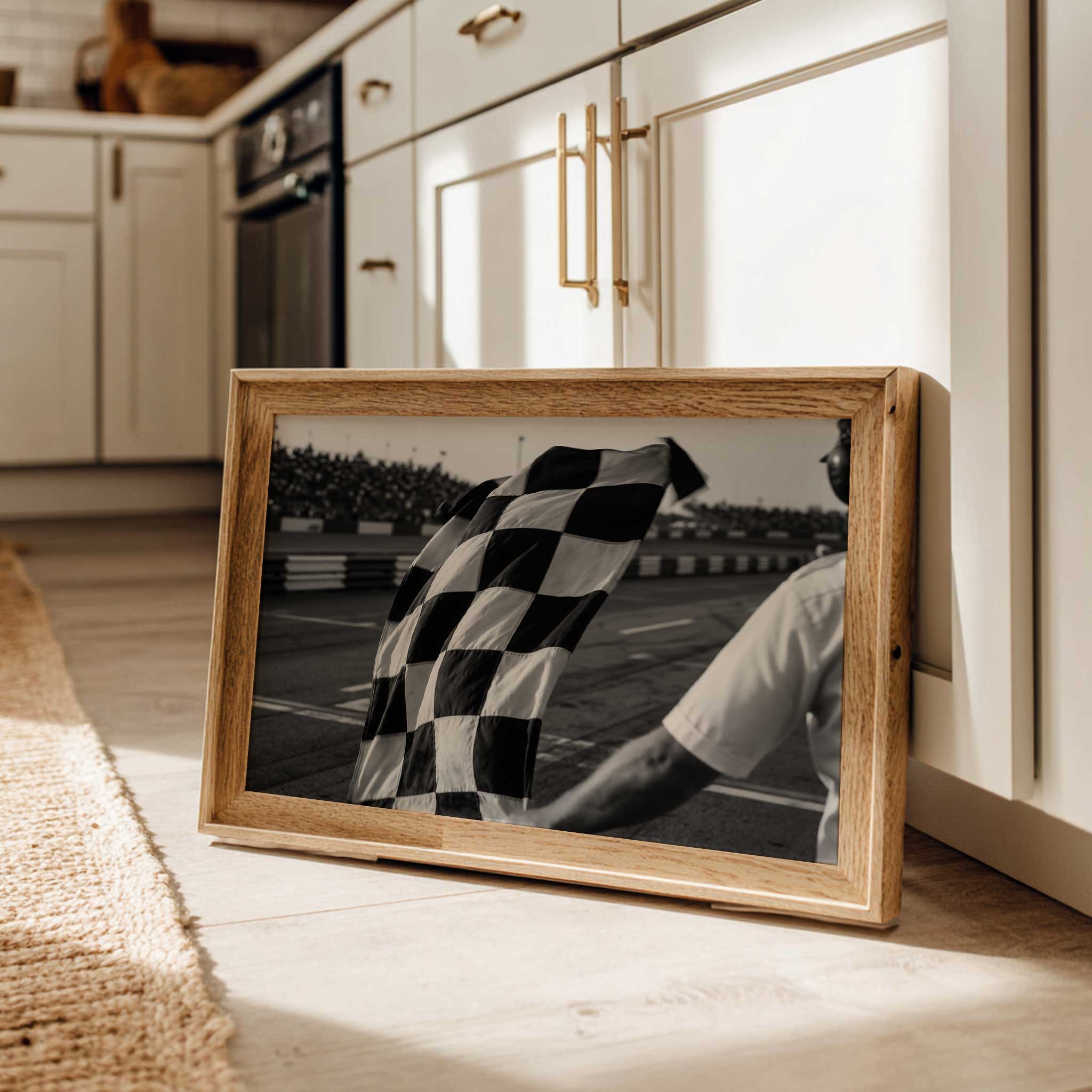
[IMAGE_INSERT_ARTICLE_01]
Compositionally, the poster leverages the grid to create a sense of depth and motion before motion exists. Foreground cars are detailed enough to anchor the eye, while the mid and background dissolve into a wash of stands and sky that suggest scale. That gradation makes the image versatile for framing: it reads well at both intimate sizes and larger formats where the crowd and track become architectural elements. As wall art, it transforms a room by introducing a cinematic slice of race weekend — you don’t only see Suzuka, you feel the charged pause that precedes speed.
This approach also explains why venue-led imagery translates so naturally into wall art. A circuit carries landscape cues — grandstands, runoffs, and skyline — that ground the piece in place identity. When an artwork prioritises those cues, it works as a portrait of location rather than a moment-bound souvenir. The result is emotionally durable: the print can evoke different memories for different viewers, from the smell of hot rubber to the collective intake of breath that comes seconds before the start.
For collectors and interior planners, the poster offers subtle narrative power. It complements other motorsport pieces without screaming for attention, and it elevates everyday rooms into spaces that suggest motion, focus, and the communal drama of race weekend. Whether displayed alongside a shelf of motorsport books or framed as a singular statement, the image keeps the essence of Suzuka alive — a place defined by precision, pressure, and a distinctive visual density that makes it an enduring subject for Formula 1 art.
Author: