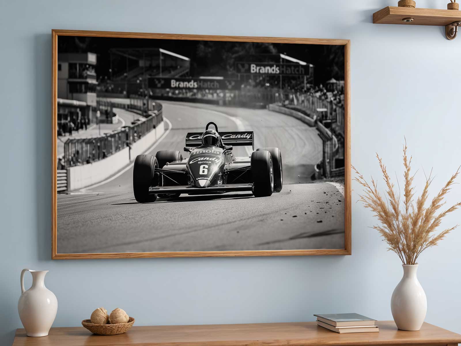
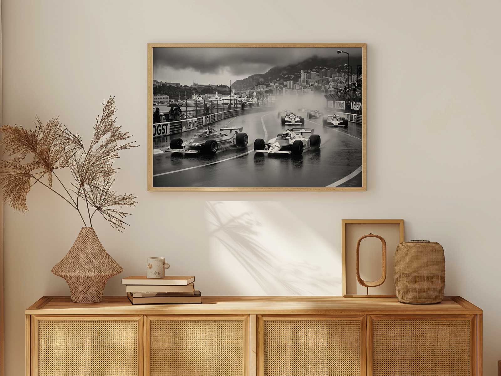
The Monte Carlo Grand Prix is more than a sequence of corners; it is an atmosphere you can almost touch. A poster that aims to capture this place does so by compressing a peloton's drama between rails and façades, turning tight sightlines, glossy asphalt and urban décor into a visual shorthand for speed and weekend tension. In that compression lies the poster’s power: the image doesn't need timing sheets or final standings to feel unmistakably Monte Carlo—viewers recognise the city in the way buildings press close to the track, how scale and motion are forced into a narrow frame.
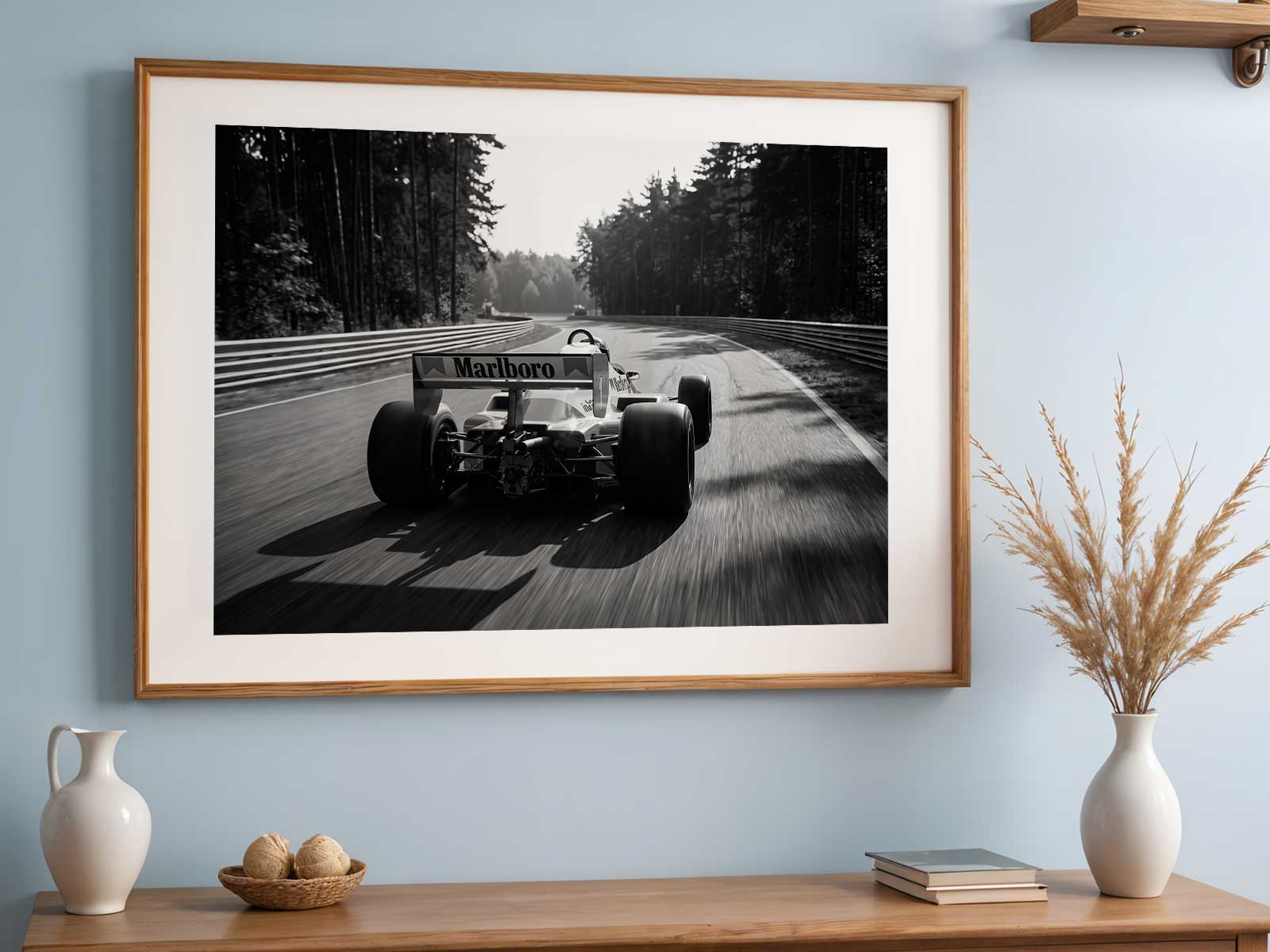
A successful Monte Carlo print starts with what you notice first: the claustrophobic juxtaposition of cars and architecture. The eye follows a band of colour—helmet visors catching Mediterranean light, team liveries sliced into streaks—while stone balustrades, railings and close-packed façades become a second language, telling the story of a street circuit where every metre is claimed. That tension between human-made ornament and mechanical velocity creates an unmistakable mood, half-cinematic, half-immediate, that translates beautifully to a poster meant for walls.
Colour and contrast do much of the work. Muted terracotta and pale stucco suggest the city’s décor, while the track’s darker greys and the bright primaries of cars give the composition rhythm. Light, whether sharp midday glare or late-afternoon warmth, sculpts the scene into layers: vehicles in motion at the visual foreground, architectural textures receding but still present as a frame. Shadows, rail reflections and the suggestion of crowd silhouettes lend depth without the need for photoreal detail, which is why simplified or stylised treatments often become the most evocative collector pieces.
[IMAGE_INSERT_ARTICLE_01]
Beyond the purely visual, the Monte Carlo poster works as memory and mood. Fans do not require a race result to feel transported; the compressed framing and implied speed trigger recollections of close overtakes, tight racing lines and the unique pressure of a weekend where seconds decide everything. That implied narrative—tension rising, engines taut, streets holding the moment—turns an image into an emotional object suitable for offices, living rooms, or dedicated display spaces.
Design choices that emphasise place identity reinforce the poster’s appeal. A careful balance between recognisable urban cues and suggestive motion preserves the circuit’s identity without becoming a technical map. This is important for collectors: the artwork stands as a cultural token of the event and the city rather than a diagram of performance. It invites conversation—why that curve feels familiar, how light and texture evoke seaside glamour—and makes the piece both decorative and meaningful.
Finally, consider how venue-led imagery changes a room. A Monte Carlo print tends to tilt an interior toward sophistication and narrative drama. Placed over a mantel or above a desk, it acts as a focal point that anchors a space in a specific time of day and a sense of movement. The city’s architectural cues pair well with warm woods and cool metals, while the dynamic composition adds energy to otherwise calm schemes. For the collector or gift-giver, this is a visual object that does more than celebrate motorsport: it evokes place, story and the rare thrill of compressed speed between rails and façades.
Select a scale and finish that let the composition breathe—matte for a quiet, museum-like presence or gloss for punch and depth—and the poster will remain a window to Monte Carlo every time you look at it.