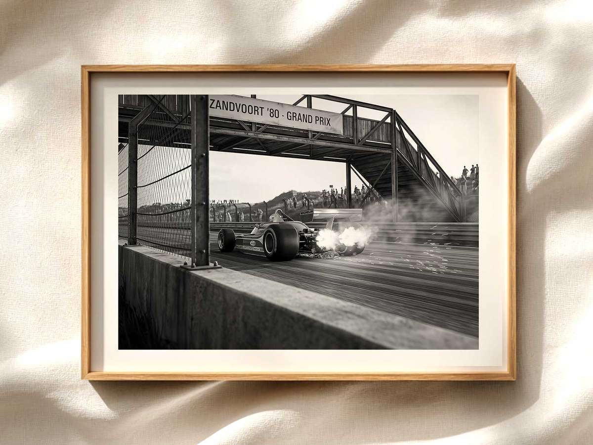
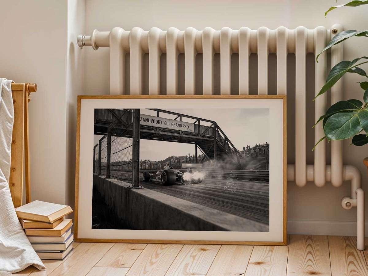
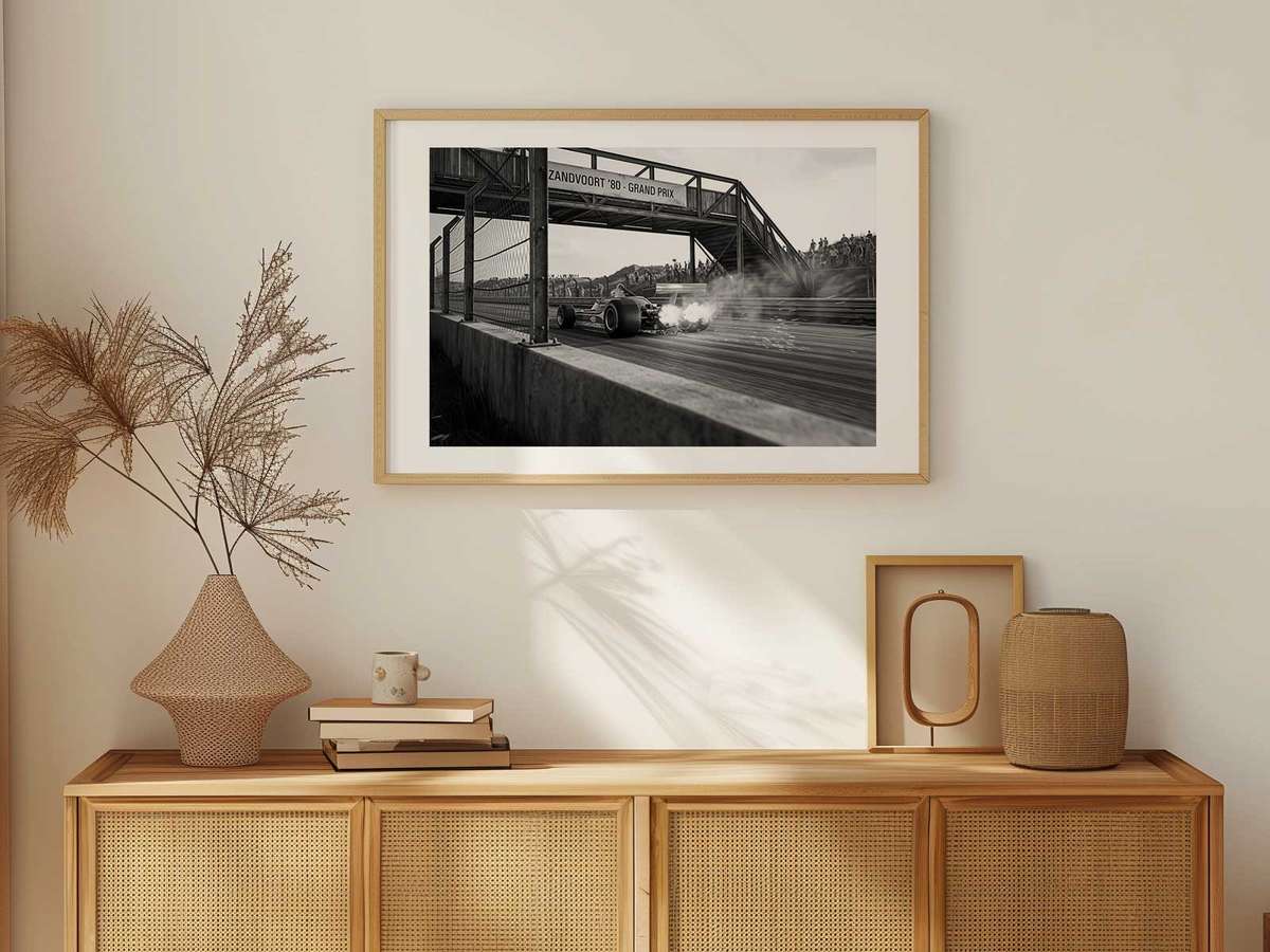
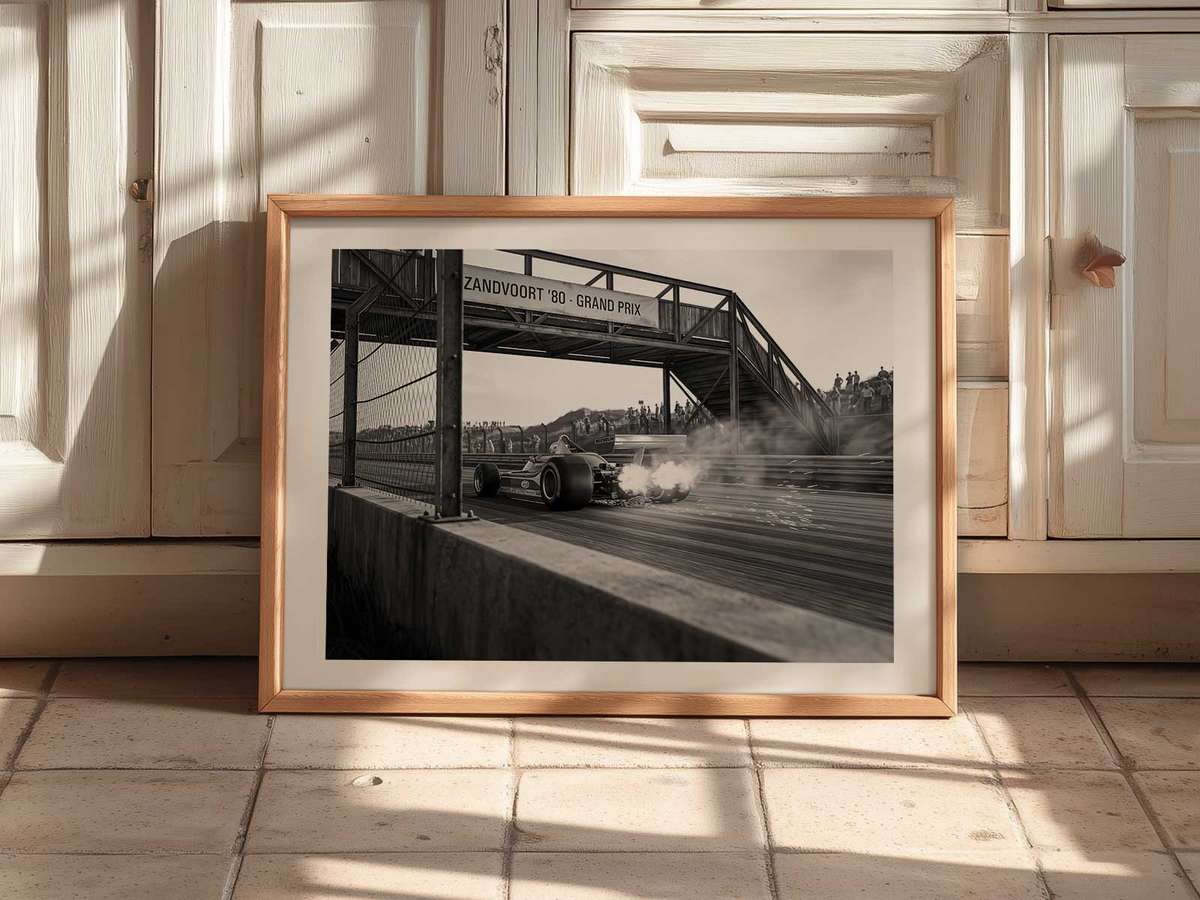
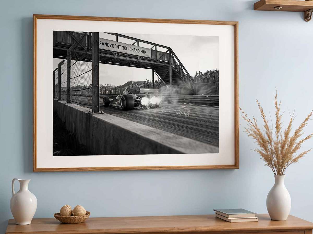
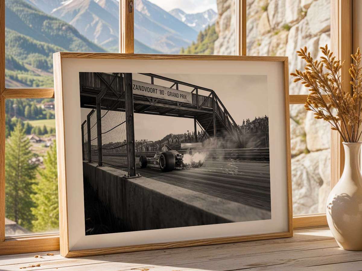
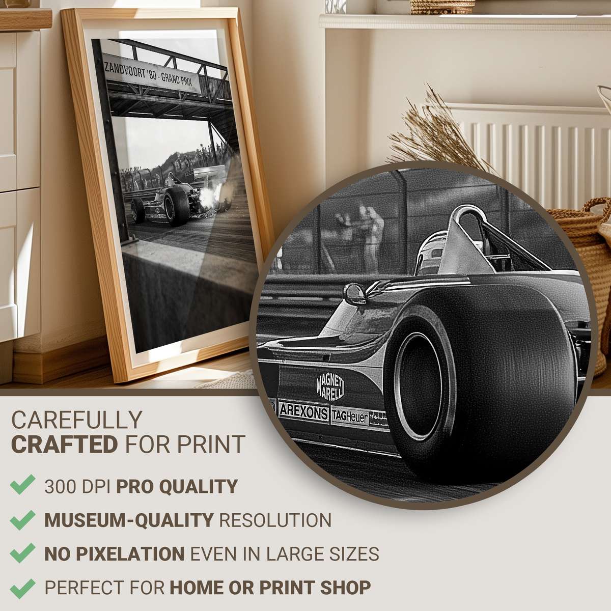
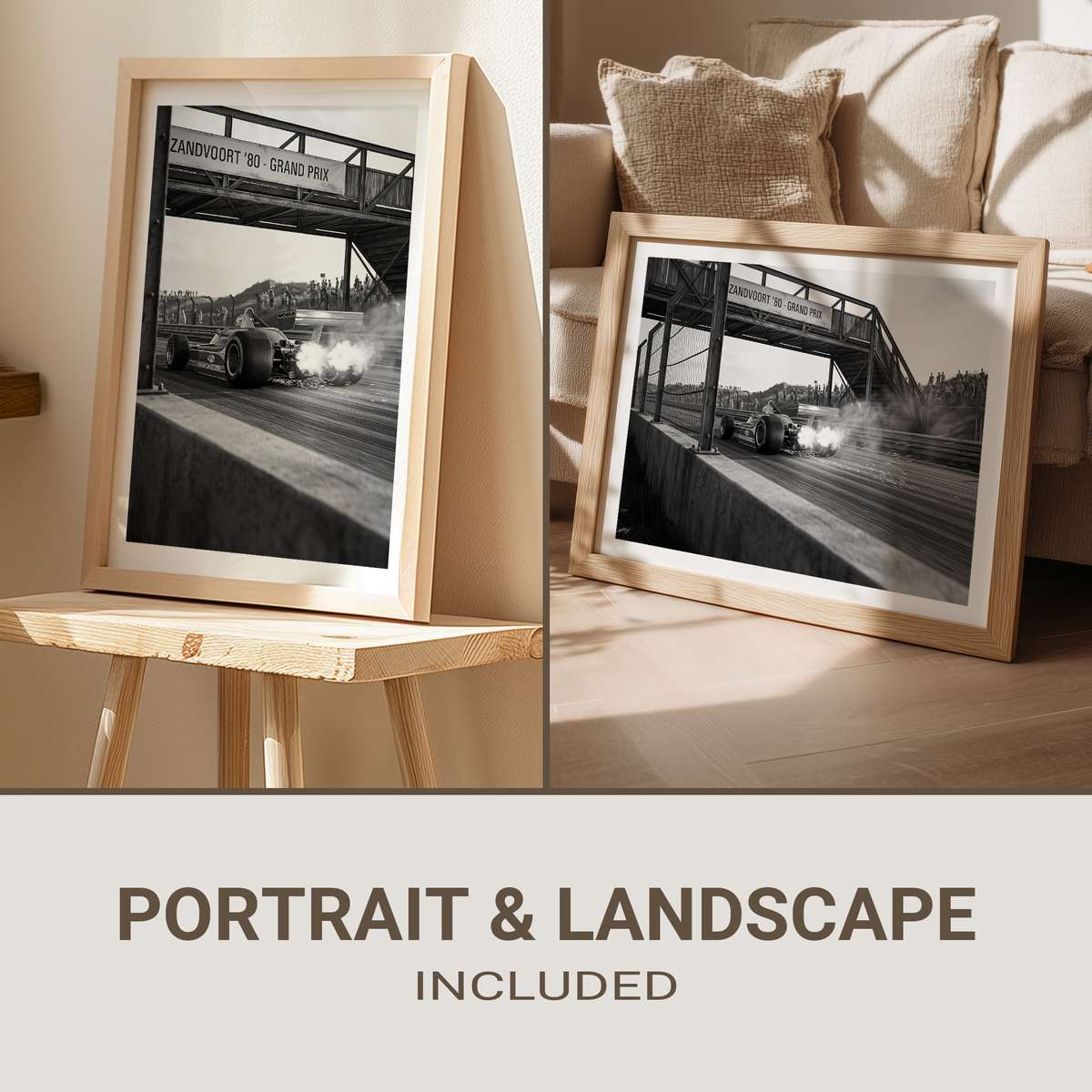
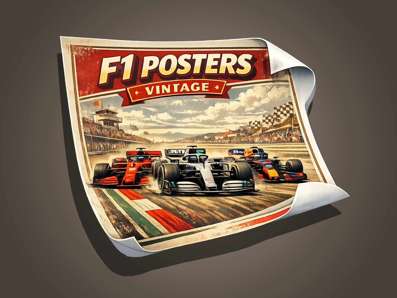
The Ferrari F1 car is instantly recognizable even when shown as a single element in poster art. This article focuses on reading the car visually — its silhouette, livery and the ways artists convey speed — so you can better appreciate or choose a Ferrari F1 poster that communicates presence and motion without relying on track context or circuit imagery.
Silhouette: the shape that announces Ferrari
Silhouette is the first visual cue a viewer registers. A Ferrari F1 car’s profile — low nose, tightly packaged cockpit, exposed wheels and long rear bodywork — creates a distinctive outline that reads well at a distance and at small scale. In poster design, artists simplify or exaggerate that contour to increase legibility: reducing clutter around the wheels, elongating the nose or emphasizing the rear wing helps the viewer immediately identify the subject as an F1 car and, more specifically, as a Ferrari.
When assessing a poster, look for clear negative space around the car and an uninterrupted rim-to-rim outline. A clean silhouette resists competing elements like busy backgrounds or overlapping type, making the car the dominant visual anchor on the page.
Livery: color and brand as visual shorthand
Ferrari’s livery acts as a visual shorthand that communicates brand, era and emotion in a single glance. The iconic red remains the primary signal, but successful poster art uses livery elements — sponsor stripes, number plates, or subtle metallic finishes — to evoke a specific model or period without textual explanation.
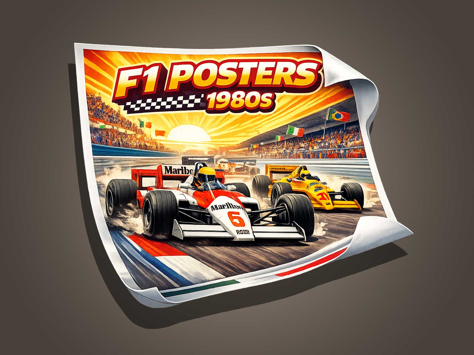
Designers may choose three approaches when translating livery for wall art: faithful reproduction, stylized reduction, and selective accenting. Faithful reproduction appeals to purists who want historical accuracy. Stylized reduction pares back details to flat blocks of color, increasing contrast and boldness for modern wall design. Selective accenting preserves the red base while adding only a few hardware details or sponsor marks to suggest authenticity while keeping the composition elegant.
Conveying speed: visual techniques that make a static image feel fast
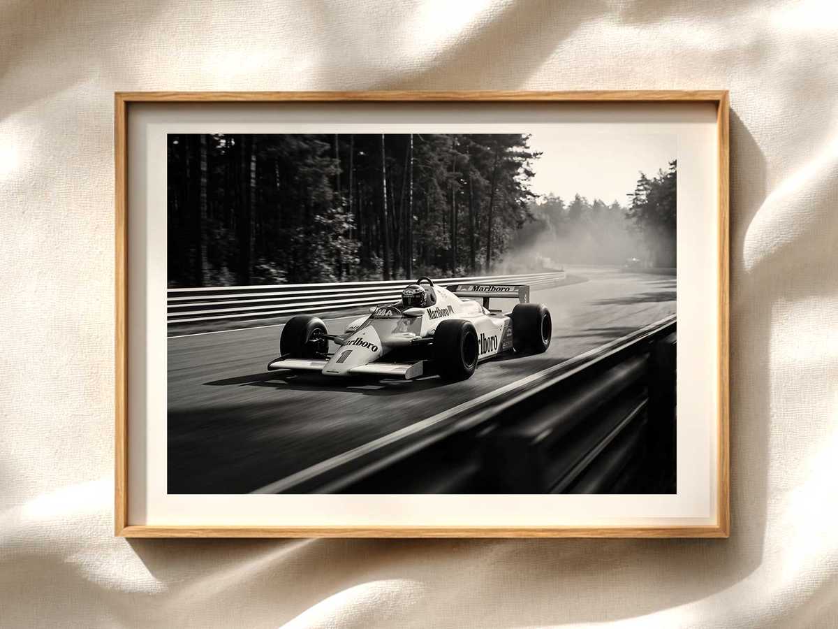
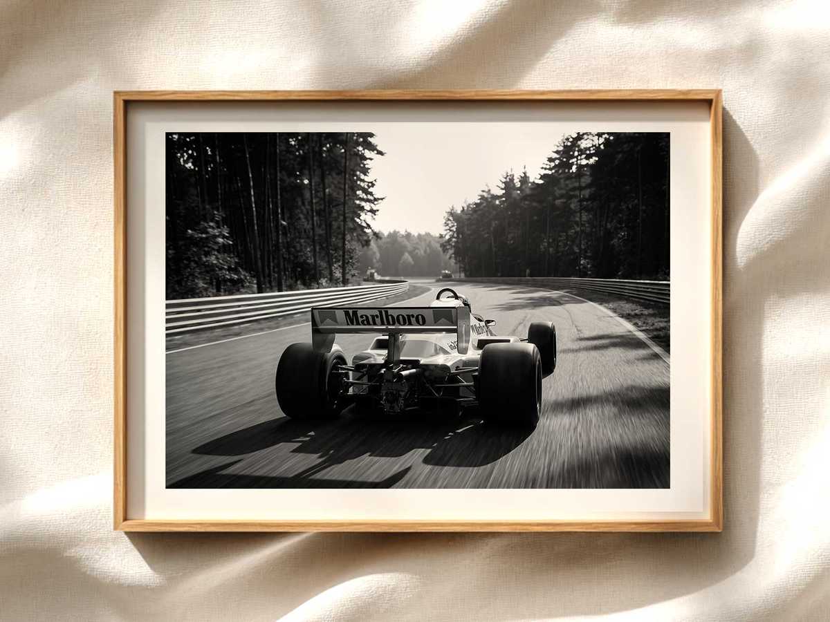
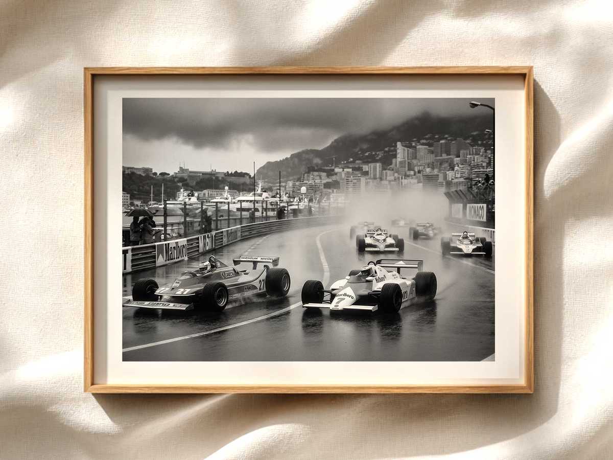
Conveying speed in a still image requires intentional visual strategies. Motion blur, angled composition, tire squirm marks, and aerodynamic wake lines are common techniques. More subtle approaches include careful use of perspective — a low vantage point with converging track lines or a foreshortened nose — and contrast-driven streaks that lead the eye in the direction of travel.
Color and light also contribute: high-contrast highlights and reflective surfaces imply rapid movement through changing light, while desaturated backgrounds push the car forward. In many posters, artists use directional brush strokes, radial gradients, or layered transparencies to simulate wind and velocity without adding photo-real noise.
Composition choices that keep the car at the center of attention
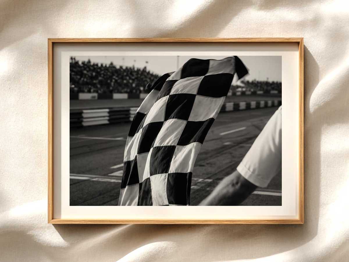
Beyond silhouette and livery, composition determines how the viewer interprets the car. Centering the car can deliver monumentality, while off-center placement with negative space suggests motion and anticipation. Crop choices matter: showing only part of the car — a close-up on the nose, the cockpit and steering wheel, or the rear wing — can intensify focus on form and detail.
Typography and graphic elements should support, not compete with, the car. Minimal type, restrained color palettes and balanced margins ensure the Ferrari’s form remains the visual hero. For retail posters intended to hang in living spaces, designers often test pieces at poster scale to verify the silhouette and livery read correctly from typical viewing distances.
Practical tips for choosing a Ferrari F1 poster focused on the car
- Prioritize posters with a strong, clean silhouette and ample negative space around the car.
- Decide whether you want historical accuracy or a stylized interpretation of the livery.
- Look for visual cues of motion — angled composition, streaks, or perspective — rather than relying on blurred backgrounds alone.
- Check how the poster reads at the size you’ll display it; small prints need bolder shapes and fewer details.
- Consider framing or matting that complements the car’s lines rather than introducing competing visual elements.
Why a car-focused reading improves appreciation
Reading a Ferrari F1 poster through silhouette, livery and speed lets you appreciate the vehicle as design object and cultural icon. This approach keeps the visual story centered on form and motion, making the artwork work in diverse interiors — from minimalist living rooms to enthusiast garages — without requiring knowledge of specific races or circuits.
Whether you’re selecting wall art for yourself or curating a motorsport-themed space, prioritizing how a poster communicates the Ferrari F1 car visually will lead to stronger, more impactful choices.