In visual culture, the Formula 1 car can function as both machine and symbol. For a city like Miami—synonymous with neon, palm-lined geometries and retro-modern glamour—the F1 car’s silhouette, livery and implied velocity translate into a distinct design language. This article focuses on reading the race car as an object of design within Miami’s imagery, explaining how shape, color and motion cues are used in posters and wall art to evoke place and pace.
Silhouette: the primary read of form
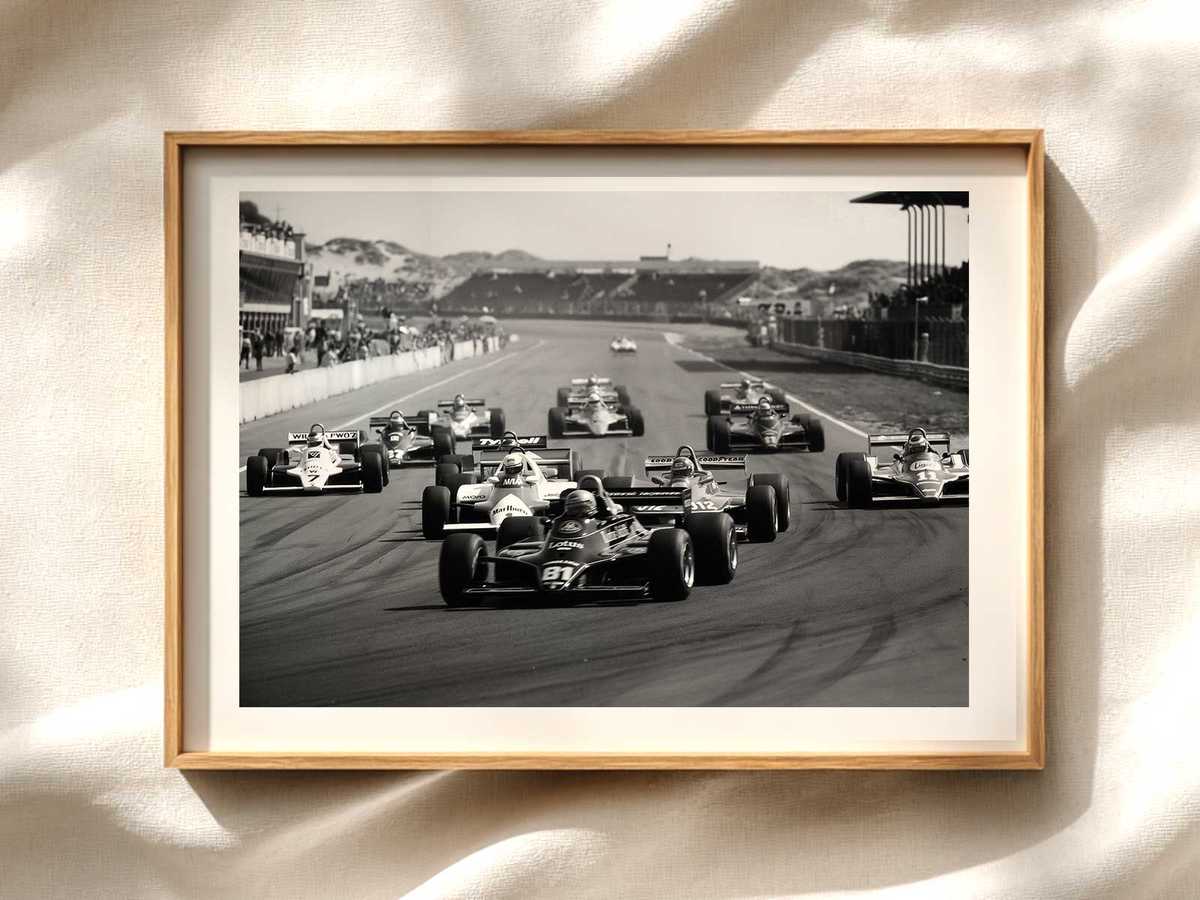
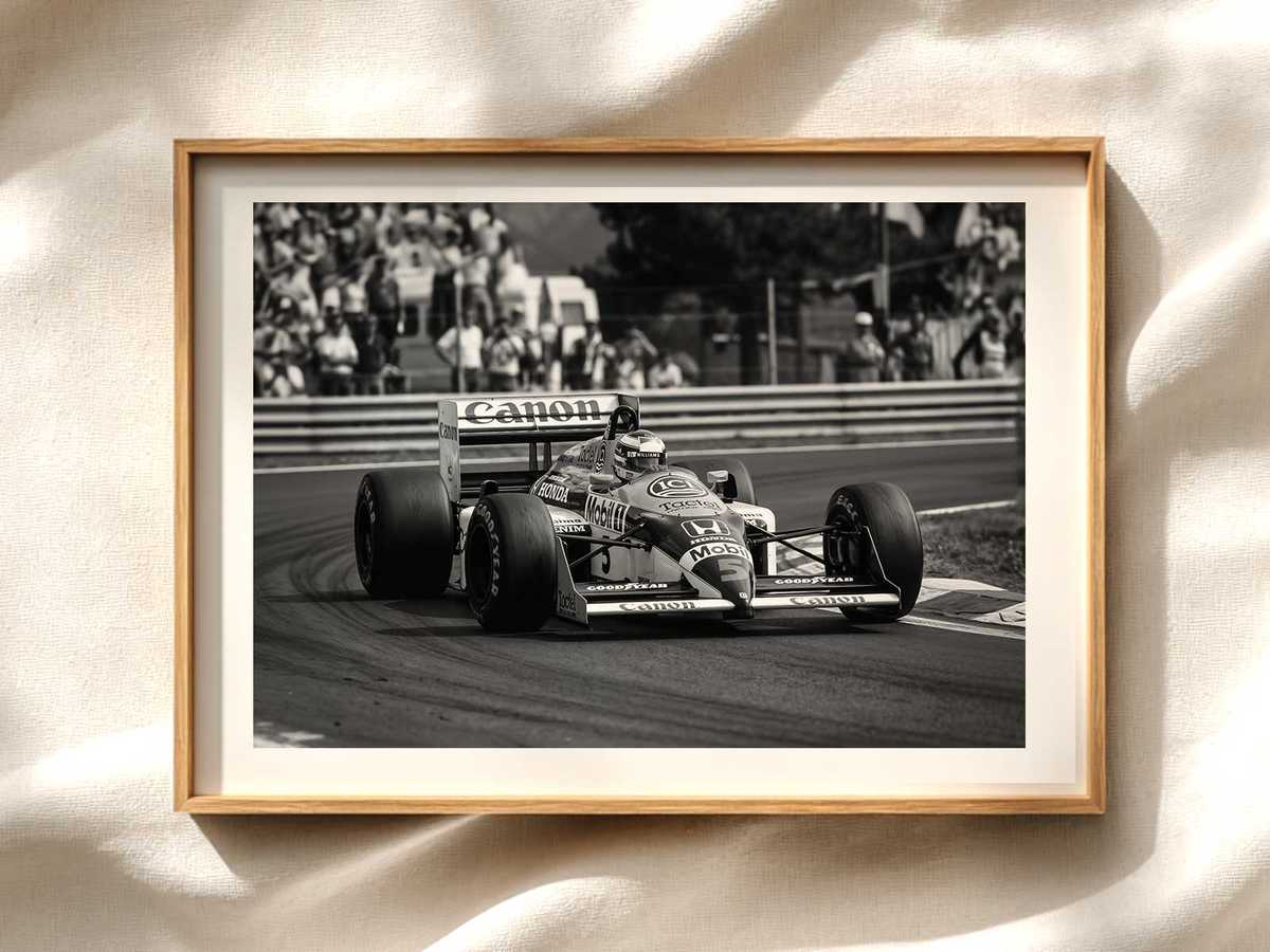
The first thing viewers register in a poster is the car’s outline. An F1 single-seater has a long, low profile, pronounced nose, exposed wheels and an aerodynamic halo. In Miami-themed art, designers exaggerate or stylize these elements to echo local architecture and skyline rhythms. A stretched nose can mirror the elongated horizon of Biscayne Bay; the exposed wheels become graphic circles that echo Art Deco motifs. Keeping the silhouette legible at a glance is essential: it signals “race car” even when other details are abstracted.
Livery and color: Miami’s palette applied to the car
Color is where the car most directly connects to Miami’s visual identity. Pastel pinks, teal aquas, sun-bleached oranges and neon magentas reference the city’s Art Deco heritage and nightlife. When applied to an F1 livery, these hues do more than decorate: they change the car’s cultural meaning. A classic racing red reads as competition and tradition; a Miami palette suggests leisure, nightlife and tropical light. Designers often balance high-contrast accents (for readability at a distance) with soft gradients to convey heat and atmosphere, crucial for poster impact.
Surface detail and typography: logos as compositional elements
Beyond base color, surface details—sponsor blocks, numbers and team stripes—serve as compositional tools. On Miami-oriented posters, typography and decals are treated visually: type may adopt Art Deco lettering, sponsor blocks become blocks of color that echo building facades, and numbers are positioned to reinforce the car’s motion line. This approach keeps the focus on the car as designed object rather than on specific brands, which is useful for decorative posters that aim to evoke mood over motorsport specificity.
Sensation of speed: implied motion in static art
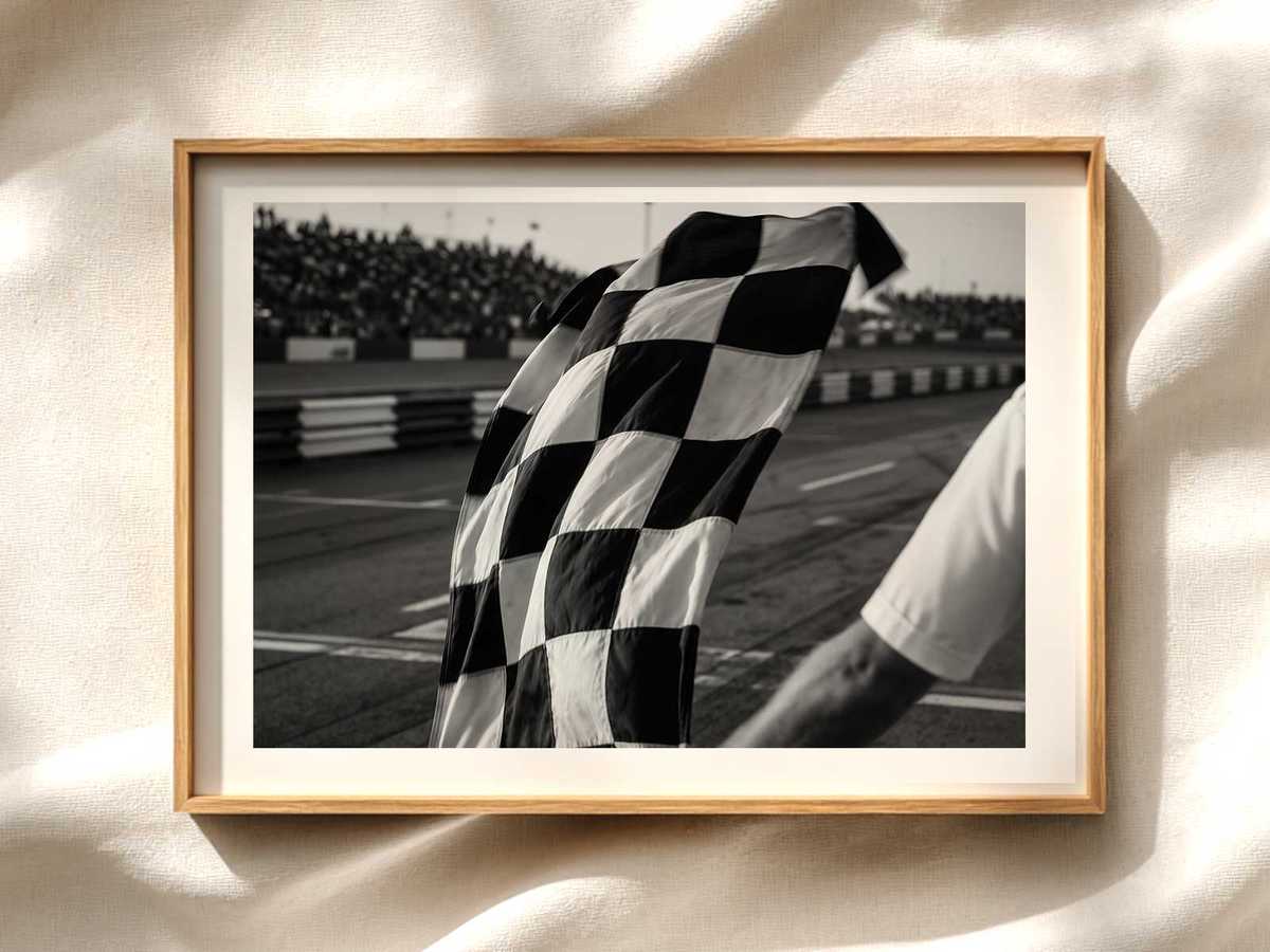
Conveying speed in a still image relies on visual shorthand. Motion blur, radiating lines, tilted camera angles and dust or spray are familiar techniques. For Miami posters, designers often combine these with environmental cues—palm fronds whipping, neon streaks, reflected light on wet asphalt—to suggest both velocity and place. The car’s wheel orientation, angled body and trailing light streaks guide the viewer’s eye across the composition, turning a static print into a dynamic narrative.
Scale and context: placing the car within Miami
How large the car appears relative to other elements changes interpretation. A monumental car silhouette against a miniature skyline emphasizes design and iconography, turning the vehicle into a symbol of the city’s energy. Conversely, showing the car in proportion to Miami landmarks roots the image in a specific locale, useful when the poster aims to celebrate a race weekend. Thoughtful use of negative space—sky, waterfront, or a stretch of road—lets the car breathe and keeps the visual read clean.
Material choices and print finishes that enhance reading
In poster production, paper weight, finish and inks alter perception. Matte stocks soften neon palettes and emphasize form, while glossy finishes amplify contrast and make colors pop—ideal for neon-heavy Miami schemes. Spot UV or metallic inks on key elements like the car’s livery or number plate can mimic reflective surfaces and add tactile interest, reinforcing the car’s engineered quality as a crafted object.
Compositional strategies for poster buyers and designers
If you’re selecting or commissioning a Miami F1 poster, consider these practical strategies: prioritize a clear silhouette for instant recognition; choose palettes that balance Miami’s neon identity with legibility; use minimal but purposeful surface detail to avoid brand clutter; and pick a finish that enhances the intended mood—matte for retro elegance, glossy or metallic for nightlife vibrancy. These choices ensure the car reads as a deliberate design object rather than a photographic record.
Conclusion: the car as a visual bridge
Reading the Formula 1 car as an object of design helps explain why it adapts so effectively to Miami-themed imagery. Through silhouette, livery, surface detail and implied motion, the car becomes a visual bridge between motorsport and place. For posters and wall art, this approach yields images that are both instantly recognizable and emotionally resonant—capturing speed, style and a sense of Miami’s atmosphere.
Explore Miami-inspired F1 posters to see these principles in action, and consider how silhouette, color and motion work together to make a race car more than a vehicle—an icon of design.