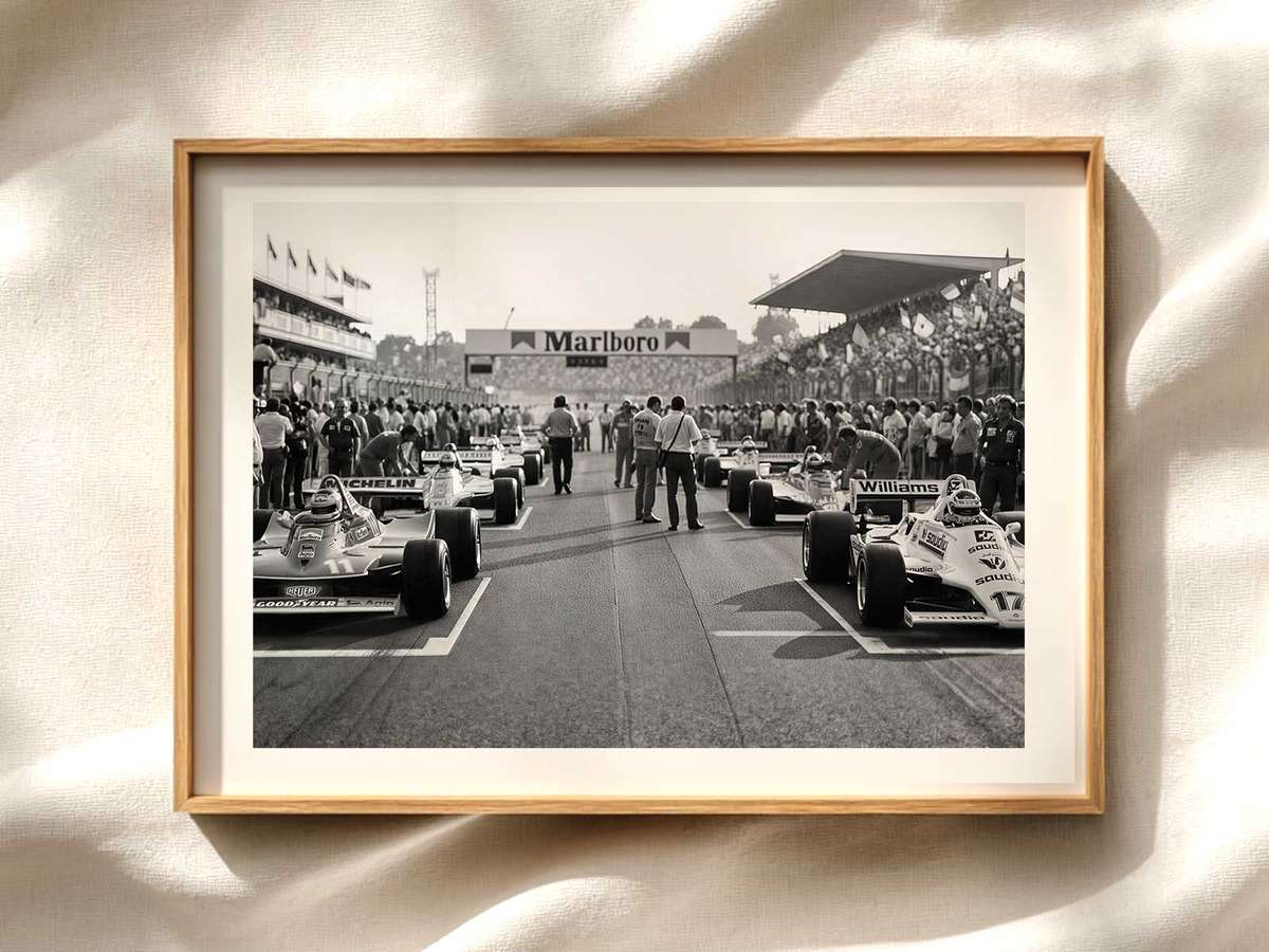
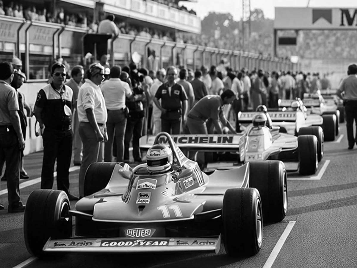
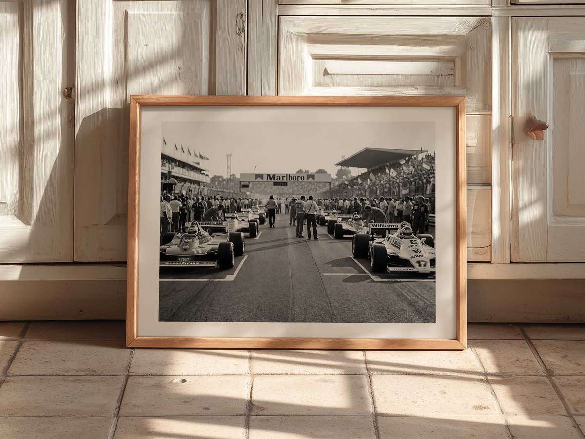
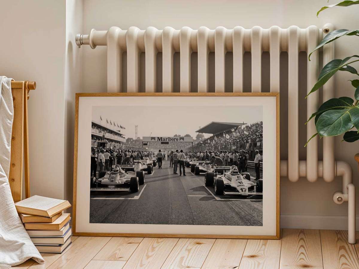
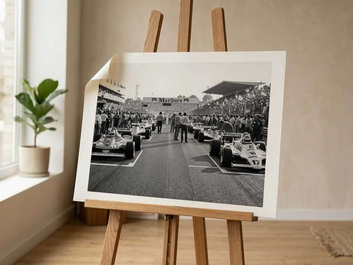
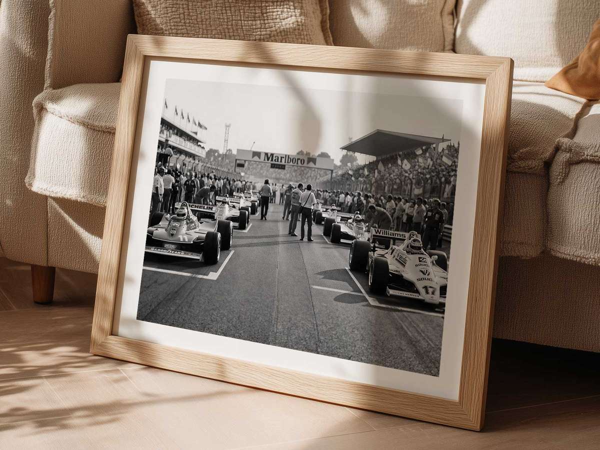
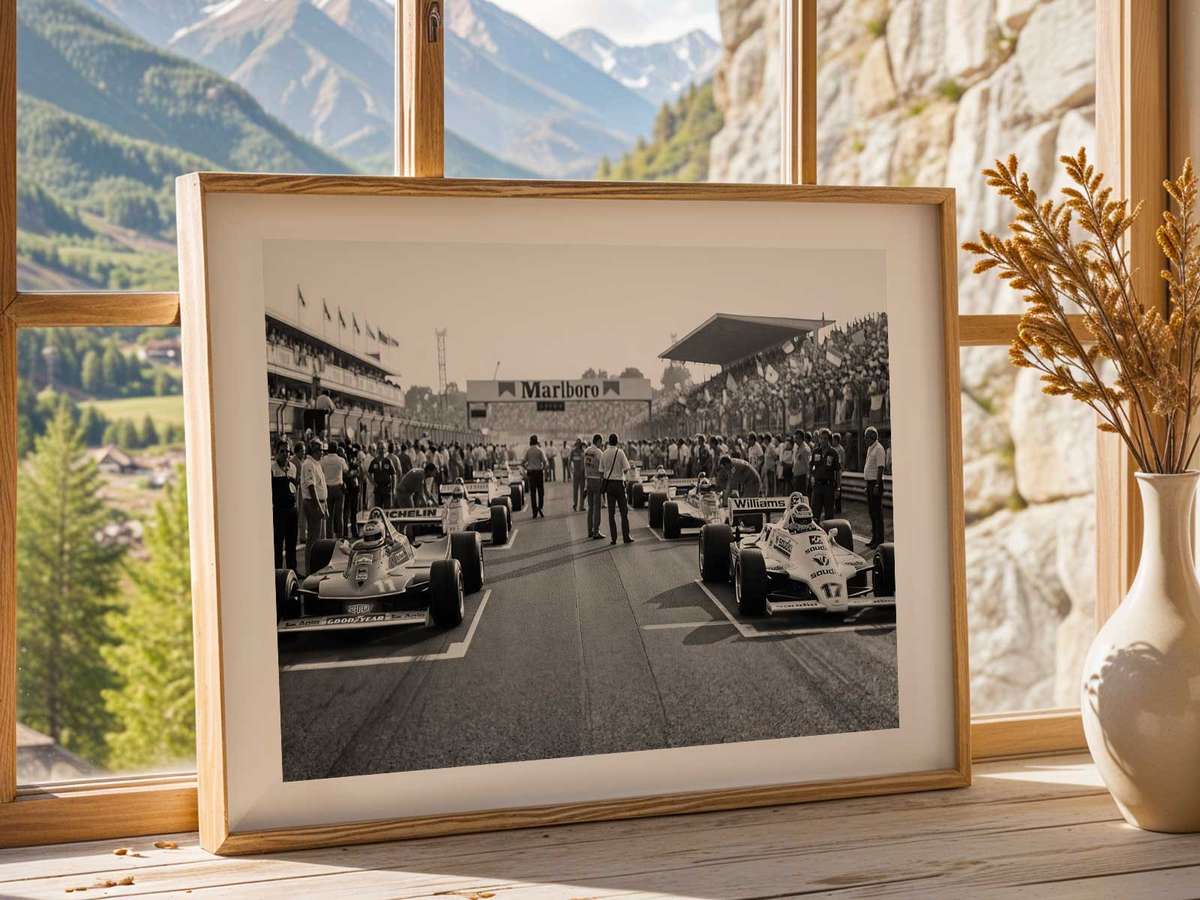
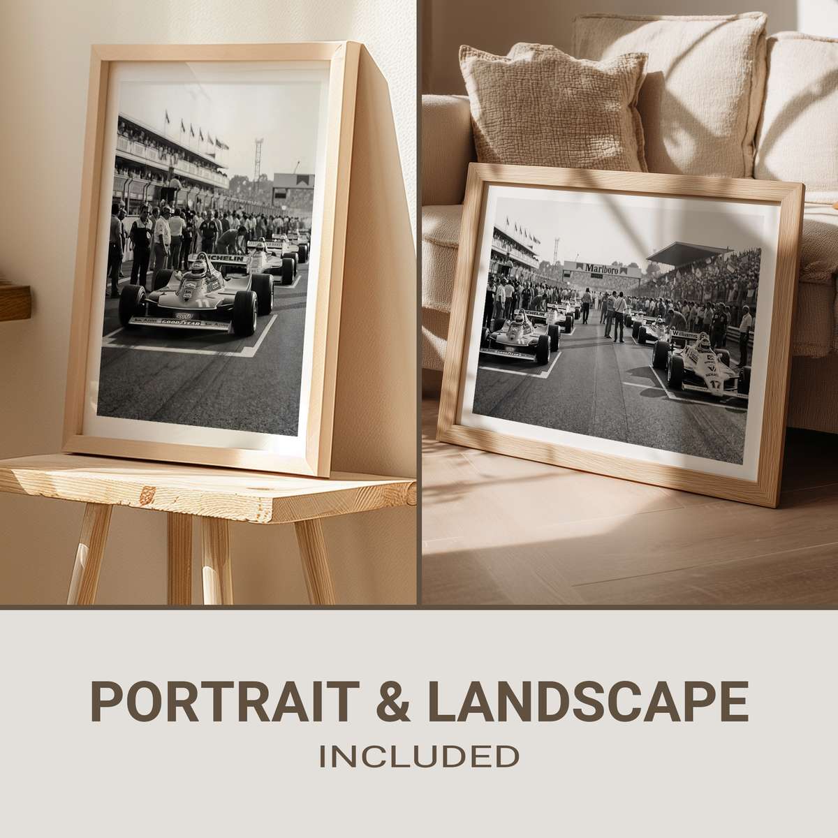
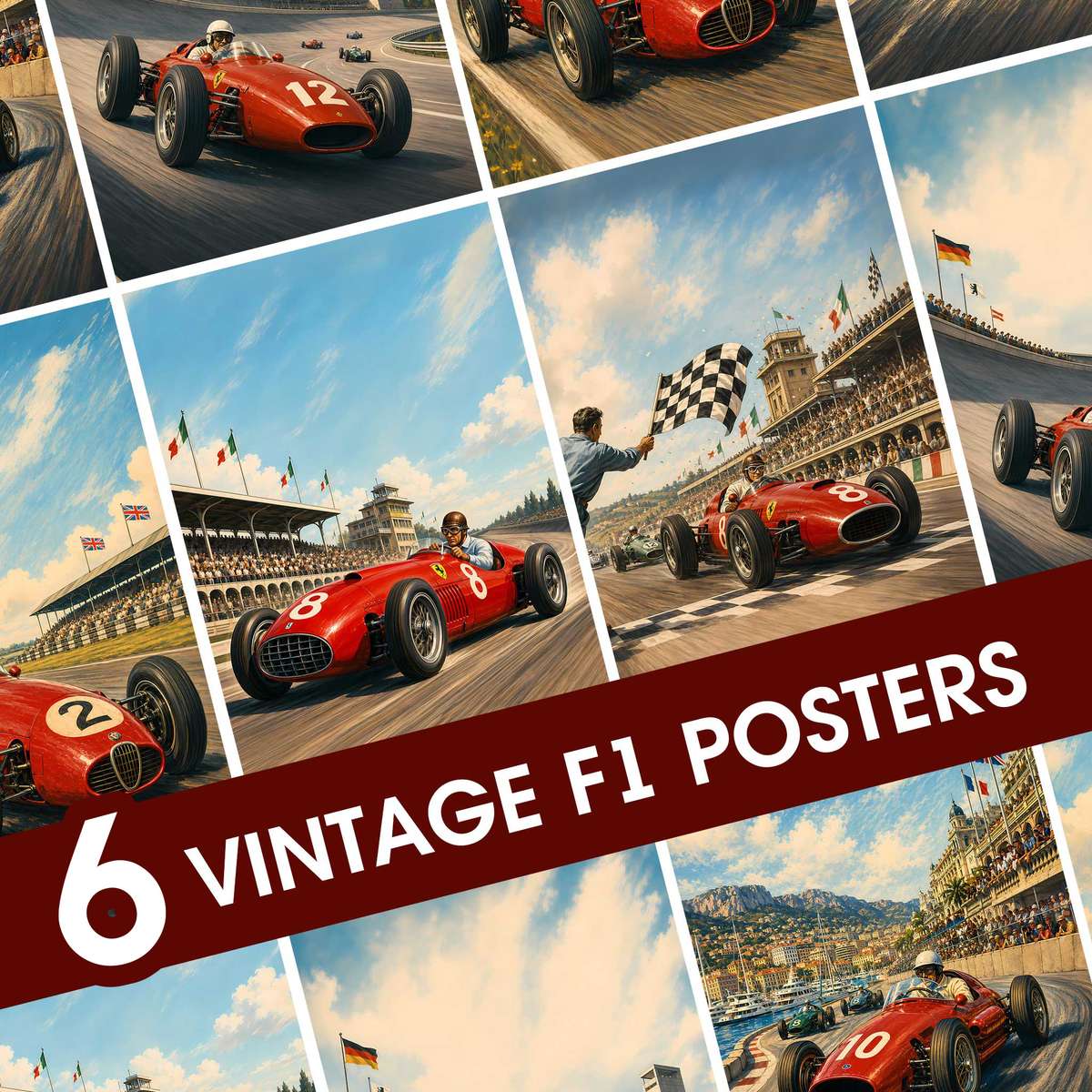
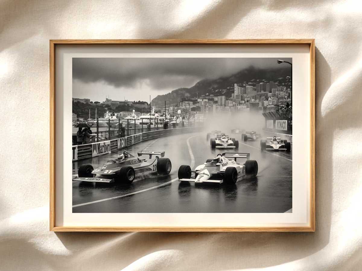
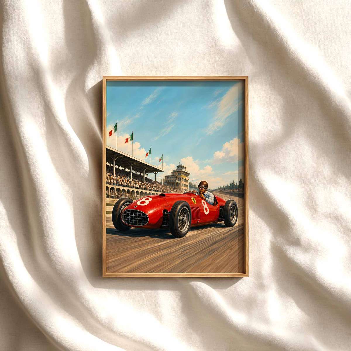
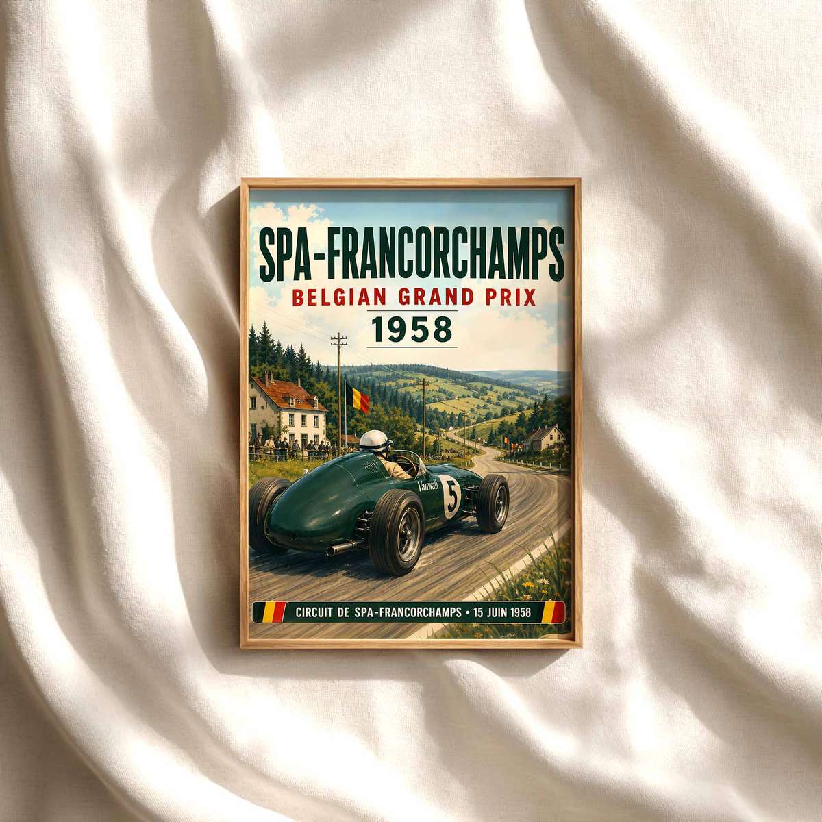
There are moments in Formula 1 that exist more as images than events: the tight, layered view of the grid moments before lights out is one of them. A poster that isolates this charged instant transforms a sporting photograph into a piece of interior art because it carries immediate visual drama, unmistakable racing identity and a dense vocabulary of colour, shape and motion. The effect is at once architectural and cinematic—rows of machines become a pattern, team liveries read like a curated palette, and the human figures threaded through the scene provide scale and intent.
What a viewer notices first is rarely a technical detail; it is the rhythm. Wheels, noses and wings line up in repeating motifs that lead the eye along track lines and into negative space. That repetition gives the composition a graphic clarity which suits wall display: it works at a glance from across a room and rewards inspection up close. Colours from team liveries—accent stripes, sponsor blocks, helmet motifs—act as focal points, while the darker mechanical silhouette of suspension and bodywork lends a sculptural weight that anchors the piece within a living interior.
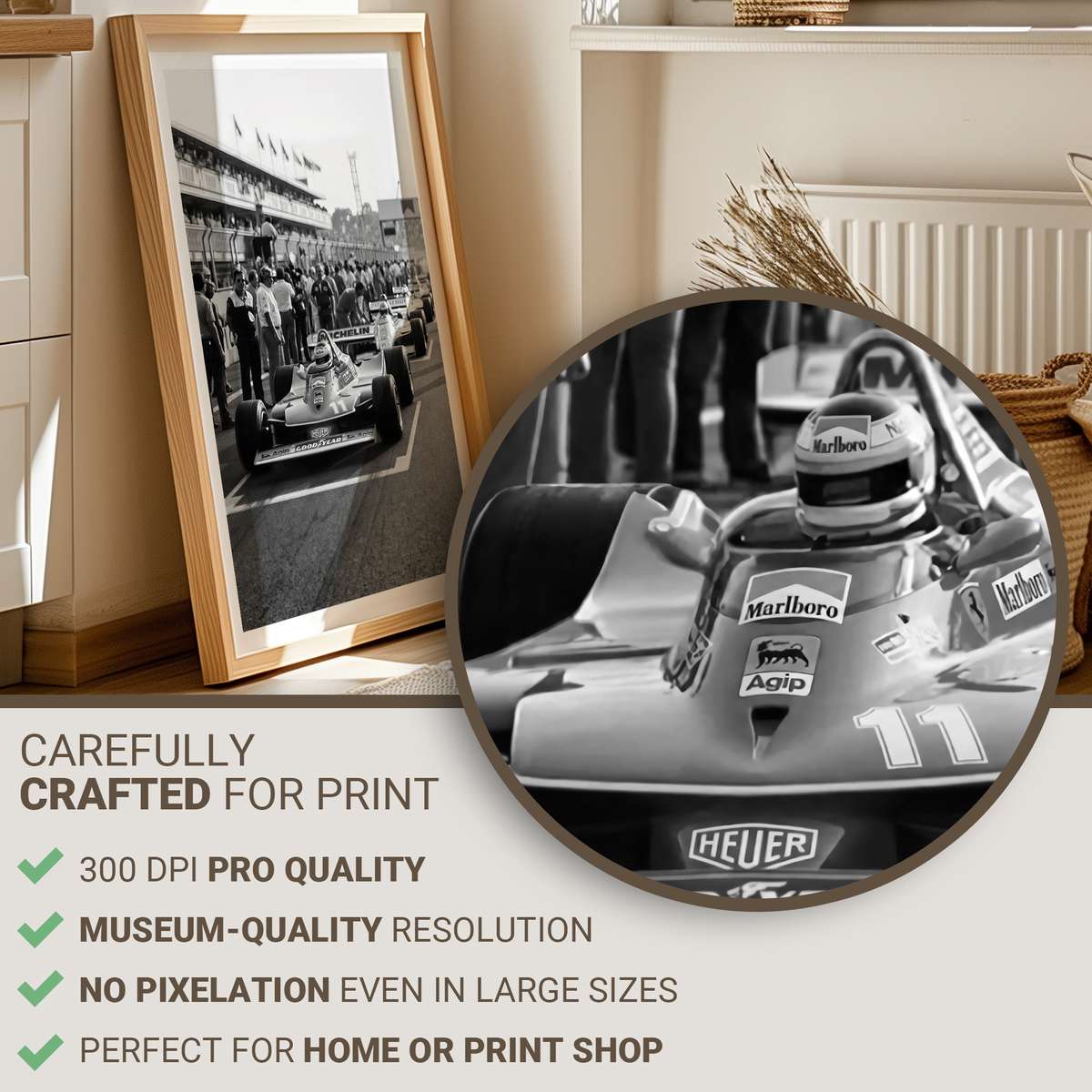
The poster’s identity as ‘racing’ is immediate because of the coded signs embedded in the image. Low-slung shapes, open cockpits, the gritty texture of slick tyres and the presence of race marshals or engineers in the frame all read as authenticity markers. For fans, these cues trigger memory and recognition: a helmet shape, a team colour, a wing profile. For design-minded buyers, they function as refined graphic elements—contrast, line and form—that lift the image beyond sport into decorative territory.
This visual density—cars packed together in a quiet, anticipatory moment—also carries strong evocative power. It suggests narrative without movement: the latency of speed, the collective inhale before chaos. That suspended tension translates into atmosphere for a room. A study takes on purposeful energy; a living room acquires an edge of sophisticated adrenaline; a home office or garage wall benefits from a clear, directional focus that still feels cultured rather than clichéd. The poster doesn't shout “race”; it offers composition and mood that converse with architecture and furniture.
[IMAGE_INSERT_ARTICLE_01]
Collectors and design buyers prize images that reward repeated viewing. A grid-before-start poster does precisely that because it folds multiple stories into a single frame—the rivalry implied by proximity, the team identities sitting side by side, the micro-gestures of drivers and crew. This makes the artwork versatile: it can anchor a motorsport collection, complement automotive memorabilia, or be the singular statement piece in a sophisticated living space. It’s an image that ages well because its appeal is visual and cultural rather than dependent on a single result or headline.
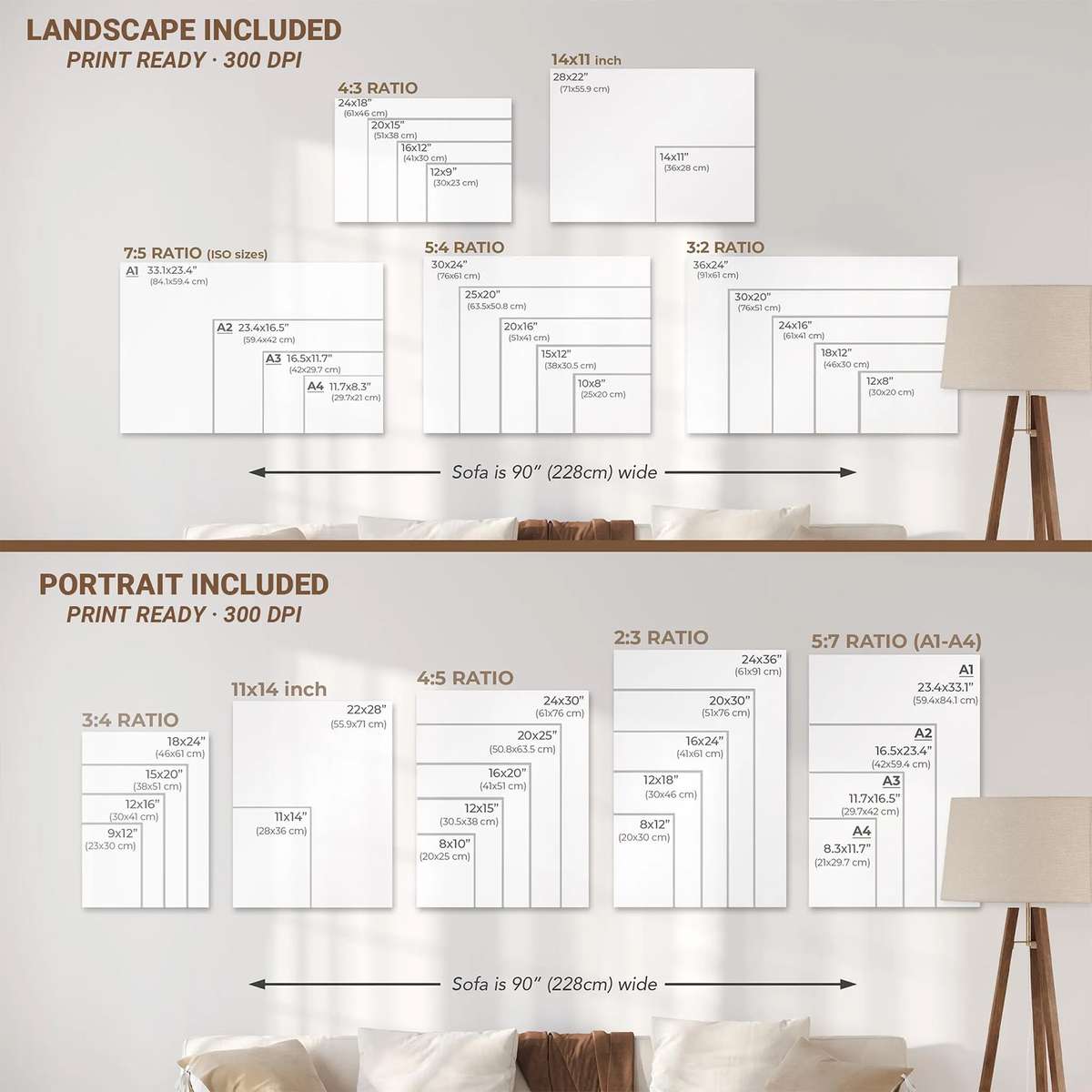
Ultimately, this kind of F1 poster bridges two desires: the wish to own a tangible piece of racing’s visual memory, and the desire to curate a specific ambience at home. It invites both sentiment and design attention. Hung in the right scale, with a frame that respects the image’s tonal balance, a poster of the grid before the start becomes more than decoration—it becomes a way to live with the sport’s energy, every day, without needing a trophy cabinet to prove its relevance.