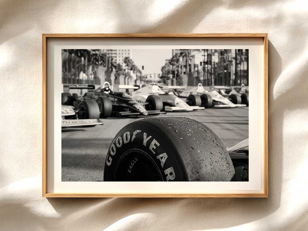
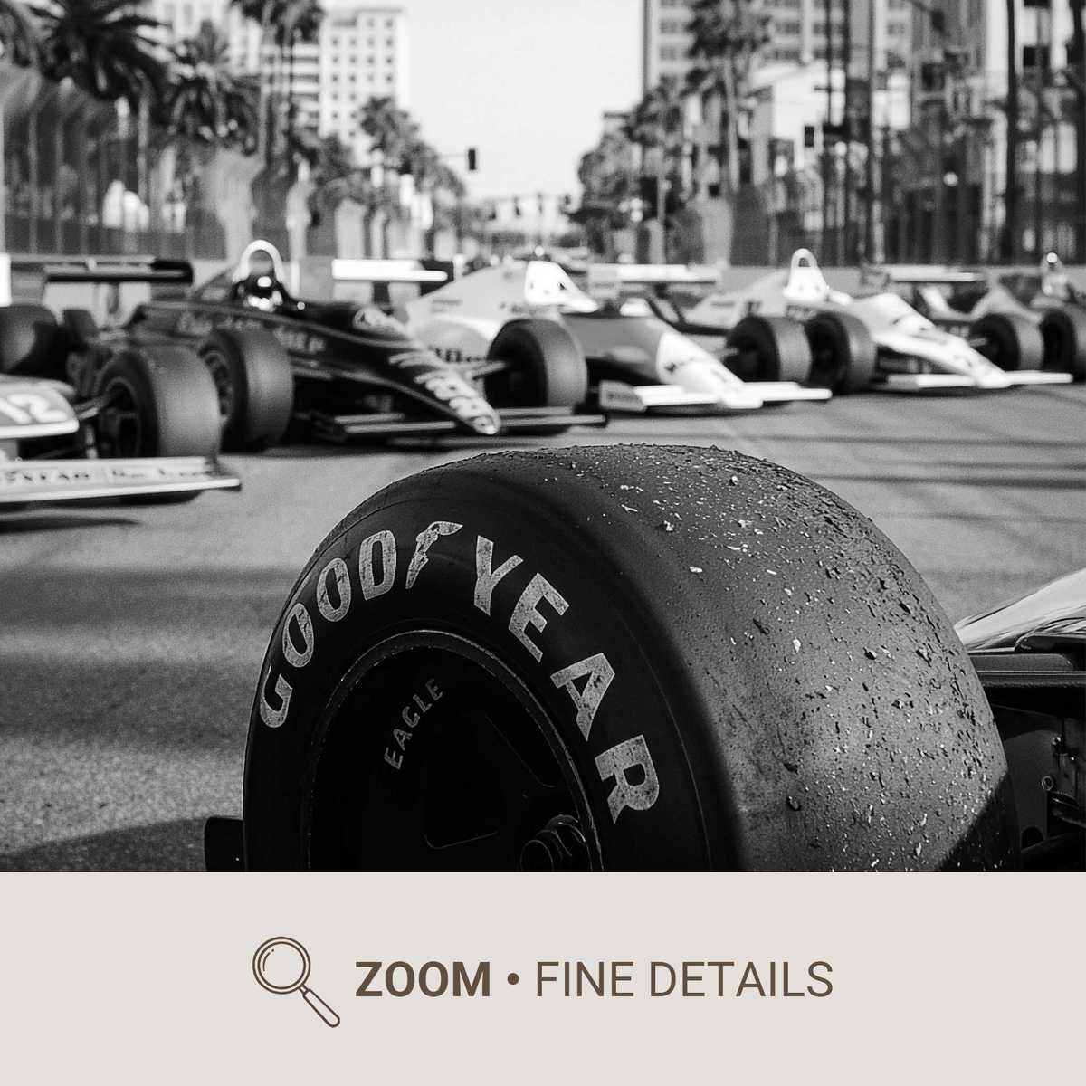
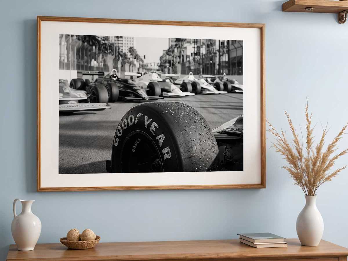
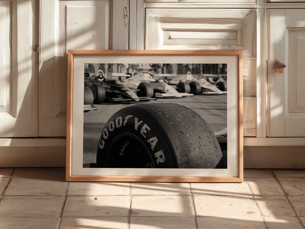
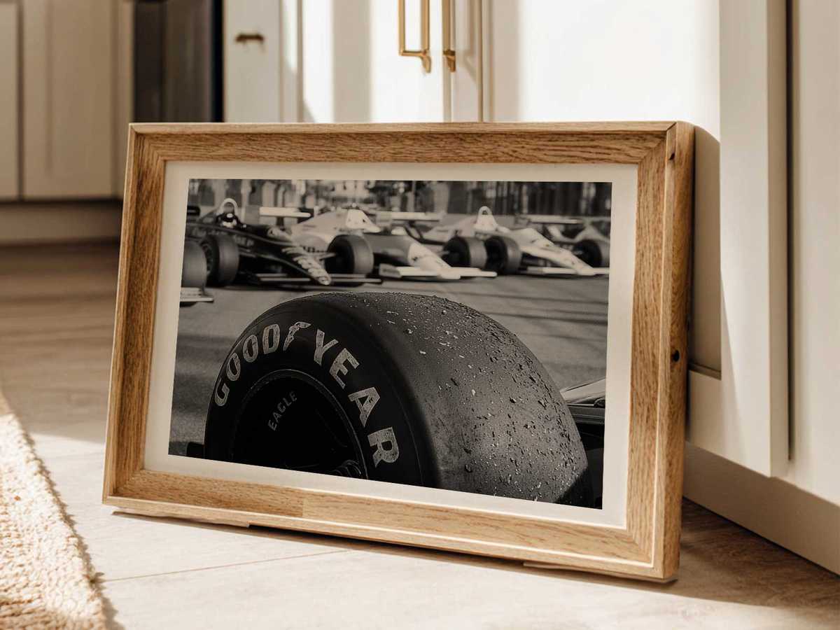
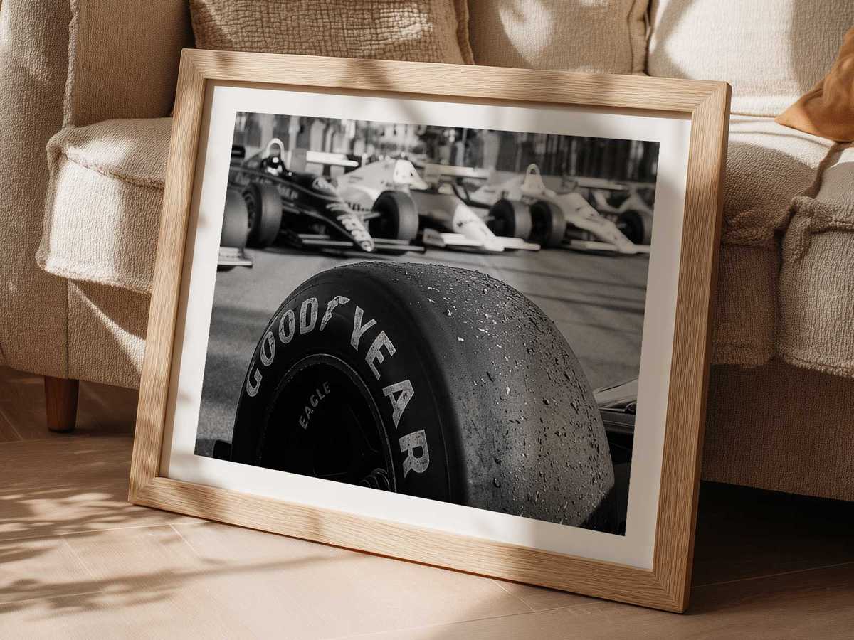
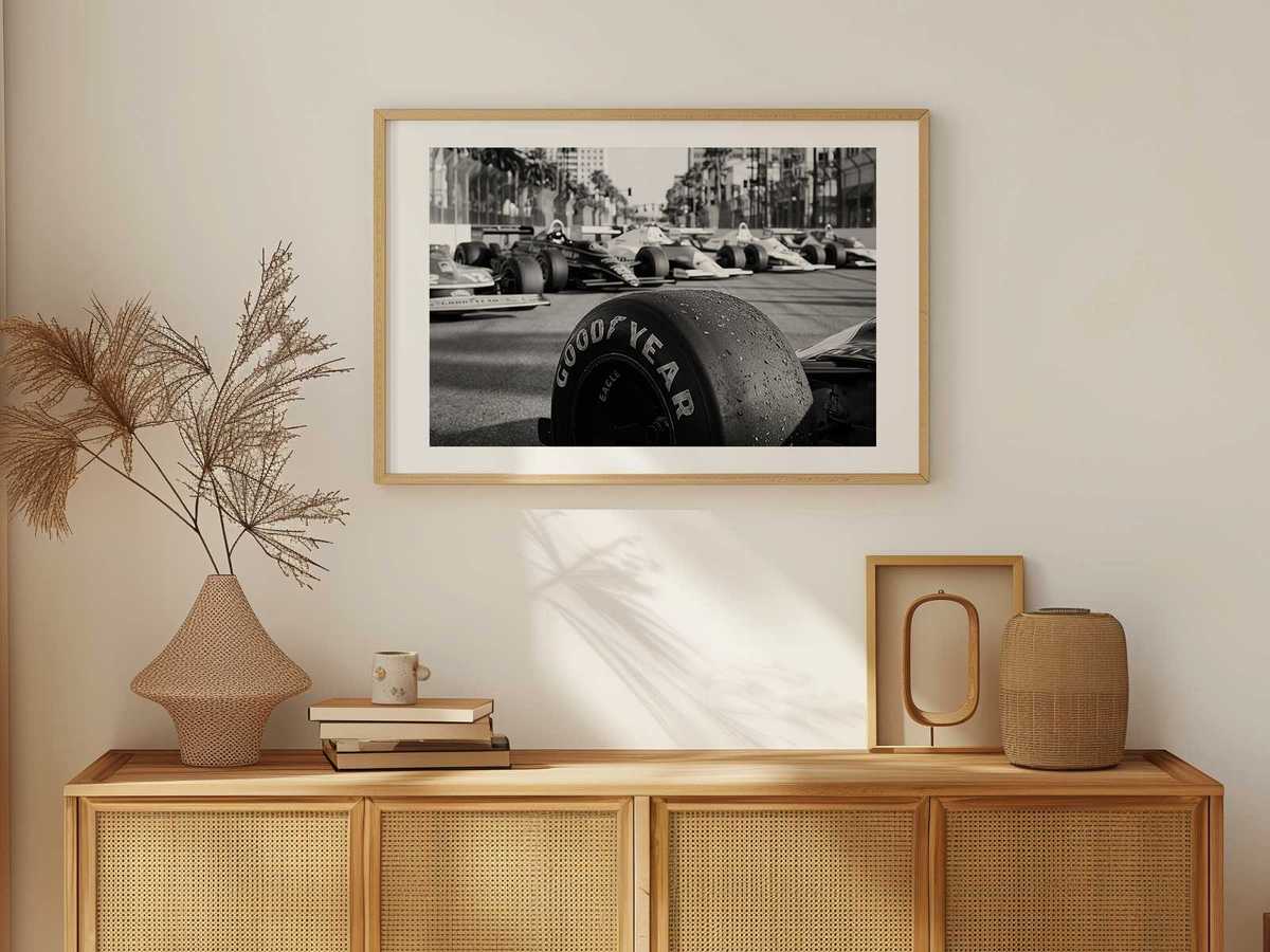
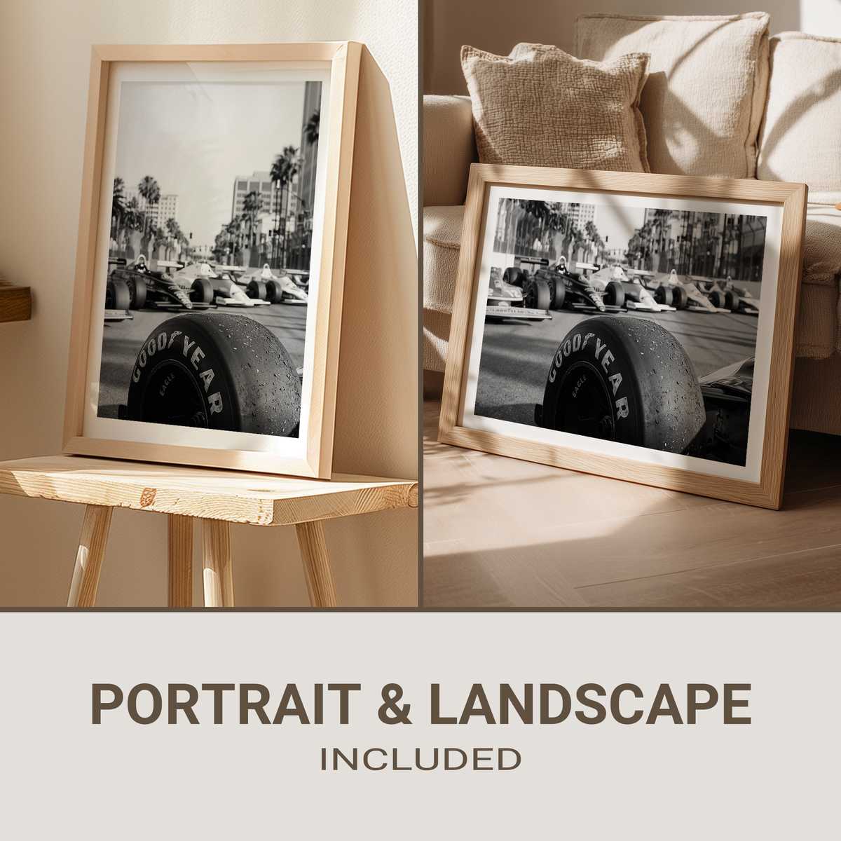
There is a particular way Montreal announces itself in a single image: the compression of a pack of cars between metal rails and nearby façades, the play of light on a tight urban corridor, and the quiet architectural punctuation that makes a racing weekend feel like a city festival. This poster translates that sensation into a collectible print—less a race result and more a place you can hang on the wall and remember how a weekend smelled, sounded, and looked.
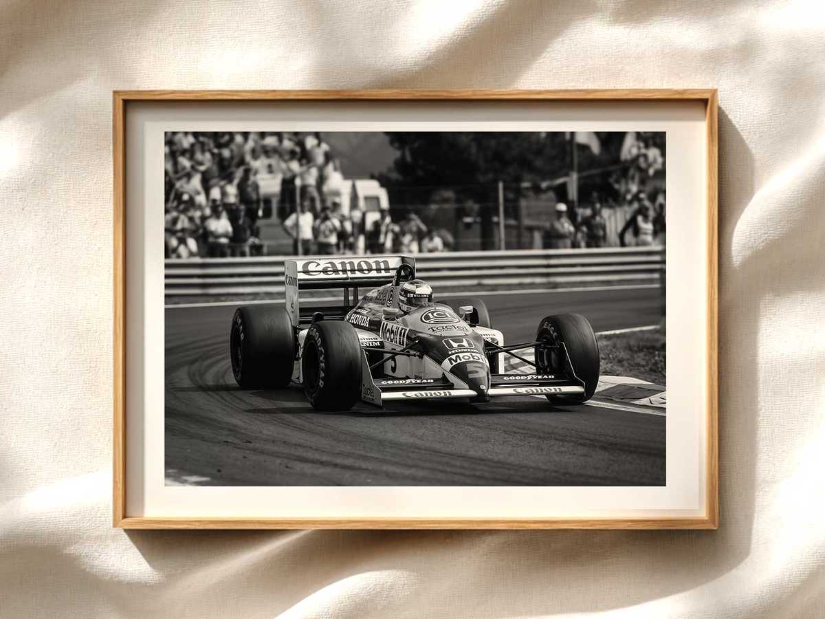
The visual centre of the composition is the peloton, squeezed into a narrow field of view so that every car reads as a deliberate brush stroke. That compression does something important for the viewer: it converts speed into density. You don’t need motion blur to feel velocity here; the proximity of barriers, the repetition of grandstand geometry, and the way façades loom close make movement palpable because space has been reduced. The effect is cinematic and intimate, suited to a high-quality print for living rooms, offices, or game rooms where atmosphere matters more than timing sheets.
Colour choices and contrast carry much of the poster’s voice. Cool greys of asphalt and steel set a disciplined stage, while selective highlights—sunlit panels, reflective visors, a flash of team livery—act as punctuation. These accents guide the eye along the tight line of the field, echoing how a spectator follows the race: jump from leader to midfield, catch a reflection, then return to the tight group. In framed form, this measured palette reads as both modern decoration and an evocative memory of trackside light.
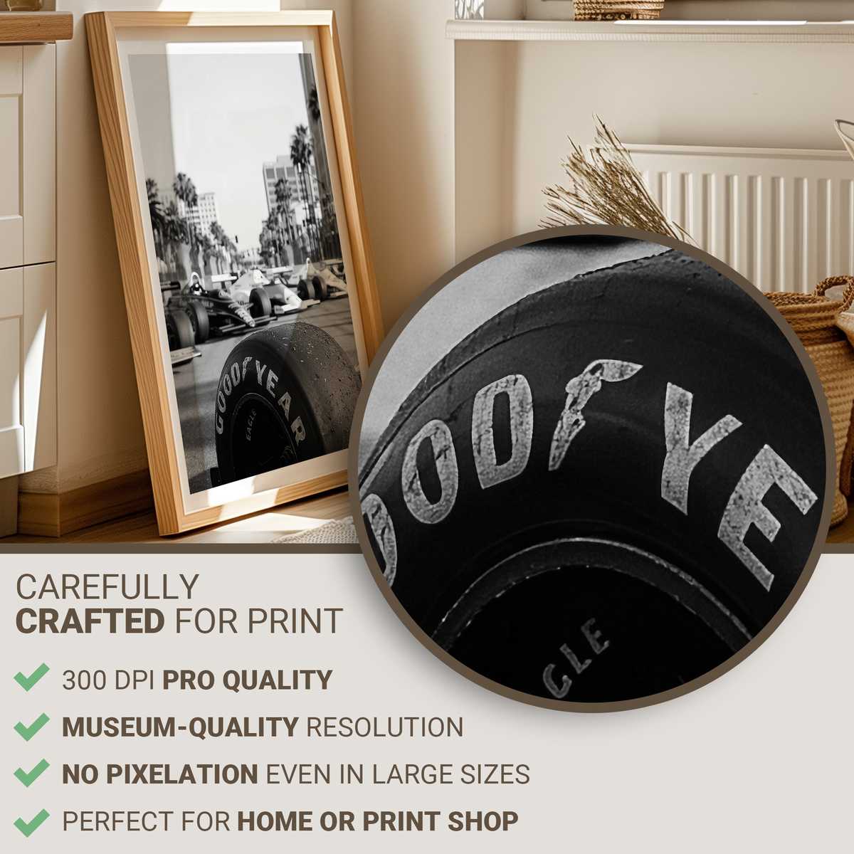
Architectural cues anchor the scene and make the artwork unmistakably Montreal without relying on explicit signage. Façades and temporary structures, the rhythm of railings, and a suggestion of urban skyline compress around the cars, creating a sense of place. For collectors who know the circuit’s character, these elements trigger recognition; for newcomers, they form an elegant, urbane backdrop that keeps the image from feeling generic. The poster therefore works on two levels: as a precise venue portrait and as refined art that complements contemporary interiors.
[IMAGE_INSERT_ARTICLE_01]
Part of the poster’s appeal is its invitation to recall sensory details. Even in two dimensions you can imagine the smell of rubber and the distant murmur of engines, the crowd’s hush before a decisive corner, and the fleeting glint of sunlight on a helmet. A venue-led image like this carries memory without insisting on a winner. It celebrates the weekend’s tension—the tight margins, the shared line through a narrow passage—so that the print becomes a shorthand for the whole experience.
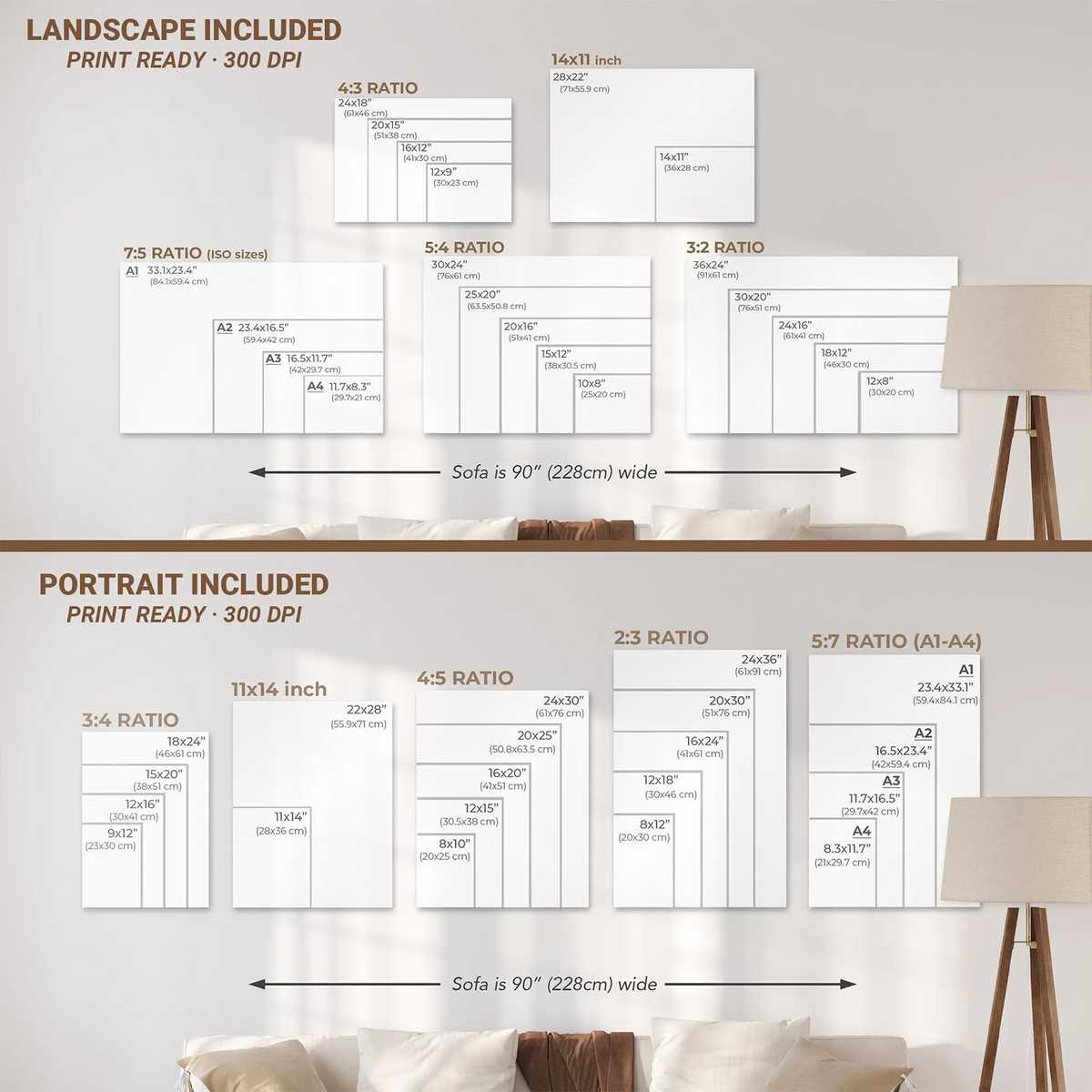
Display-wise, the composition favours horizontal formats that emphasize direction and flow, but it also adapts gracefully to smaller studies where texture and contrast become the main attraction. Hung alone, the poster becomes a visual focal point that tempers a room with motion; grouped with maps, program covers, or other circuit studies, it helps form a curated motorsport gallery that speaks of place rather than podiums.
Ultimately, this Montreal-inspired poster is about translation: turning the weekend’s atmosphere—speed rendered as density, urban décor compressing space, and tension held between rails and façades—into an object worth keeping. It’s art that asks you to remember how the city felt on race day, not just which lap led to which result.