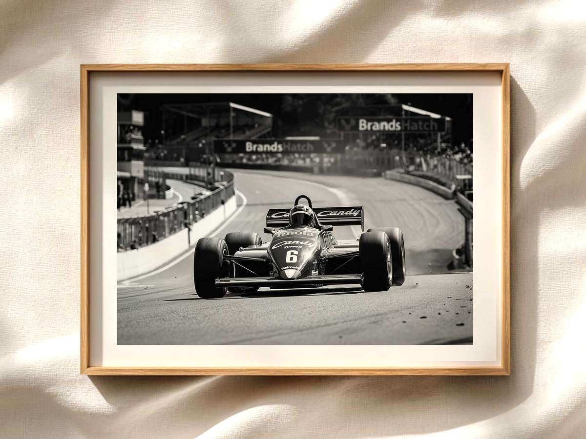
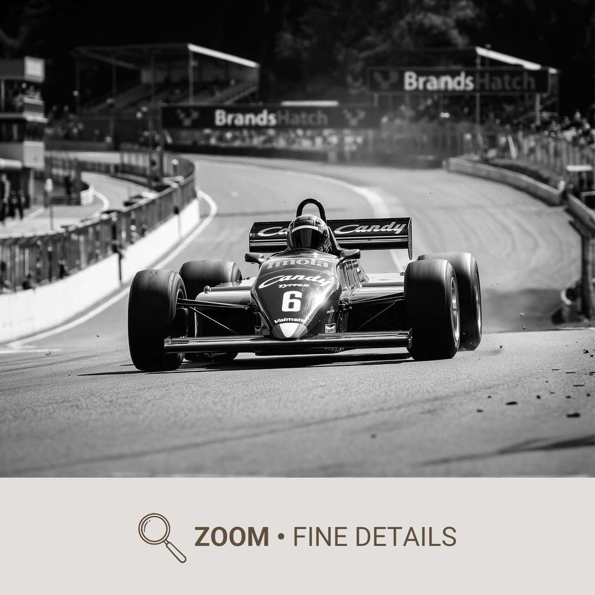
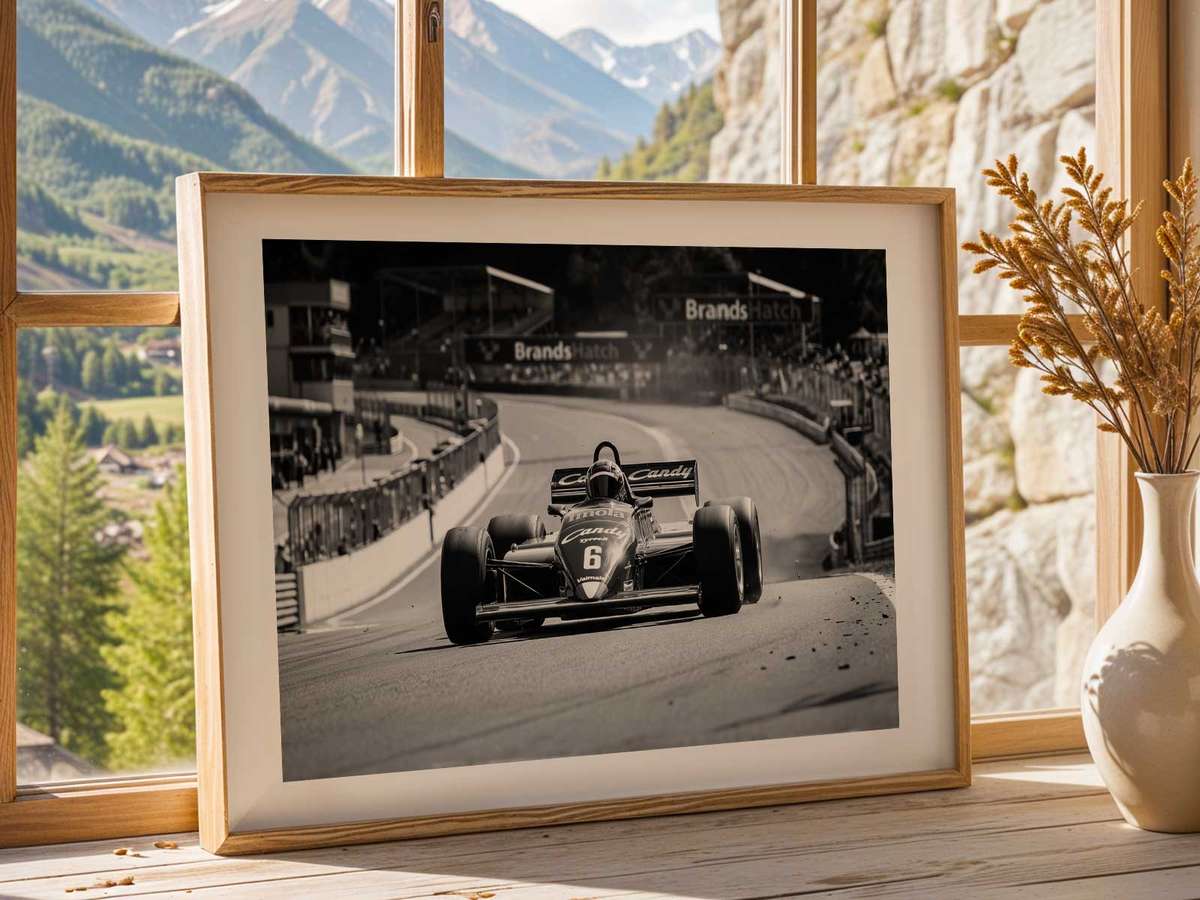
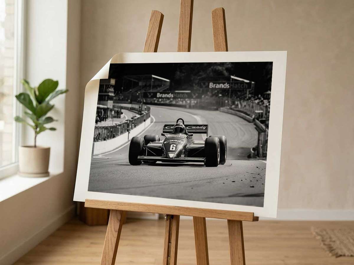
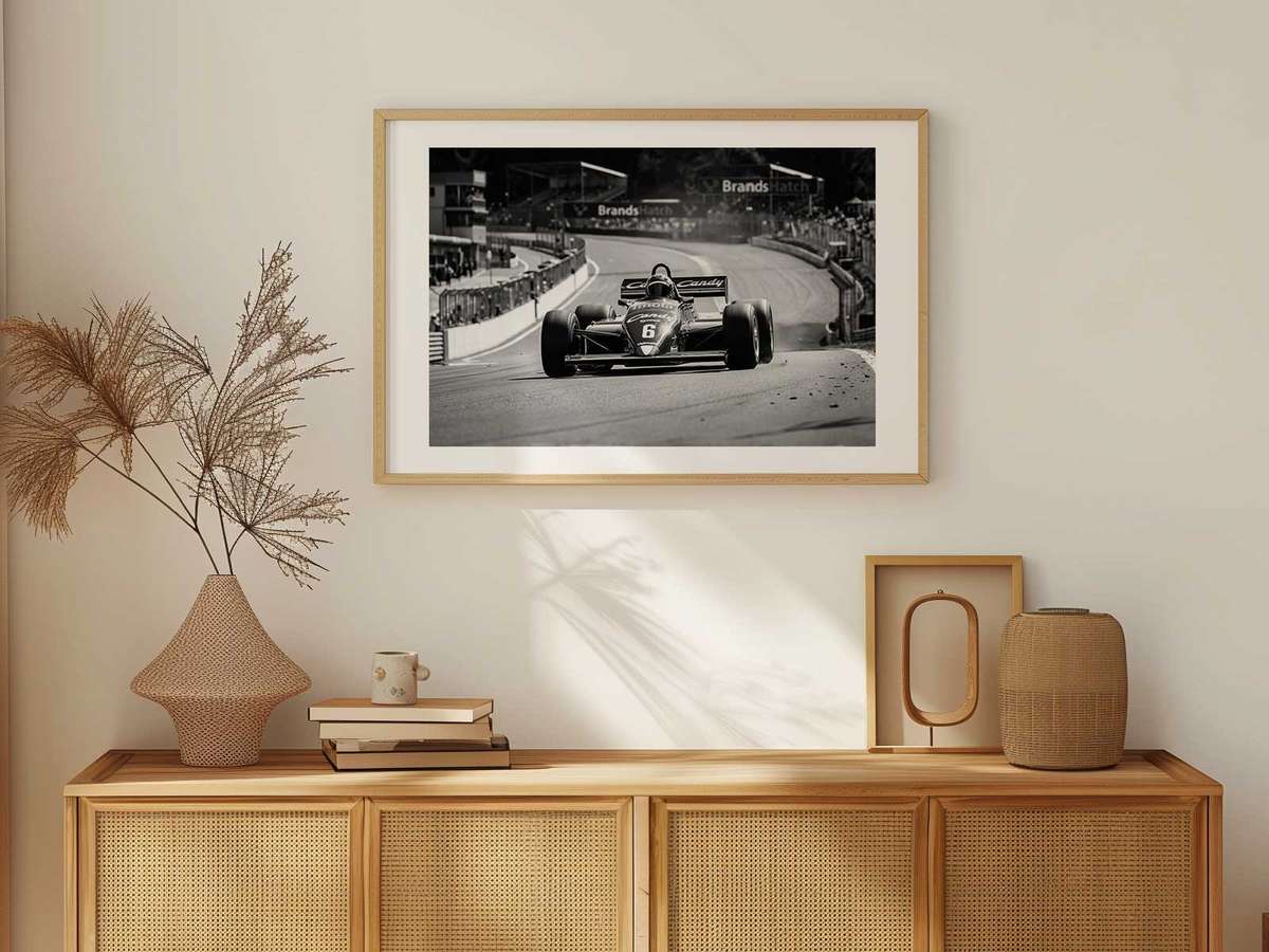
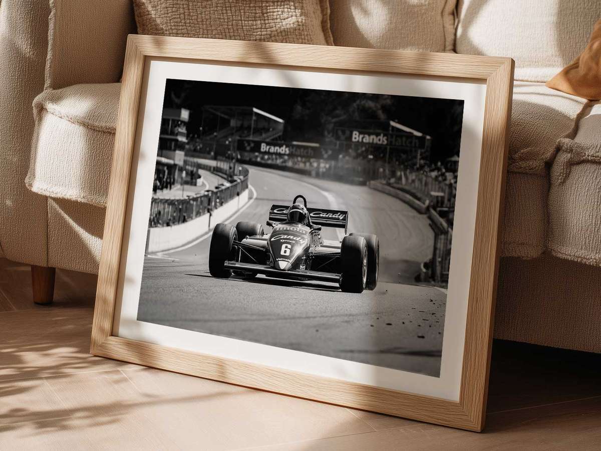
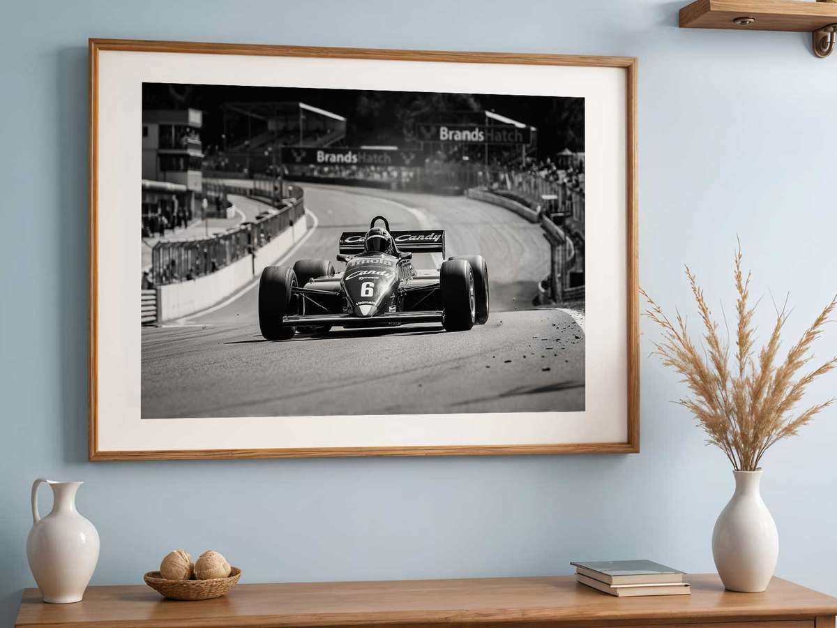
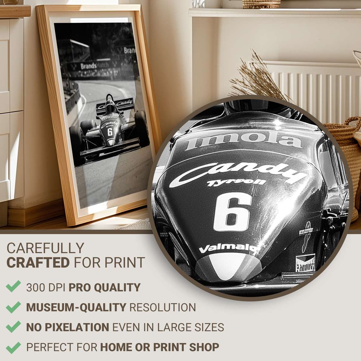
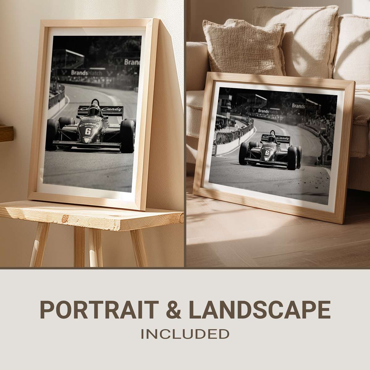
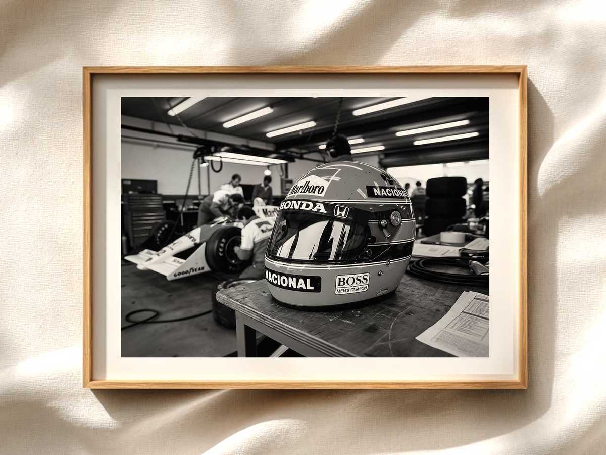
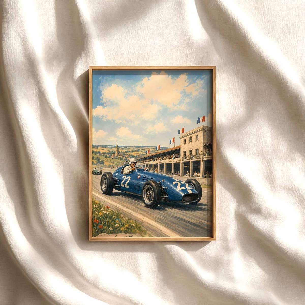
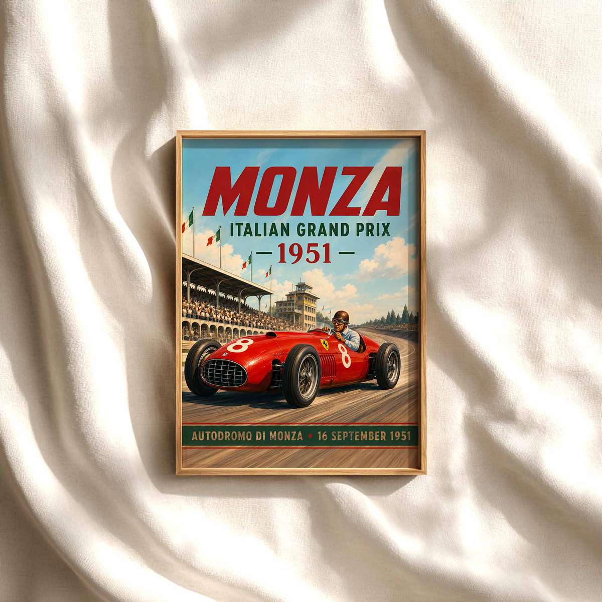
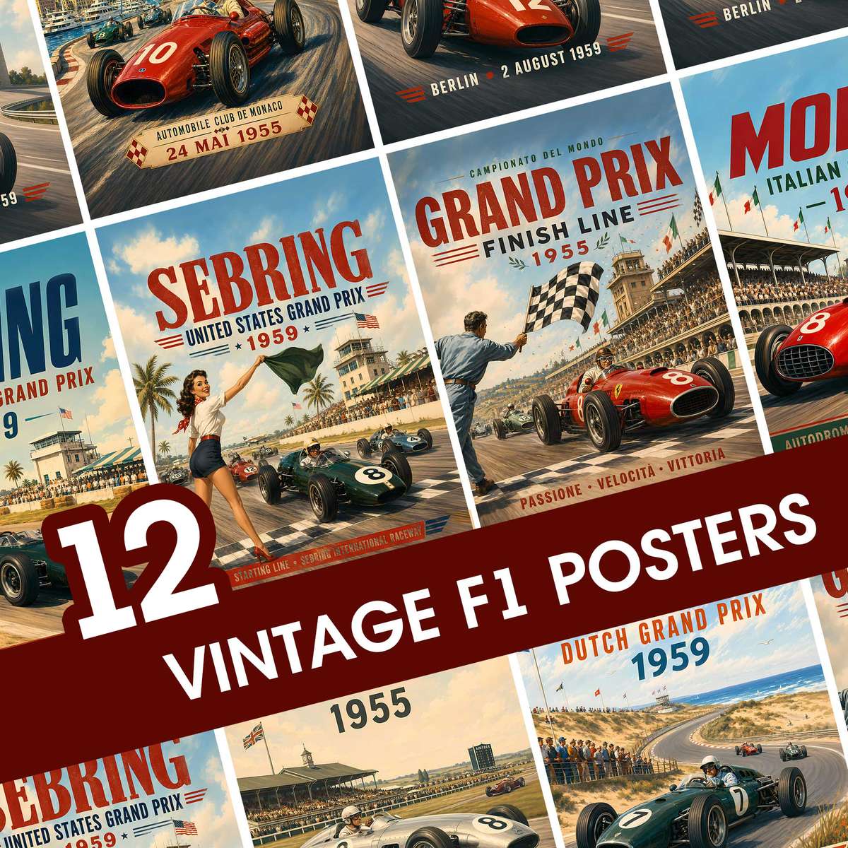
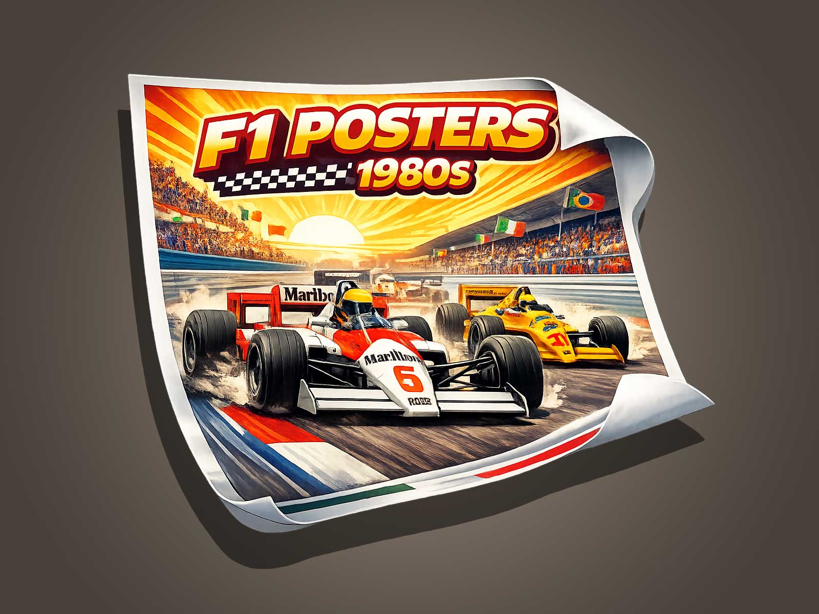
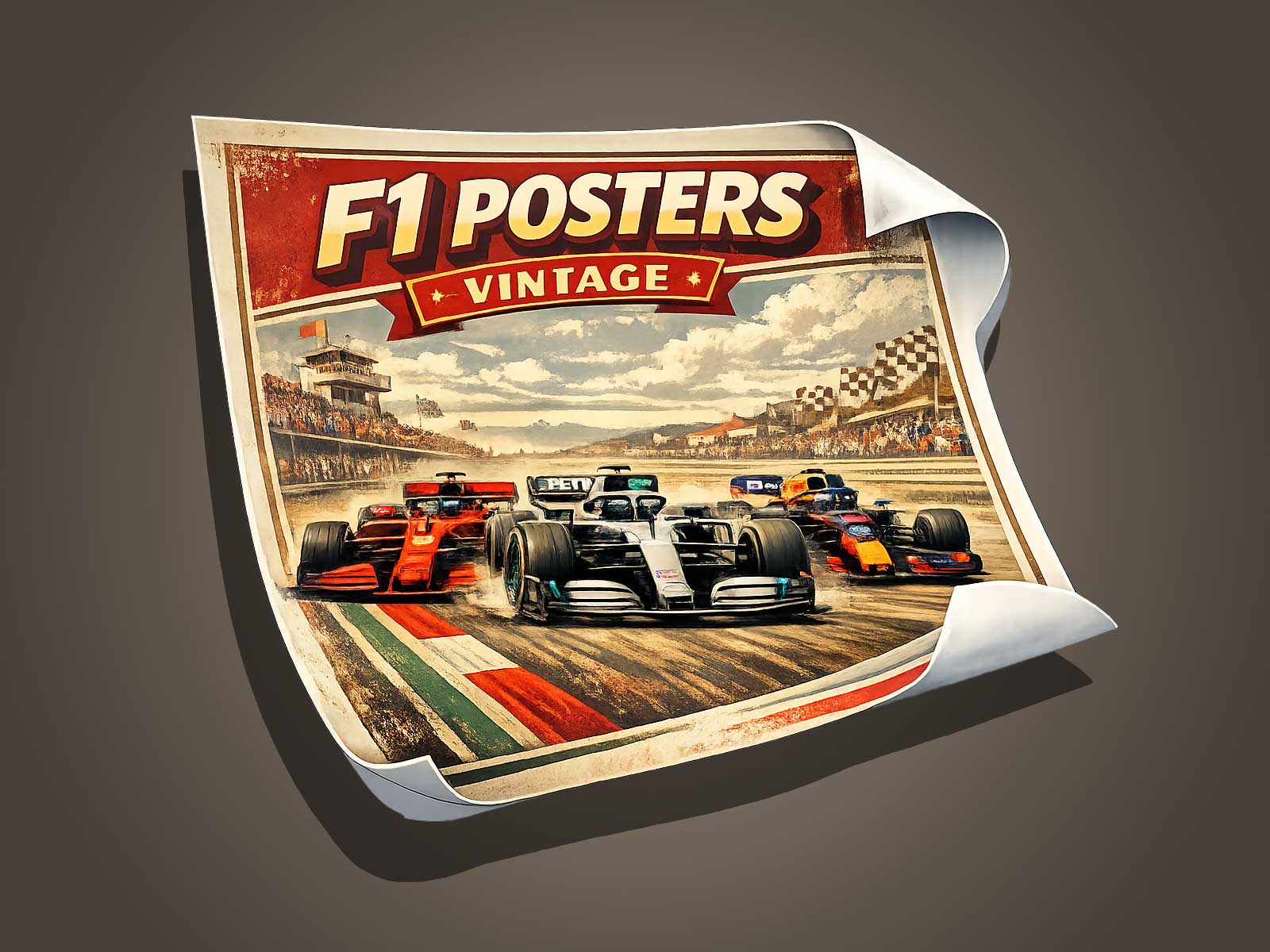
Re-reading Miami’s visual heritage through a 1980s-inspired vintage F1 poster aesthetic reveals fresh depth: the city’s pastel-and-neon palette, palm silhouettes and Art Deco patina combine with authentic Formula 1 livery cues from the era to create images that feel historic and original at once. This article explains the visual codes used, how designers evoke historical patina without slavish imitation, and why the resulting composition reads strongly when printed and viewed at distance.
Why Miami’s 1980s Visual Identity Works with a Vintage F1 Approach
Miami’s 1980s identity—popularised in part by cultural touchstones such as Miami Vice and reinforced by preservation-driven repainting of the Art Deco Historic District after its 1979 National Register listing—left a recognisable visual shorthand: pastel-and-neon palettes, palm silhouettes and streamlined architectural forms. These elements are naturally compatible with vintage motorsport graphics, which in the same era relied on bold sponsor liveries, simplified shapes and strong colour contrasts to read at speed and at scale.
Authentic 1980s F1 Visual References: Candy-Tyrrell and Livery Cues
Designers working in this hybrid genre can draw on legitimate visual references from late-1970s and 1980s Formula 1: sponsorship-driven liveries such as Candy on Tyrrell cars created distinctive, graphic colour blocks (blue, red, white) that function as credible period motifs. Using these livery cues as inspiration grounds a poster in F1 heritage without copying any single historic poster design.
Evoking Patina and Visual Memory Without Forgery
To suggest historical depth designers use established graphic techniques—distressed textures, muted shifts in colour, subtle film grain and careful desaturation—to create a sense of patina. These methods convey layered visual memory and heritage value while avoiding direct imitation of any specific archival poster, preserving authenticity rather than producing a forgery.
Design Choices That Preserve Visual Strength for Print and Distance Viewing
Large-format posters must obey practical legibility rules: high contrast between foreground and background, simplified messaging, bold shapes and a clear typographic hierarchy. Letter heights and spacing should be scaled to expected viewing distance, and forms simplified so the composition remains readable from afar. These principles—used in billboard and signage design—ensure that the vintage-F1-inspired Miami poster remains visually impactful once printed and displayed.
Composition: Balancing Historical Codes and Modern Clarity
A successful composition foregrounds a strong silhouette (for example a palm or streamlined car profile), places colour blocks derived from period F1 liveries to guide the eye, and uses negative space to hold typographic elements legibly. Combining Miami’s pastel/neon palette (tempered into muted, print-friendly tones) with the graphic clarity of 1980s F1 liveries produces a poster that reads as heritage-driven yet contemporary and clear at a distance.
What the Final Image Communicates
When done with restraint, the final poster communicates layered meaning: it references Miami’s preservation-shaped look and cultural memory, nods to Formula 1 visual heritage through authentic colour and shape cues, and demonstrates craftsmanship in print design—patina techniques that suggest history without pretending to be an antique. The result is a piece with genuine heritage value and the practical legibility needed for large-format display.
For designers and collectors of vintage-style motorsport posters, this approach offers a way to honour both place and period: harness Miami’s 1980s visual codes and period F1 livery inspirations, apply proven patina techniques, and build a bold, readable composition scaled for print and distance viewing.