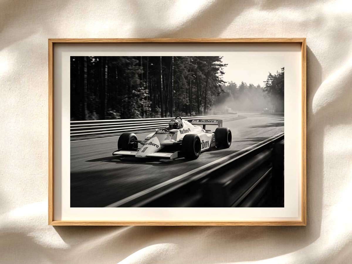
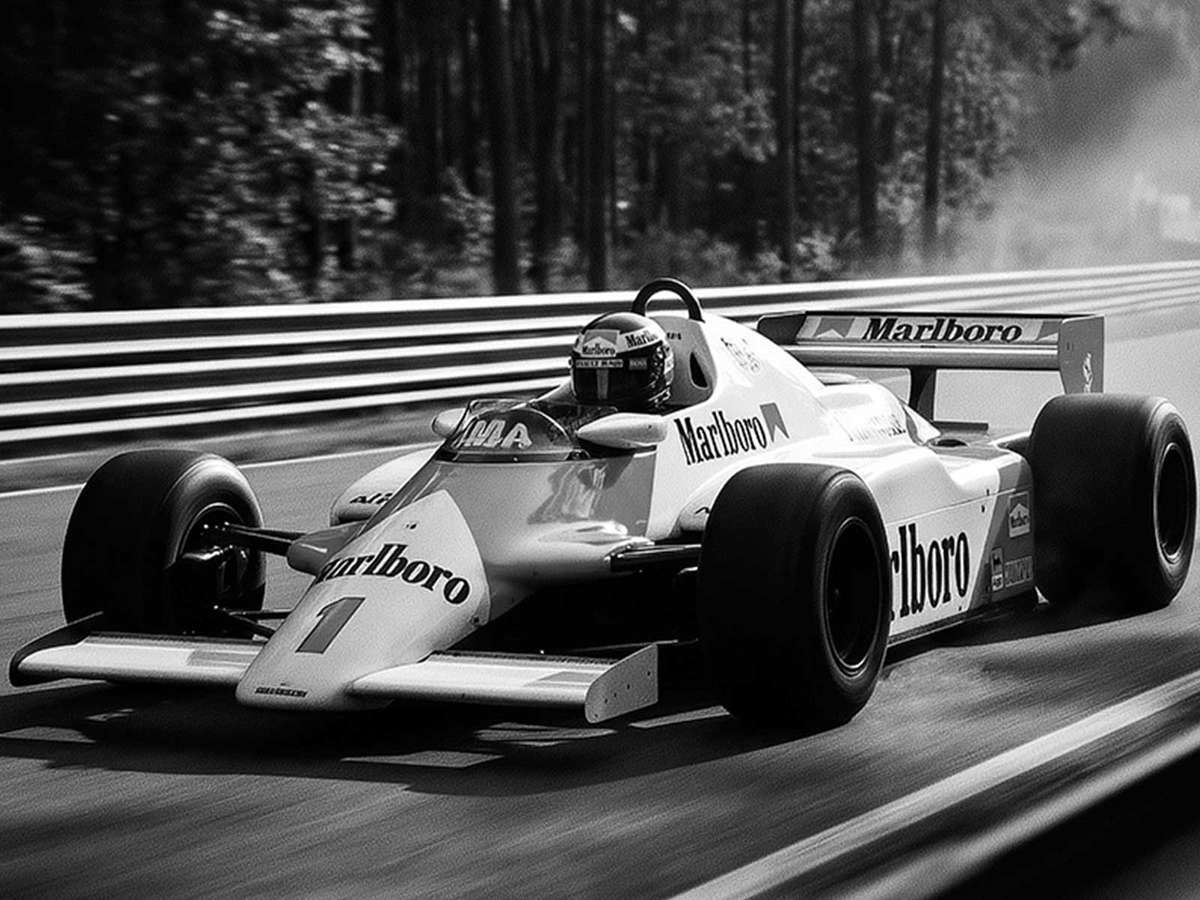
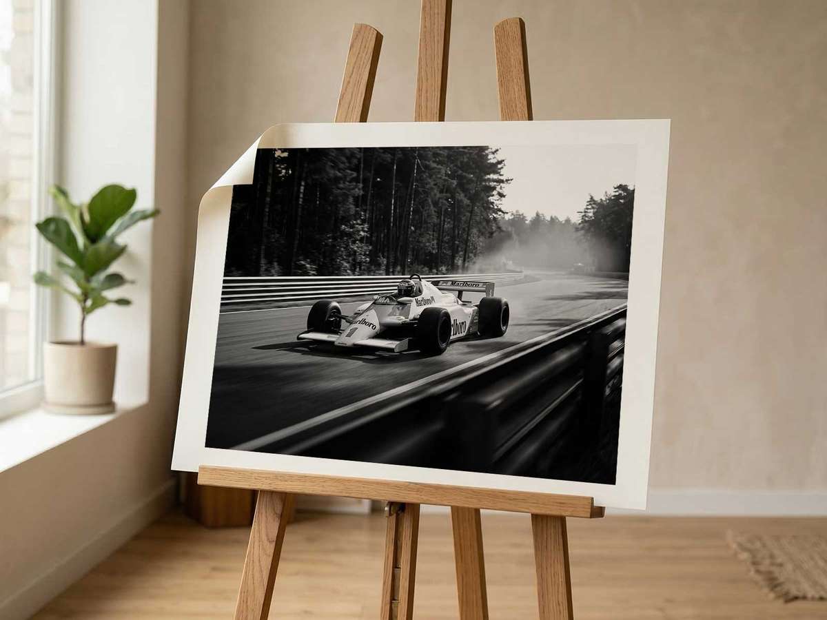
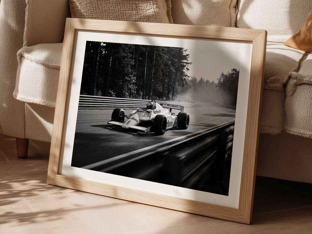
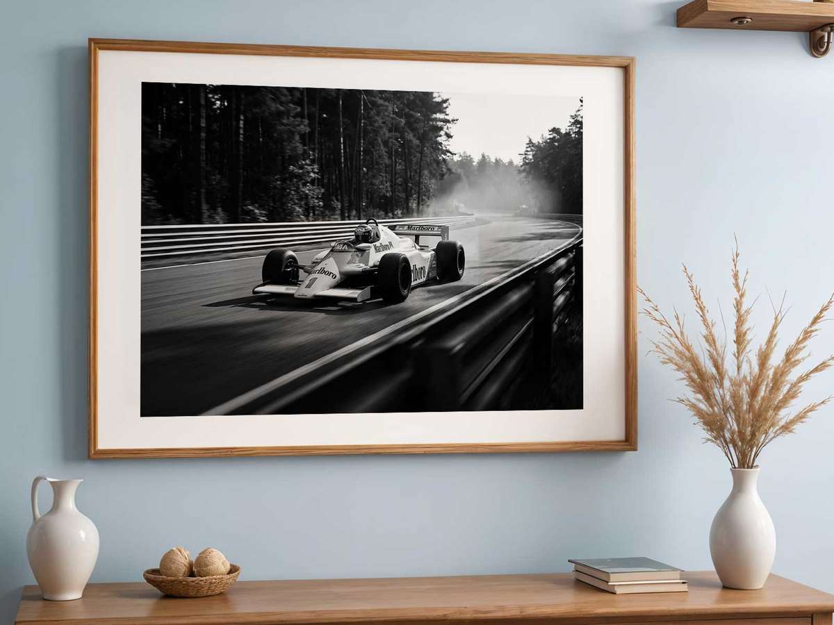
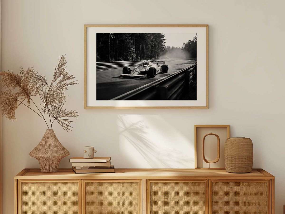
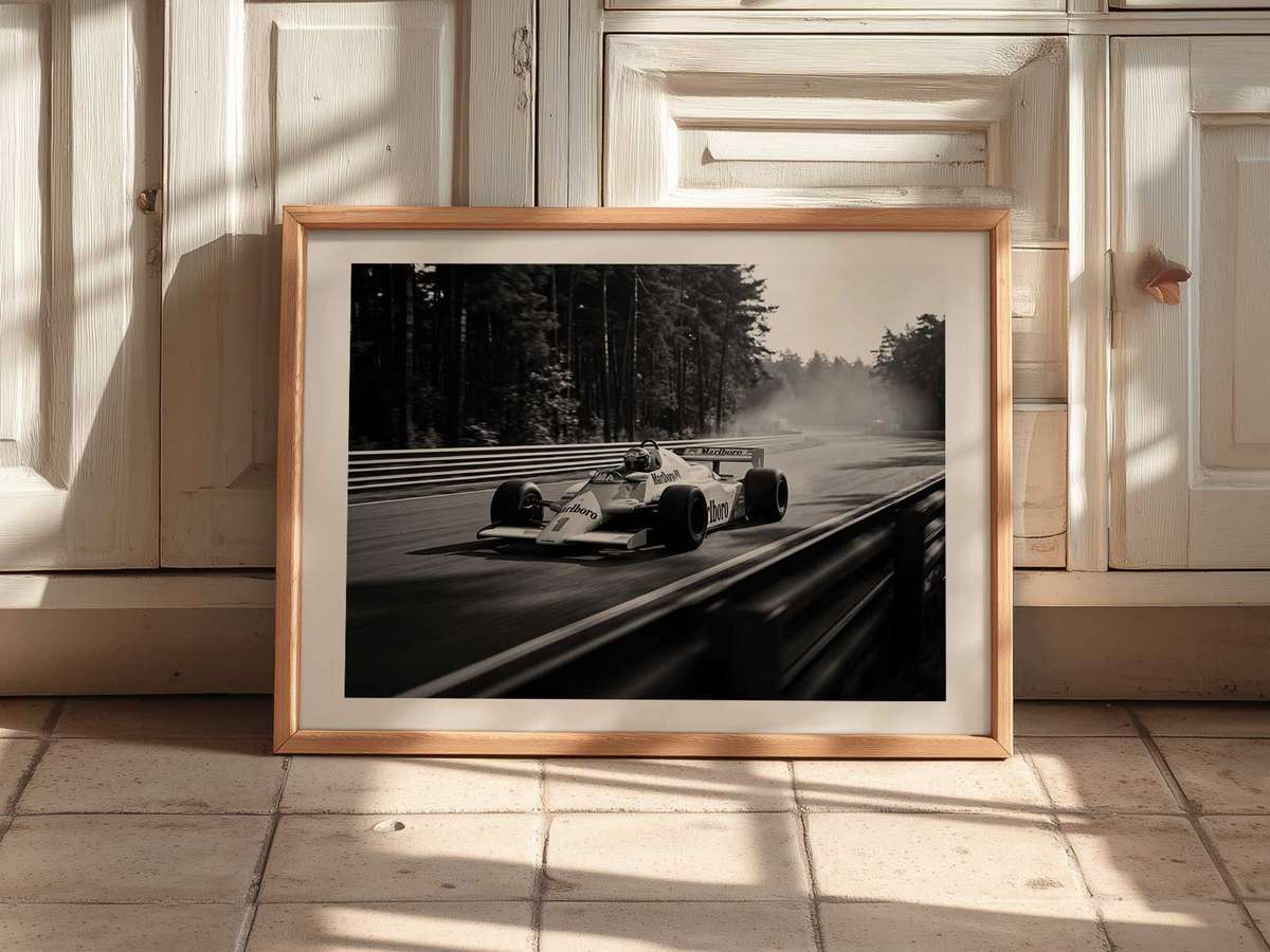
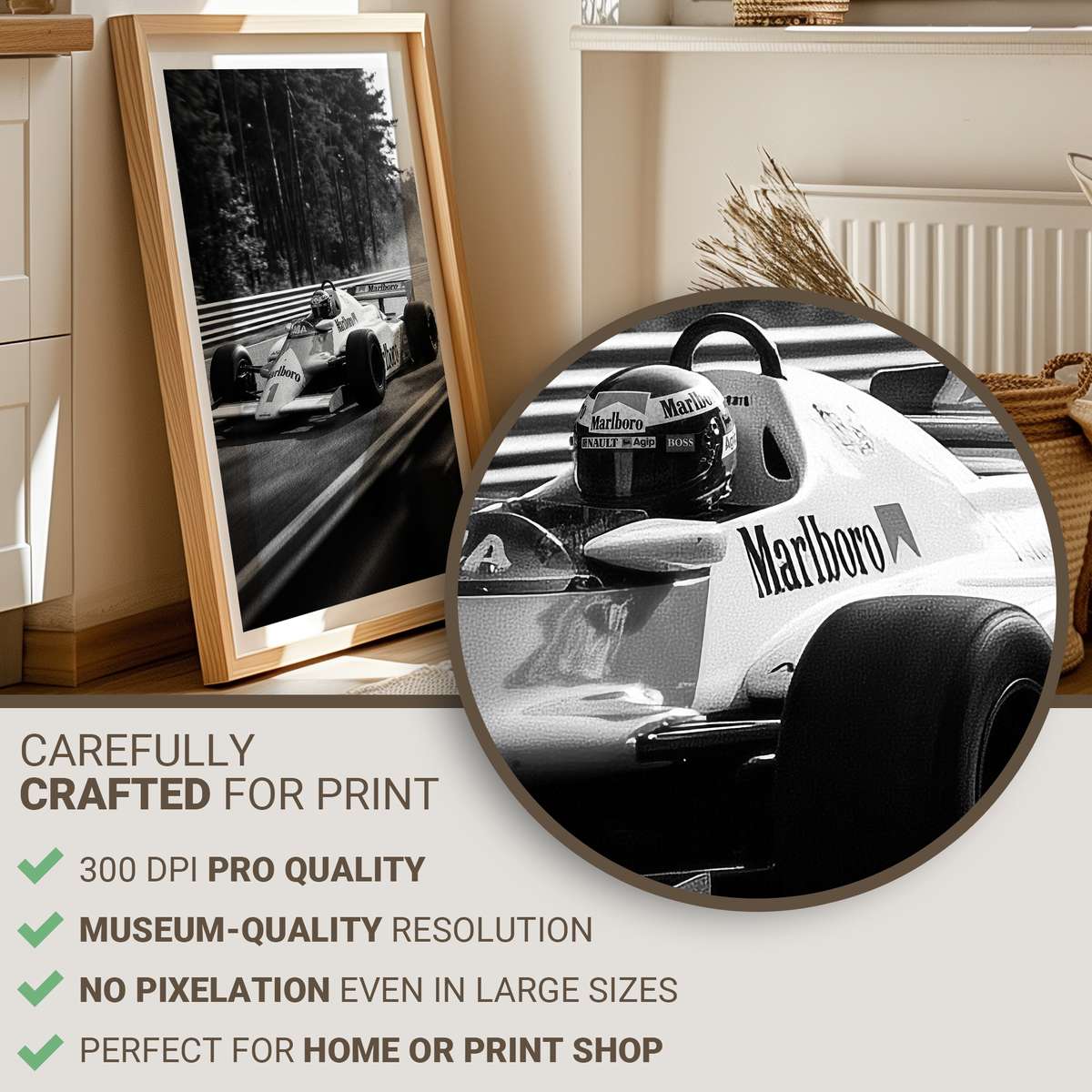
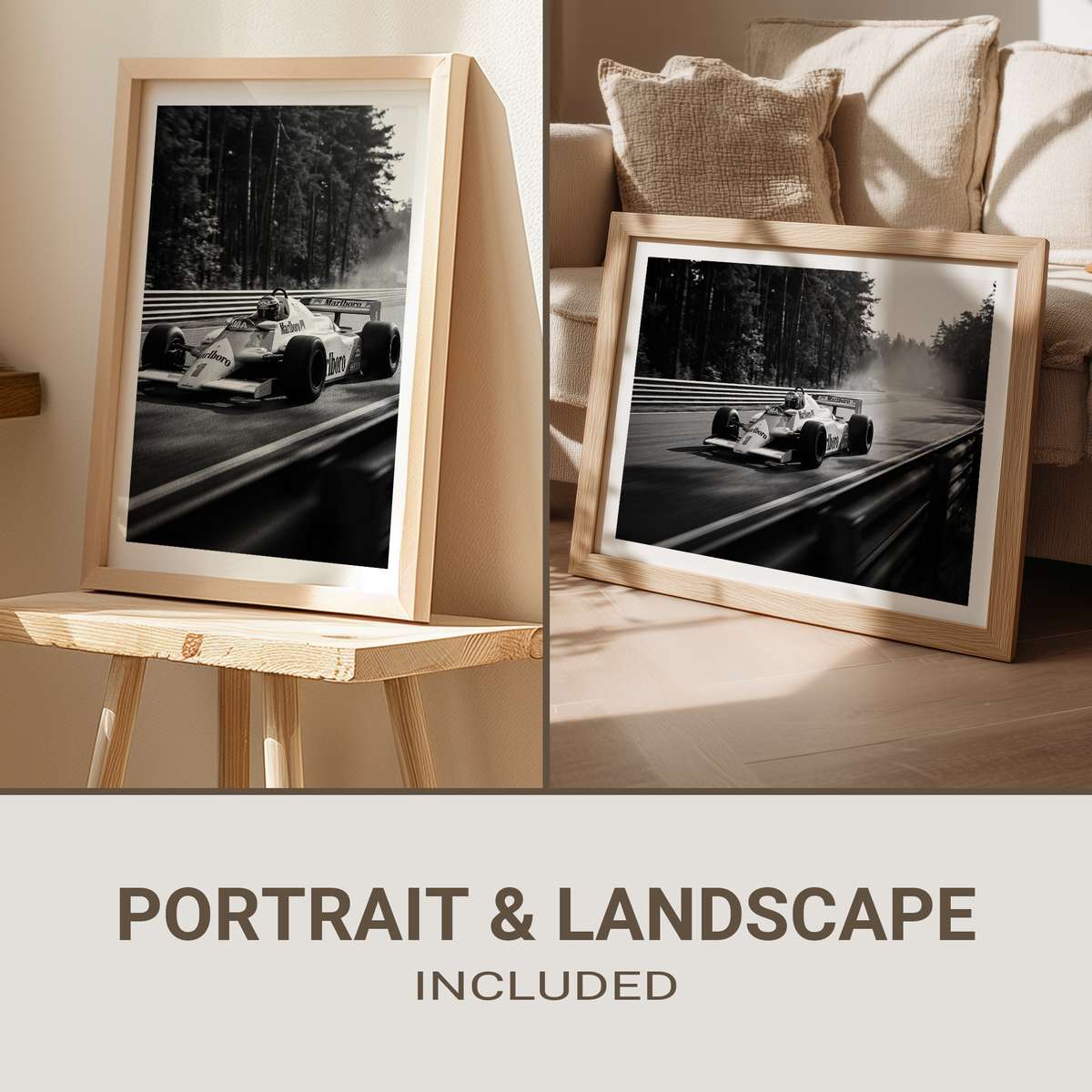
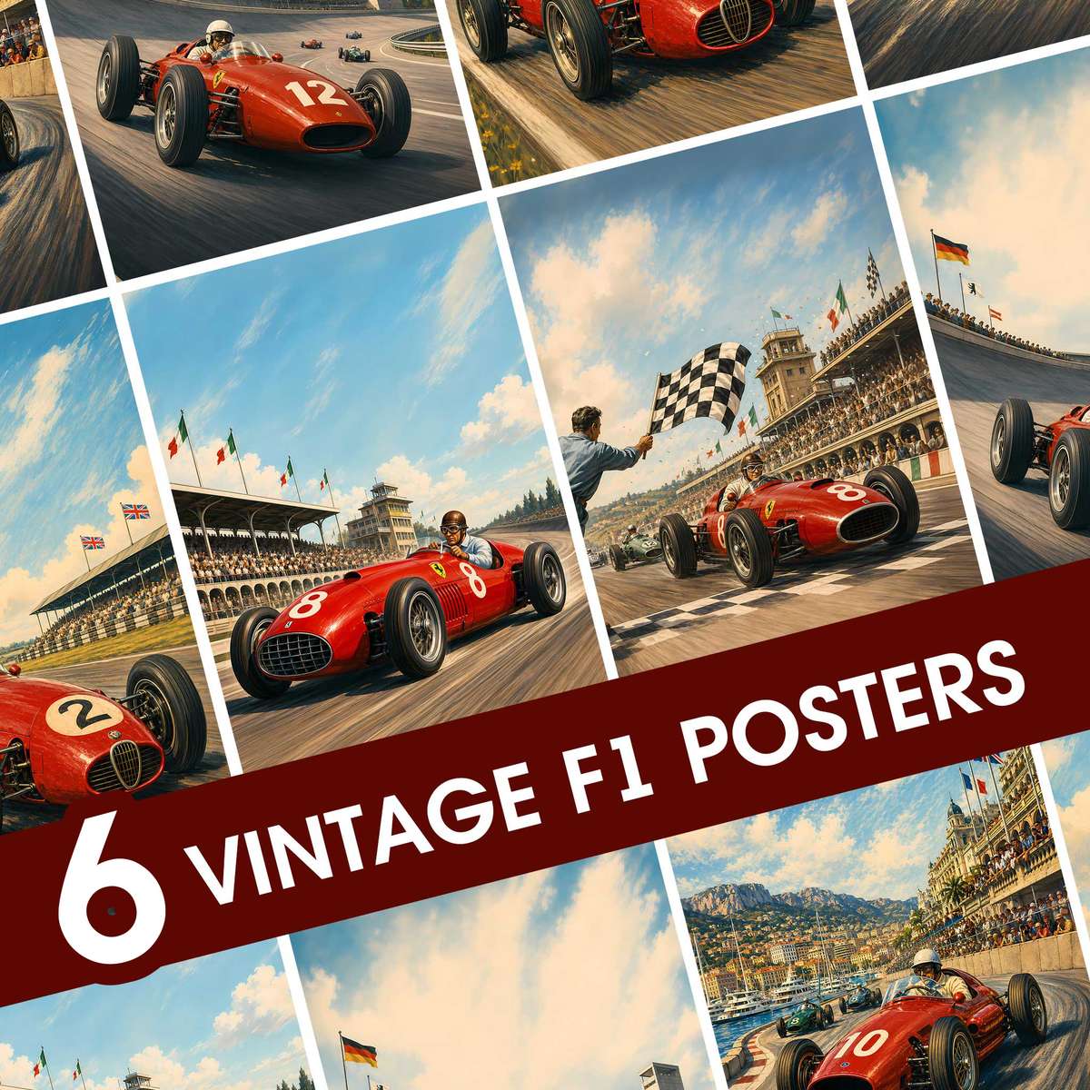
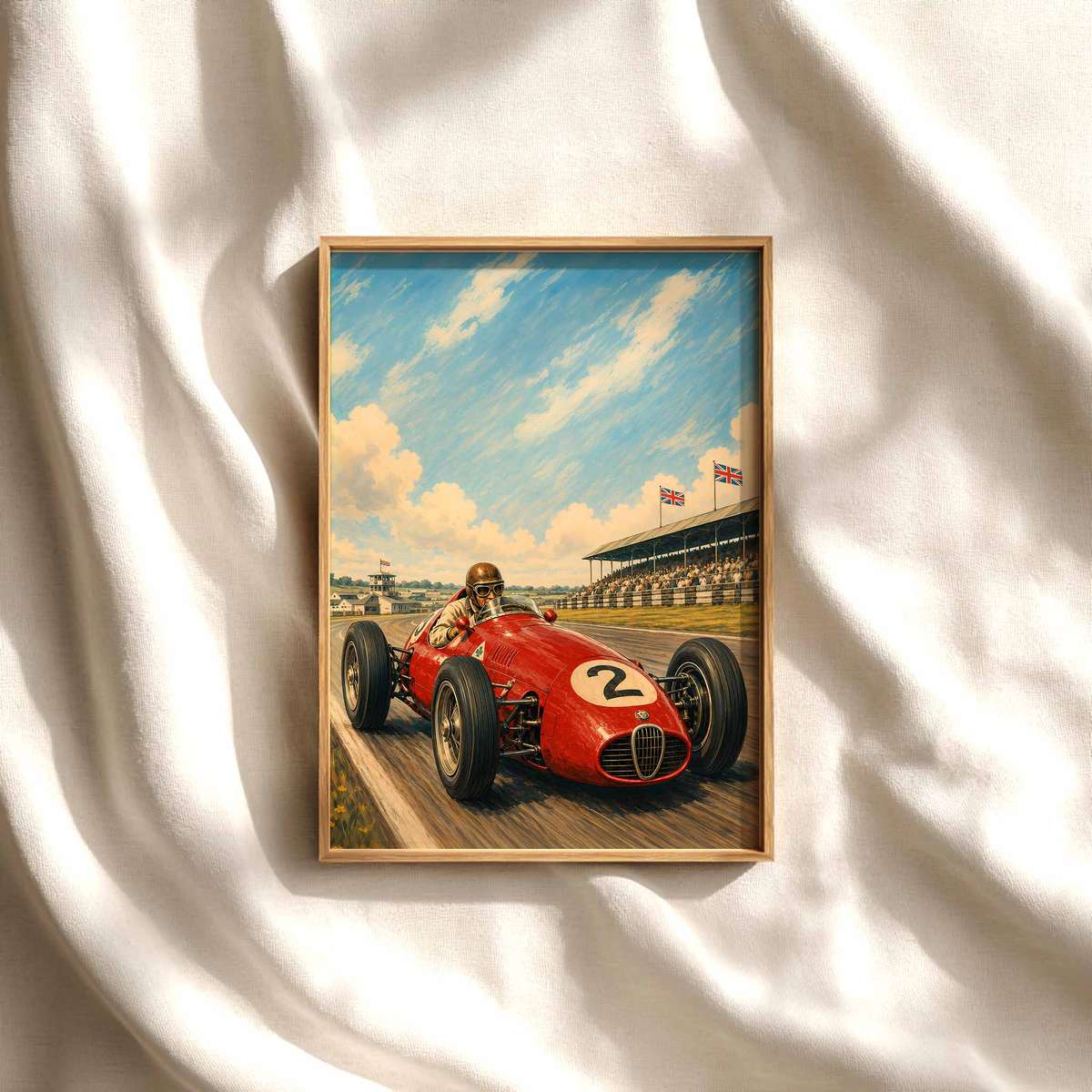
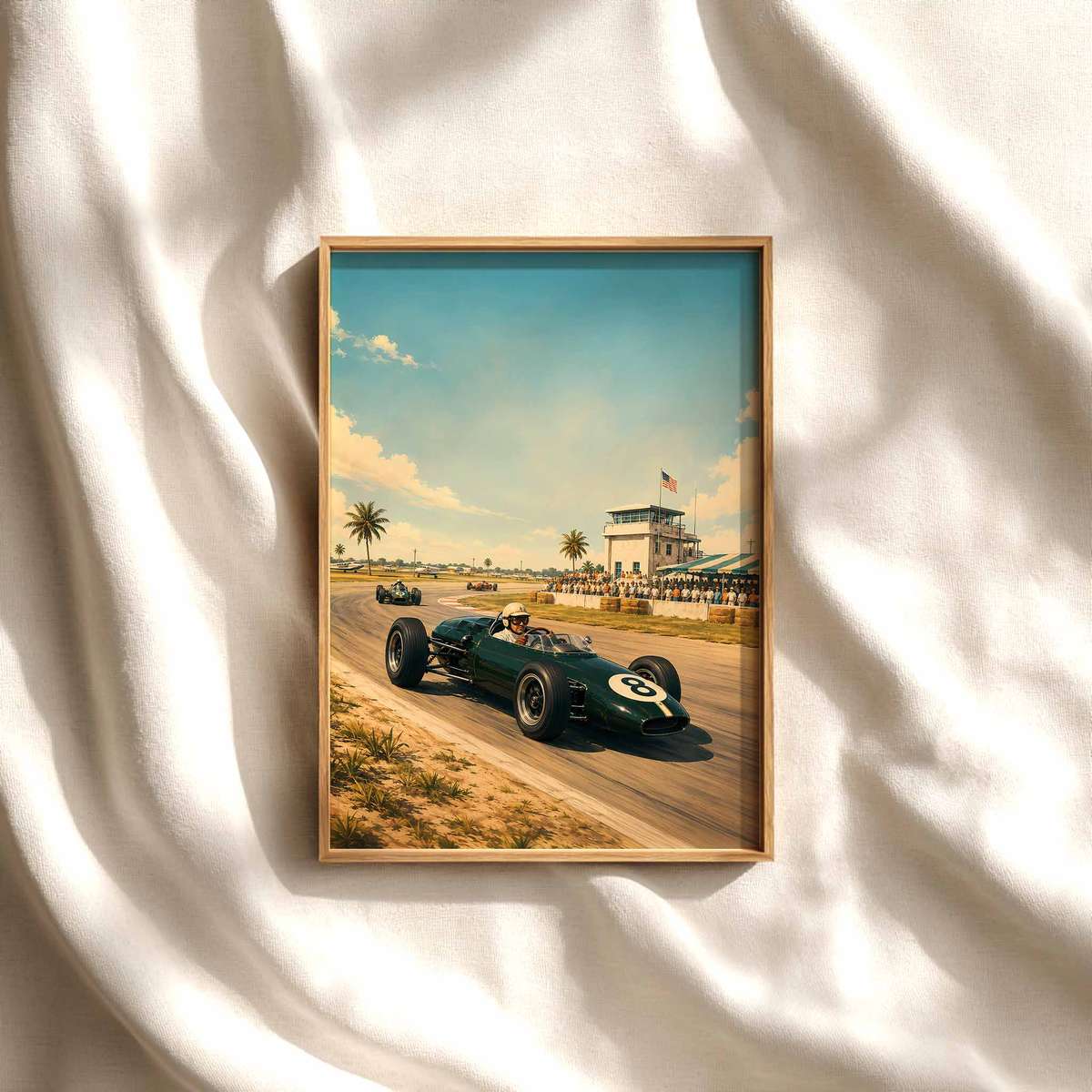
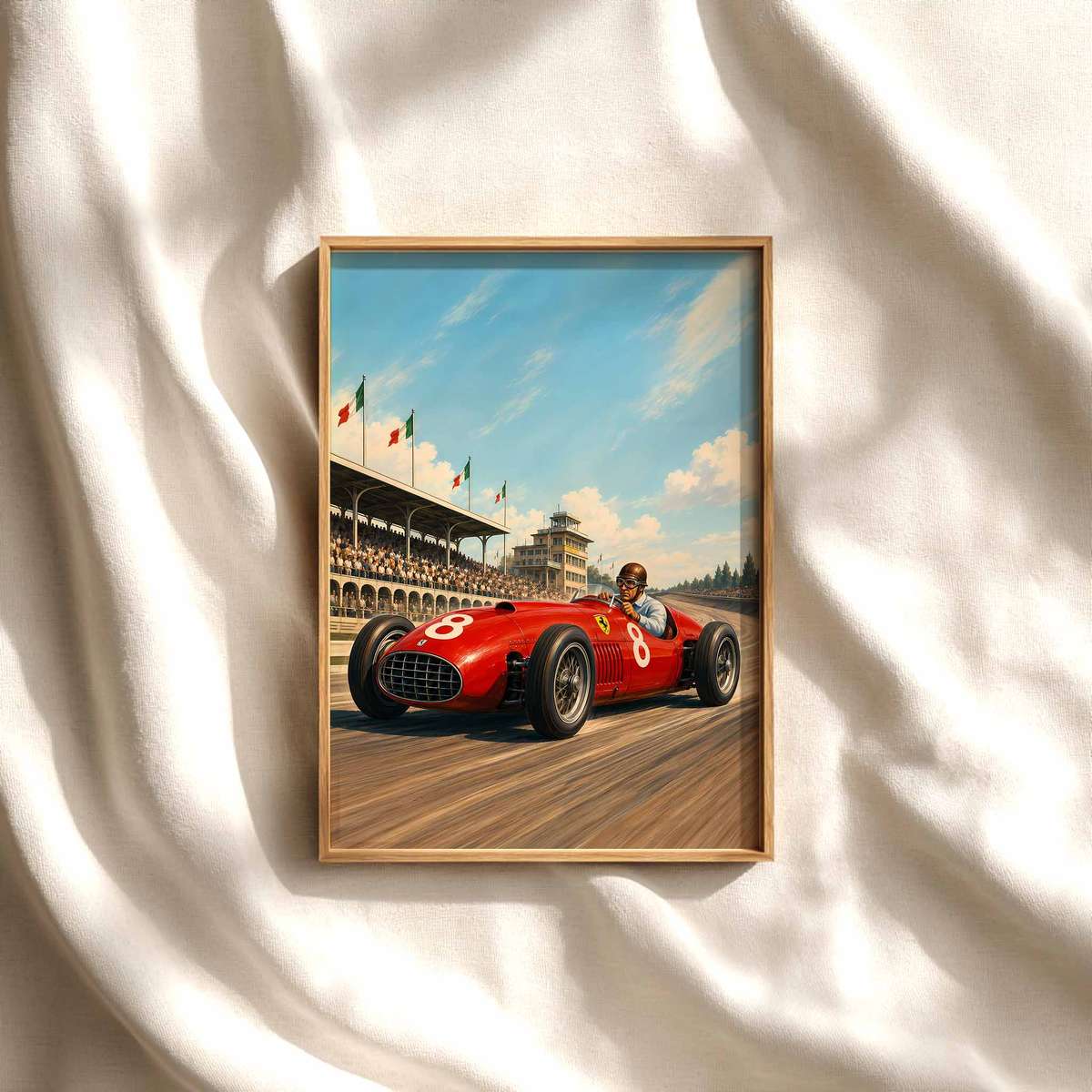
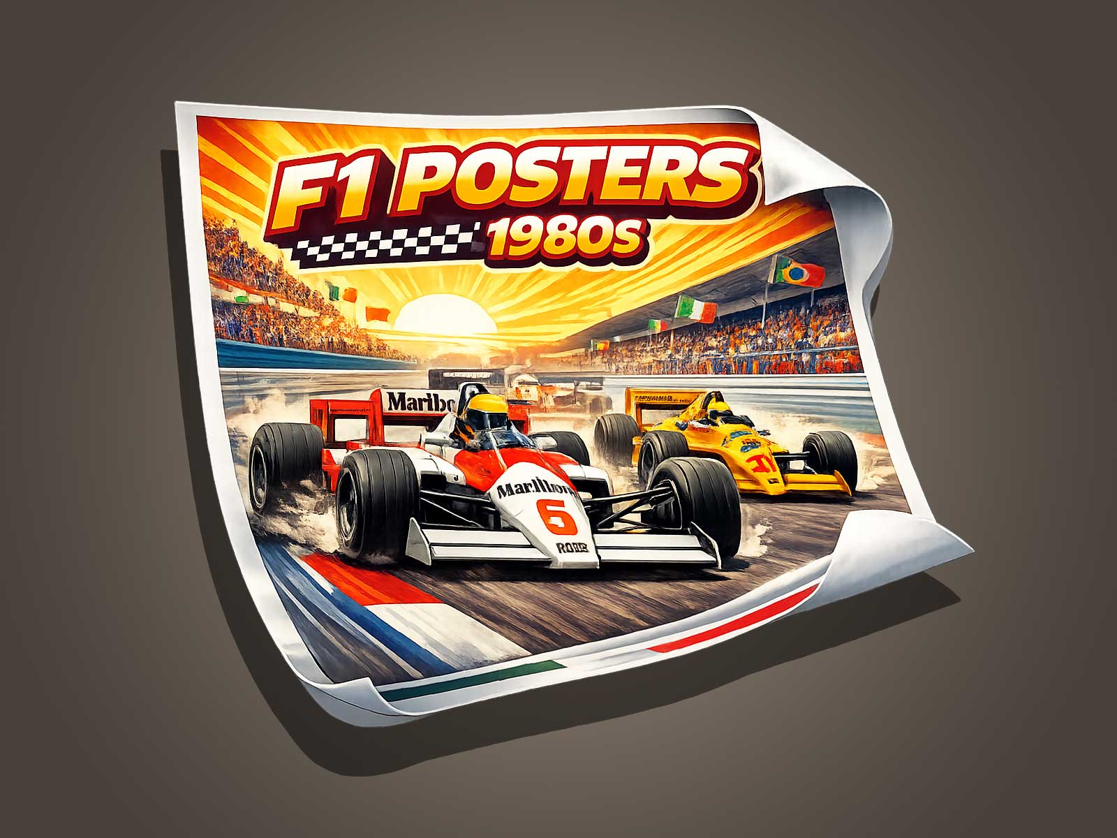
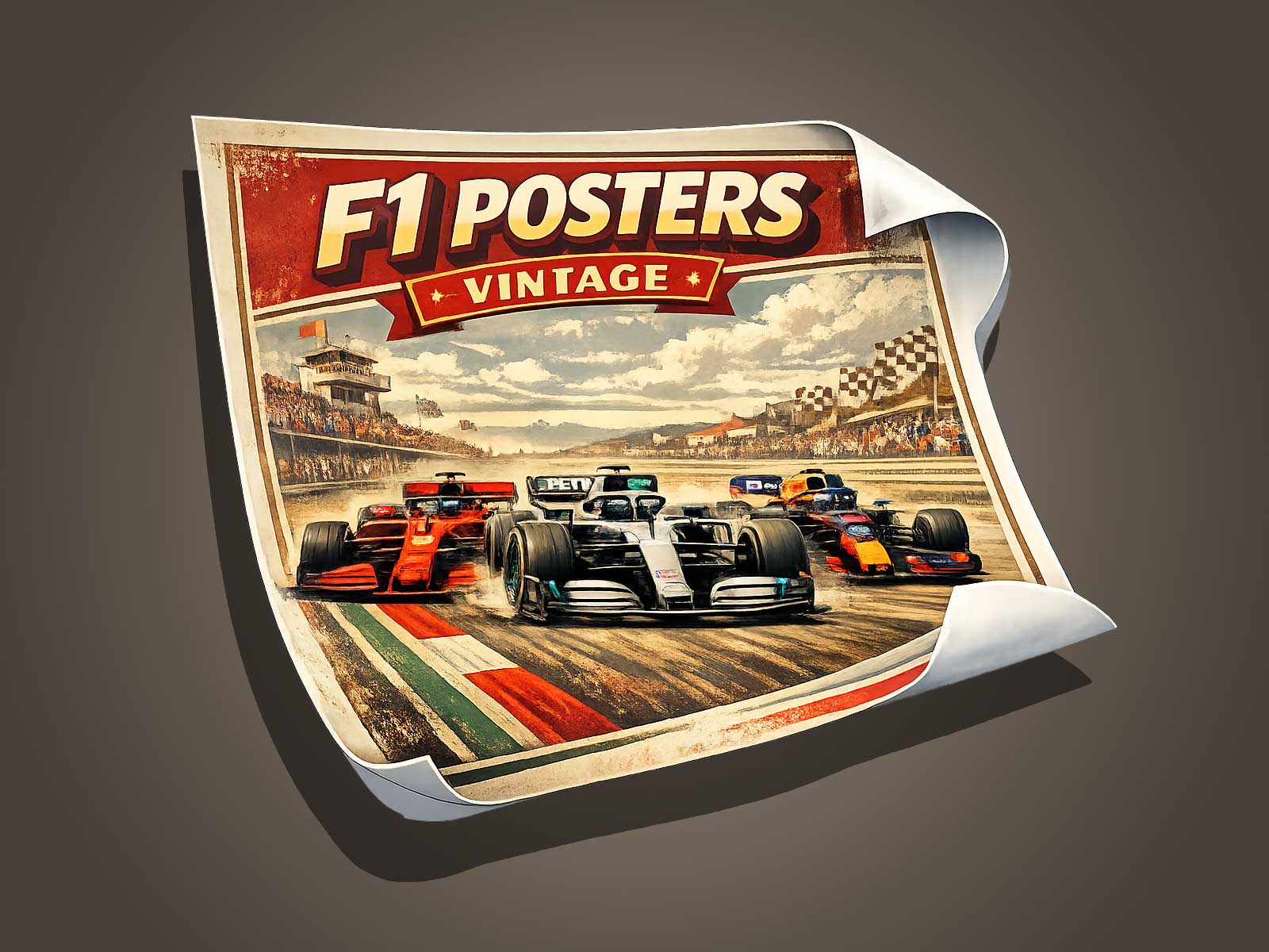
In poster design for Formula 1, the driver can transcend biography to become a visual shorthand for speed, courage and victory. This article examines how an F1 champion is portrayed as a graphic presence on posters: the compositional choices, posture, color and symbolic props that convert a person into an emblematic figure. Rather than a full life story, we focus on the visual and emotional techniques artists use to evoke the aura of a champion—useful for collectors, designers and fans seeking to understand or create striking F1 wall art.
Turning a Driver into an Emblem
Great F1 posters rely on reduction and emphasis. Instead of detailing every career milestone, designers isolate traits that read instantly: the helmet silhouette, a signature stance, or a team livery fragment. These elements function like a logo; stripped down, they preserve recognizability while heightening drama. For an F1 champion, posture matters—an upright, forward-leaning pose suggests readiness and focus, while a relaxed, confident stance conveys mastery and ease. The artist chooses which moment to freeze: a pre-race calm, a victory celebration, or a contemplative gaze—each choice shapes the viewer’s emotional read.
Charisma Through Composition
Composition directs attention and assigns meaning. Placing the driver off-center against negative space can imply motion and future potential. A close-up cropped composition emphasizes personality—eyes behind visor reflections or the texture of gloves speak to experience. Low-angle views give a heroic scale, literally making the driver look larger-than-life. Layering—helmet in the foreground, blurred car shapes behind—creates depth and reinforces the link between pilot and machine without turning the piece into a technical diagram.
Color, Light and the Aura of Victory
Color palettes communicate temperament: saturated reds and oranges read as aggressive and kinetic, while deep blues and muted tones convey cool authority. Light is equally important—rim lighting can suggest speed and highlight contours, while dramatic chiaroscuro lends gravitas. Subtle use of metallic or foil accents on a champion-themed poster can mimic trophy gleam and add tactile prestige. Designers often heighten contrast and simplify textures to make the image read at a distance, important for posters meant to be absorbed quickly on a wall.
Symbolism Without Overload
Symbols — laurel wreaths, checkered patterns, or abstracted track lines — anchor the driver to the idea of championship without cluttering the design. Effective posters integrate such motifs sparingly: a faint track curve in the background, a single laurel outline, or a number plate stylized into the composition. Typography also plays a role; a bold, condensed typeface can echo speed, while a classic serif suggests legacy. The goal is to suggest achievement, not to catalog it.
Emotion and Narrative in a Single Frame
Even a single image can tell a story. A tilted helmet perched on shoulder evokes vulnerability after a triumph; a helmet tucked under an arm suggests readiness. Subtle gestures—the tilt of a chin, the angle of shoulders—create narrative beats. The most resonant posters invite viewers to project memories and feelings: recollections of a race, the thrill of an overtake, or the quiet intensity before lights-out. This emotional resonance is what elevates a depiction from portrait to icon.
Practical Tips for Collectors and Designers
- Focus on a single visual idea: pick one trait (helmet, posture, number) and make it dominant.
- Test readability at different sizes—posters must work from across a room.
- Limit color palette to two or three dominant hues to strengthen mood.
- Use negative space to imply motion and give the figure room to breathe.
- Include tactile finishes sparingly—metallic inks or textured paper amplify the champion aura.
Why the Visual Aura Matters
Fans buy posters to feel connected to the sport’s mythos. When a driver is rendered as a graphic presence rather than a factual timeline, the artwork taps into imagination and emotion. It distills what the fan admires—skill, bravery, grace—into an immediate visual language. For designers, the challenge is to honor the subject’s identity while composing an image that functions as both art and emblem. When successful, the result is a poster that not only celebrates an F1 champion but also becomes a lasting piece of cultural iconography on the wall.
Further Viewing
For an example of this approach applied to a classic team aesthetic, see the McLaren print listing that blends vintage racing styling with driver-focused composition: https://www.etsy.com/listing/4433928602/mclaren-f1-print-racing-wall-art-vintage